Posts for: PeterBergh
Dec 6, 2018 10:18:06 #
Delderby wrote:
#1 pic - I looked and pondered - then searched in SmartEdit at the dozens of alternative lighting and colour situations. I came to the conclusion that the OP's
picture, with subdued colors, soft light and vertical format is exactly right. In fact, IMHO, it deserves congratulations.
picture, with subdued colors, soft light and vertical format is exactly right. In fact, IMHO, it deserves congratulations.
Thank you
Dec 5, 2018 22:36:36 #
canadaboy wrote:
Hello Peter I added a contrast adjustment layer then a Curves adjustment of a gentle S shape then a Soft Light blend mode at 50% opacity. I will post my result if you wish.
This is all down to personal taste but my version of your excellent shot I would be happy to hang on my wall.
This is all down to personal taste but my version of your excellent shot I would be happy to hang on my wall.
I am very happy you liked it. Please post. I am not yet comfortable enough with Photoshop to understand exactly what you did, but I got the general idea: you boosted contrast a bit and then boosted a bit in the midtones. Correct?
Dec 5, 2018 20:47:14 #
RichardTaylor wrote:
Very nice.
thanks
Dec 5, 2018 20:44:29 #
canadaboy wrote:
... For me they are in need of some quite minor tweaks in PP to bring out the best in them and add the interest that's obviously there.
Exactly what tweaks do you think are needed and in which picture(s)? I am not saying this to be obnoxious, but I would like to know.
Dec 5, 2018 20:34:52 #
treadwl wrote:
It was offered as something to think about. I am not opposed to editing my work in Lightroom. Indeed all my images get the once over on the computer (especially since I shoot in RAW) but I do try to get it right in the camera. Sometimes I know the scene will require some HDR so then I know I'll be tied to the computer.
Thanks for looking.
Thanks for looking.
I understood what you were saying. I merely wanted to point out that some people, such as myself, work more on intuition than on thinking.
Dec 5, 2018 17:46:21 #
Linda From Maine wrote:
For me, the softly filtered light has an ethereal ... (show quote)
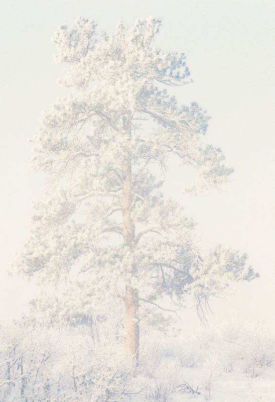
The lone tree was, in fact, taken in fog on a cold winter morning (on a hill across the street from my home, BTW), well after sunrise -- to allude to the topic title ;-). The tree was, actually, hardly visible; I had to boost contrast considerably. I'm glad you like it.
In regard to the first picture in my initial post: what I tried to convey was the feeling of light that I saw when looking at the scene; I feel that a darker rendition would not convey that feeling of light. If you look carefully at that image, you will see some clues to depth -- primarily some shadows -- but they are not obvious.
Dec 5, 2018 17:09:38 #
CHG_CANON wrote:
Peter, you mentioned in another overexposed example you use LR. Try the following adjustments. Look at the difference in the two histograms with these proposed adjustments.
I appreciate your suggestion, but I have already "fixed" the shadows and highlights and the blacks and whites to the extent I feel is appropriate. I do not believe in making the histogram as wide as possible; I believe what matters is how the image looks.
BTW, the illusion of overexposure in the other topic was due to my looking at the images on a far-too-bright monitor (that also was not calibrated). The images in that post were, in fact, properly exposed.
As an example of why the histogram is less important, I offer this image of a tree in cold fog (its histogram is very narrow and far to the right; if I were to widen the histogram the image would lose much):
Dec 5, 2018 16:58:22 #
kenievans wrote:
I agree that those are not the only two good times... (show quote)
I purposely worded the topic title to encourage discussion. Of course, as you say, good times to shoot depend on many other things, such as quality and quantity of light, subject, etc.
The first image actually has some shadows but, as always when shooting into the light, the shadows are not as obvious as they would be with side lighting. Furthermore, I am not convinced that every image has to have a feeling of depth. See the examples below.
Dec 5, 2018 16:46:32 #
Linda From Maine wrote:
#2 is an engaging composition with interesting per... (show quote)
 Also, my postings here from 2014 mostly make me cringe because they seem so heavily saturated. That was when I was using a 14" laptop to edit in a bright room and the device apparently was lacking in quality too.
These pictures are, IMHO, not overexposed. The subjects are light in tone. Yes, I have looked at other photos on UHH and they seem OK.
I'm glad you liked the compositions.
Dec 5, 2018 16:01:57 #
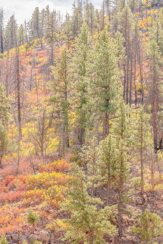
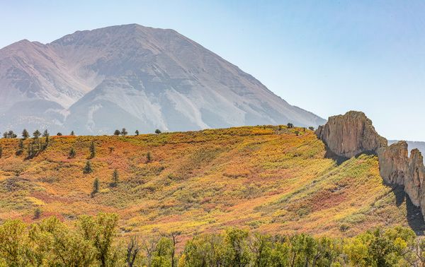
Here are a couple of counterexamples. Both are taken around noon -- about as far from sunset and sunrise as you can get.
Both are great compositions. I particularly like the leading lines from the rock formation in the foreground to the peak inb #2. But, I think you've answered your own question. Mid day shots can have blown out elements. An ND grad, like a 3x or 6x when you took the shot or a software graduated filter in LR to lower the background's exposure would have make all the difference.
Both are great compositions. I particularly like the leading lines from the rock formation in the foreground to the peak inb #2. But, I think you've answered your own question. Mid day shots can have blown out elements. An ND grad, like a 3x or 6x when you took the shot or a software graduated filter in LR to lower the background's exposure would have make all the difference.
Dec 5, 2018 14:11:13 #
Linda From Maine wrote:
... that this section is hoping to be more than just Photo Gallery without Birds. ...
Absolutely. I was hoping that, in addition to helping me make up my mind, this topic would stimulate some discussion -- which it has. I must apologize for the exposure side trail; I caused it by initially using a far too bright monitor.
Dec 5, 2018 13:46:44 #
Linda From Maine wrote:
The subject of b&w vs. color (of same image) has always been of interest for me. In this topic the conversation has revolved more around the exposure, but I hope the OP is willing to discuss his own preference of one over the other...and yes, the why 
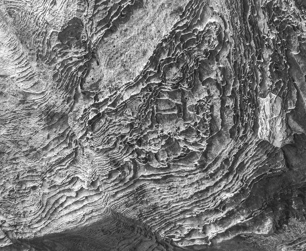
The reason I posted both versions is that I have difficulties making up my mind which image I like best. The color one is geologically more interesting, but the B/W brings out the shapes better. Had I a strong preference for one or the other, I would not have posted my query.
Dec 5, 2018 13:41:19 #
selmslie wrote:
We can't see the exposure and ISO in the EXIF. Can recall what it was? ...
The image is a scan of a transparency from a Mamiya RB67, a completely manual film camera, so there are no EXIF data. The picture was taken 25+ years ago; I have no clue what the exposure was, nor do I recall what lens I used. I think the film was Velvia 50.
Dec 5, 2018 13:31:18 #
selmslie wrote:
You might want to re-scan them. Even the downloaded versions look too bright.
But there may be other issues. Is your monitor calibrated?
But there may be other issues. Is your monitor calibrated?
Mea culpa. I was viewing the images om a grossly overbright monitor. When I view them on a reasonable -- calibrated -- monitor, they show the way I want them. In nature, the formations are very bright.
Dec 5, 2018 13:14:12 #
PeterBergh wrote:
... Unfortunately, the images show as overexposed. Please disregard the exposure.
Mea culpa. I was viewing the images om a grossly overbright monitor. When I view them on a reasonable monitor, they show the way I want them.