Posts for: gessman
Sep 20, 2011 00:15:52 #
myts10 wrote:
I like the color and background. I think the composition in number 3 is the best. To me it does not look natural sideways.
Thank you. I appreciate your opinion.
Sep 20, 2011 00:14:16 #
fivedawgz wrote:
Yes. And that's when I get a bunch of dupe messages posting.
bobmielke wrote:
Has anyone noticed their mouse cursor hanging up and then the need to wait 4-5 seconds to free it up?
Yes. And that's when I get a bunch of dupe messages posting.
I've seen that and other hesitating as well. I'm beginning to wonder if it is someone else's "adware" tracking me or if it's UHH. I run anti-spyware cleaner frequently and even though I'm not spending much time on other sites right now, I'm still getting it.
Sep 20, 2011 00:06:28 #
Hey folks, if I'm over-working ya and need to slow down or give it a break, please let me know. I have wrestled with these two shots and whether I should like 'em or not. this first shot is a little less complicated than the other one, I think, so I'll get it out of the way first.
This female common Merganser is coming in for a landing and has just skidded a little on the surface of the water and then slowed down but hasn't yet settled onto the water's surface. Is this a case where it is prudent and acceptable to show a moving subject as moving out of the image rather than into it?
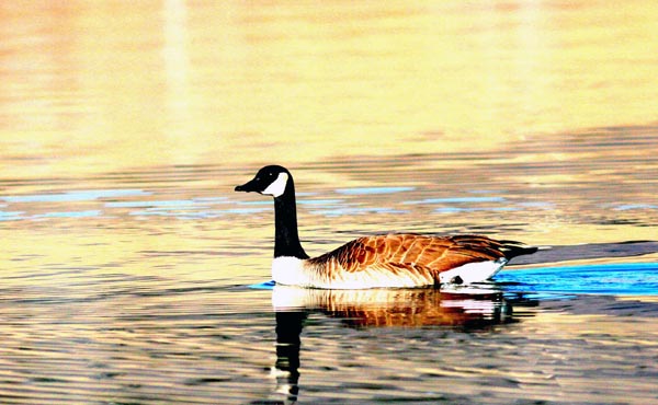
The Canada Goose is in a extraordinarily colorful state in some surreal looking water. Digital sometimes does some real goofy stuff like this when the light is hitting it just right. Is this "too" much or can it get away with being called "natural?"
This female common Merganser is coming in for a landing and has just skidded a little on the surface of the water and then slowed down but hasn't yet settled onto the water's surface. Is this a case where it is prudent and acceptable to show a moving subject as moving out of the image rather than into it?
The Canada Goose is in a extraordinarily colorful state in some surreal looking water. Digital sometimes does some real goofy stuff like this when the light is hitting it just right. Is this "too" much or can it get away with being called "natural?"
Do I have to give up showing how they land and obey composition rules?
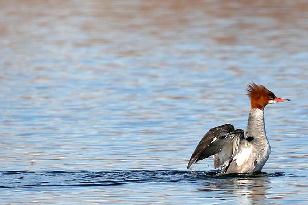
Do I have to obey the rule of 3rds here and lose my beautiful blue water trail?
Sep 19, 2011 23:51:54 #
fo-toe wrote:
Lovely, crisp shot. Re cropping or composing: Ther... (show quote)
Thank you and it's good to know about 60-30-10. I hadn't come across that up to this point and I sincerely appreciate you sharing that with me/us. Thank you also for the compliments. I appreciate them too.
Sep 19, 2011 23:47:20 #
fivedawgz wrote:
And then there's sending a reply and having it show up 4 or 5 times and you can't delete the dupes.
I figured out what part of my problem was. I star messages I need to reply to and check mark the ones that can be moved to my UHH folder. I'd go up the list of email notices and mark off a bunch ready to move and then I'd get a piece of spam and check it and delete it, not thinking about also deleting the forum messages I had marked to move, hence, I'd delete everything that was marked. I suspected that so I went to "trash" and sure enough, I had a bunch of forum mail in my trash folder. I moved it back where it belonged and devised another plan for doing that. What concerned me most was the pm's I had gotten, opened, and read but then the email for those have disappeared making me also think the pm's were gone. I later found them too. I've got to get more familiar with all aspects of the forum in order to better understand how to maneuver my way around. However, that didn't explain all of the messages that were there and then they were not.
Sep 19, 2011 23:38:14 #
Ugly Jake wrote:
I think I would have to go with #1 - these ARE the male parts of the flower, but the vertical ones seem too suggestive, somehow.
That may have been what tilde was sayin'. You don't think it's possible that someone's been slippin' my lilies a little viagra do you? Shucks, I rotated that rascal in all directions and felt so sorry for the poor lil' lily when I aimed it down that I couldn't wait to rotate it somewhere else. After that, it became immediately obvious that this was definitely a "southpaw." Maybe that's just because that's the way it was when first we met. It's nice to see you Mr. Ugly Jake. May I call you ugly? I don't mean to agree but I like to be on a first name basis when possible. Thanks for your input.
Sep 19, 2011 23:14:46 #
ianhargraves1066 wrote:
Take it from me. I had a small house fire a year ago. Confined to my compyer room it did $65,000 of damage to the house, burned up 3 computers, a $2000 Richo laser machine and destroyed 40 years worth of negatives. I had scanned most of the negs and burned them on to CD's. Howver the heat from the fire turned 300 odd cd's into a molten mass. Keep the Ccopies in someone elses house.
Cause of the fire, A power supply for my Dell Inspiron Laptop. 41 letters to Dell, not one reply>
Cause of the fire, A power supply for my Dell Inspiron Laptop. 41 letters to Dell, not one reply>
I'm really sorry to hear that Ian.
Sep 19, 2011 23:09:09 #
ThomasS wrote:
I like the black background, and like the first photo best. Not really sure why. My macro (100mm f2.8L IS) will give me that black background at times too.
Thanks ThomasS. I think if I had to take one under the hazards of a threat on my life that's the one I'd go with too. May be just 'cause it's on top and closest to the door but... I don't honestly know what caused the background to go so dark. I have a big tree with a dark trunk just off of my deck and it could be that I was aiming at that.
Sep 19, 2011 23:05:26 #
JKious wrote:
I'm far from a professional, but here is what I came up with... I tried it with a yellowish green background, but didn't like it.
Thank you for doing that. I like the light background but then I like the black one too. I think it works well both ways. I'm a high contrast saturated color leaner but I can be swayed. Mostly I'm negotiable. Thanks again.
Sep 19, 2011 23:02:58 #
tilde531 wrote:
For me, it's between #1 and #2... leaning mostly t... (show quote)
Are you working on mastery of the fine art of the double entendre or is it just my imagination?
I didn't pluck any pedals but I was right in there where the action is. May have moved a pedal with my lens. These are all the same shot cropped and rotated 90 deg up. I couldn't tell which I preferred so I thought I'd submit it to those much more sensitive than myself. I appreciate your view. Thanks.
I hope your pain goes away soon.
Sep 19, 2011 22:49:28 #
notnoBuddha wrote:
quote=gessman quote=notnoBuddha First impression... (show quote)
I wasn't doubting or contradicting. Merely recognizing the flower in it's natural state when found it. I appreciate your input. I personally, don't have a favorite. I'm glad to know how you see it should be. Thanks again.
Sep 19, 2011 19:15:13 #
I seem to be losing messages. I've had two pm's today and both of them disappeared. I read the messages and they required a little thought before I was comfortable in replying and both of them have disappeared from where I left them - in my inbox. I've also had other messages disappear as well, messages that I "starred" so I could get back and drop in a reply to someone who had commented on one of my posts. There are those of you out there right now laboring with the misassumption that I've ignored you which is not the case. I've created such a chaotic mess for myself with all my posts and it is coming back to haunt me. I've largely worked out a system for keeping up with it now so maybe it won't happen again.
Sep 19, 2011 19:00:02 #
DB wrote:
quote=gessman quote=DB Here is the b&w /quot... (show quote)
Thank you. The reason I prefer the color icicles is that it's another example to allow me to rant against selective color only to do that in this instance would pretty just about wind up a career with that one image.
Sep 19, 2011 18:41:09 #
DB wrote:
Here is the b&w
It looks good both ways but I think I'm going with the original. In b&w you get another effect if you over-sharpen it a notch or two. Makes it almost look like a pen and ink drawing, something of which I'm very fond. It's very versatile.
Sep 19, 2011 18:34:53 #
Uh oh, JimH beat me to it. Sorry!