Posts for: Shakey
Feb 19, 2018 06:38:50 #
SalvageDiver wrote:
Hi Shakey, a little late to the party, again. But, here's my edit.
Mike
Mike
Better late than never, SalvageDiver. Yep, you gave this some thought with the pink clouds and all, but not enough. The snow is white, great. However, the buildings are subdued, almost washed out. You should be aiming for bold bright colors. There is way too much ice, which does nothing to enhance the image. You need to crop most of the bottom of the image. Maybe you rushed it because you were late to meet the challenge. You can do way better than this.
You get three thumbs this time.


Feb 18, 2018 07:40:29 #
Tatia wrote:
Here is my effort for this challenge, which is a challenge. lol Finding it difficult to get a workflow going with so many filters to use and when to use them. So this is a learning experience.
WOW! Tatia, that is outstanding. The colors are bright and bold. I am impressed with almost everything. However, look at the sky at top left. The sky looks a little odd. This is because of the diagonal bands of color. This is known as banding; it's ugly and to be avoided at all costs. (Why does banding occur? Because you used one or more of your adjustment tools too strongly.) Look at the bottom right of your image and the dirty yellow reflection. There is nothing in your beautiful image which would create that yellow reflection just there (Red maybe). So that is a no-no. If you have reflections, let them reflect something in the image. The technique is to study your image and look for things that are wrong. There is always something that needs tweaking to create a perfect image. OK, you have learned a couple of things. I am delighted to give you five thumbs for an image with impact.

Feb 17, 2018 11:04:47 #
davefales wrote: back at ya
back at yaDave, you like to comment. However, if you read the preamble at the top of page 1, you'll see a request for members not to comment until they have posted their interpretation of the challenge. The problem is we get members posting comments telling us how to do it but they don't post an image in response to the challenge. This means they can talk the talk but not walk the walk. If you want to comment in future, please meet the challenge and post your interpretation. We would love to welcome you as a participating Challenge member.
Feb 16, 2018 07:03:21 #
Swede wrote:
Can't argue with him.
http://www.facebook.com/mauricio.almendras/videos/10156275561543912/
Swede
http://www.facebook.com/mauricio.almendras/videos/10156275561543912/
Swede
LOL! Gave me a good belly laugh. Thanks for posting, Swede.
Feb 16, 2018 06:56:47 #
SoHillGuy wrote:
Nonconformist.
Yep, your image really is nonconformist, SoHillGuy. You went your own way, and I said the interpretation was to be yours. Perhaps you have a dislike of focal points for this image. Hence, no crop. The image does have a certain appeal in its complexity: unusual light sky but very dark reflections on the ice.
Would it appeal to a photo editor? Maybe - maybe not. You get four thumbs for your thinking:
Feb 15, 2018 11:30:36 #
NJFrank wrote:
Thanks Shakey.
I made a couple of additional adjustments. In your opinion am I headed in the right directions?
I made a couple of additional adjustments. In your opinion am I headed in the right directions?
.
Well done, NJ. Now you are making your work sing. Way better than your first attempt.
I'll give you five thumbs for effort.
Feb 15, 2018 11:22:08 #
Revet wrote:
I decided to play around with this using Luminar since I just purchased it.
Congratulations on you purchase, Revet. Now you need to practice with it. The sky is acceptable. The snow is blue, and the ice on the left is reflecting a blue sky that is not there. That ugly yellow patch shows how you let your adjustment tools run away with you. You cropped the way you wanted but it was not a good choice. You can do so much better than that. Maybe you rushed things with your new software. I'm sure you'll do better.
Three thumbs today my friend.
Feb 15, 2018 11:10:32 #
NJFrank wrote:
Throwing my hat into the ring. I didn't want to go too crazy with the saturation. I hope i could convey a cold winter day.
Yep, you got the cold winter day, NJ. However, your crop left a lot to be desired. That ugly yellow patch ruins the image. You let your adjustment tools run away with you. The sky is not bad except for the diagonal line, which adds nothing to your interpretation. There is no obvious focal point, this means you did not think about what you were doing. You can do way better than this. You get three thumbs my friend.
Feb 14, 2018 16:36:47 #
R.G. wrote:
My tweaks seem to have resulted in a completely different look  . You haven't said that's not allowed....
-
. You haven't said that's not allowed....-
You are correct, R.G. This interpretation is yours and wide open. The way you gave predominance to the ice is clever thinking. It looks good. The severe crop works well. The snow looks good. The sky is borderline for severe cold, but acceptable if you imagine the snow clouds have passed and the remnants are passing. (There is a title there somewhere.) On clicking Download the bold colorful buildings add the elusive WOW factor.
Yep, that image has impact. Five thumbs:
Note: as a point of interest here in Europe approaching snow clouds have a pinkish hue at the edges. I was told that and actually saw it. Never noticed it at home in NC.
Feb 14, 2018 12:19:33 #
Jim-Pops wrote:
Thanks for the new Challenge Shakey. br This is m... (show quote)
Excellent interpretation, Jim. You could have cropped a little off the bottom but it's debatable. The snow looks like snow, the ice looks like ice, the sky is a winter sky, the colorful buildings add impact. Your choice of a 16X9 ratio crop works well.
I think you have got the hang of this, by golly. Five thumbs:
Note for members: I have nothing against a different crop ratio. It's your interpretation I want to see.
Feb 14, 2018 05:17:19 #
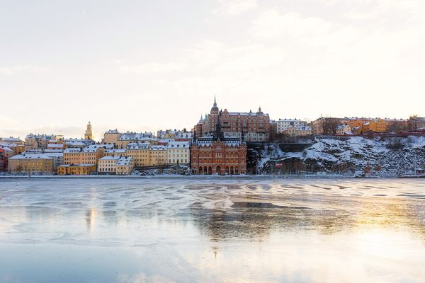
Here's Stockholm, Sweden at sunset. As you can see it very cold, the river is frozen. The photograph is interesting but lacks impact. Your challenge is to give the image impact.
To help members who struggle with visualizing the changes you need here are a few tips.
1. The sky area and the frozen river area are more or less the same size. This is a no-no, crop one or the other to draw the viewers eye to the focal point.
2. The tallest building in the old city is just off center. Another no-no if it is the point of interest. Crop one side or the other of the image to place it in a more eye catching position. Think of Rule of Thirds; The Golden Mean; Rule of Fifths; etc,. Rules are not set in concrete, place it where you thing it looks best.
3. The sky lacks detail. You may improve the sky or replace it. Your choice. The sun is setting behind the tallest buildings.
4. The ice on the river has some detail but it cold be improved. Should the ice reflect the color of the sky? Check on line to see how ice looks in the best images. Search Shutterstock.com or Google images.
5. Is the city too small? Do you need to zoom in on it?
6. Do not have two areas competing for attention. One area or object should be dominant. Everything else serves to aid impact.
Have at it any way you want. We need an image with IMPACT or the WOW factor.
PLEASE do not comment until you have posted your interpretation of the image below.
No RAW file. The .png file will be fine.
Feb 13, 2018 14:59:31 #
Jim-Pops wrote:
Agree the bird does look out of focus/soft. The problem is the colors and edges are soft on the real image. Just went over and looked at it again and I am not sure how it was made. I think the way to fix the problem is to add blur to the branch or all the base picture less the rain. I think I will give that a try. Then the bird should look more in focus.
Just gave the background a 6 pt radial blur and it helped. Thanks for looking Shakey. Appreciate your opinion.
Just gave the background a 6 pt radial blur and it helped. Thanks for looking Shakey. Appreciate your opinion.
Thanks for your explanation, Jim, that should look good.
Feb 13, 2018 10:19:48 #
Jim-Pops wrote:
This is a Ceramic bird we have that I decided to m... (show quote)

It's an
Jim. The out of bounds works well. The rain is different, a good creative thinking exercise. I'm nit-picking now. The branch is sharper than the bird. The bird is too soft. A photo stack of the bird would cure that. Feb 12, 2018 15:01:47 #
Tatia wrote:
Yes Shakey, Luminar has tools and plenty of adjustments. Is this version more to what you are looking for?
That is pretty close, Tatia. The image lacks contrast. Add a little more contrast (Brightness and Contrast adjustment tool) and/or Exposure adjustment tool. You will see a significant difference with either or both, if you need to push it further. Having done that you may need to brighten the street lights area without changing the rest of the image. Make a selection around it with a feathering of 35 to get a smooth blend.
Feb 11, 2018 18:56:36 #
Tatia wrote:
Thank you Shakey for the generous 5 thumbs. I did have an idea that you would comment on the lack of WOW as you call it. I'm happy the rest is OK. I've noticed that most of the people here use PhotoShop or Lightroom so there explanations on there workflow doesn't help all that much, but I'll get by. I'm using Luminar and I like it.
Tatia, I have not used Luminar but I'll take a look. I hope it has a selection of tools and adjustments. If it does you'll get by for sure. Don't be concerned about Photoshop or Lightroom, members use all kinds of editing programs. I use GIMP and Affinity Photo, GIMP may be old school but I get by