Posts for: Herbie1924
Dec 19, 2022 15:40:05 #
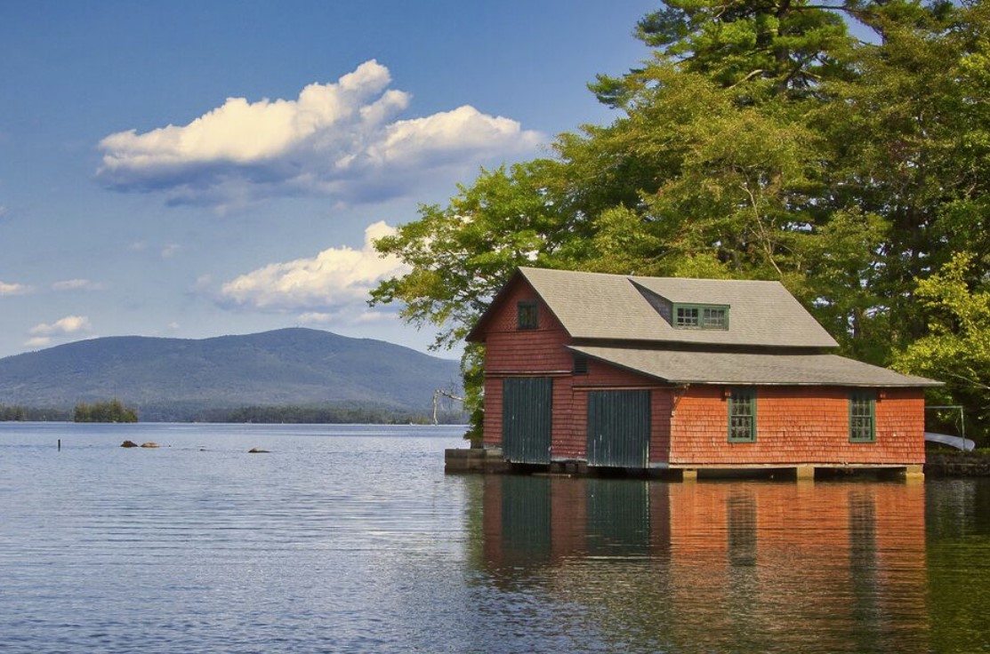
The next time you desire contest selection advice, it's suggested that you confine your request to photographers that have won medals & HM awards in contests & have judged a variety of different categories.- otherwise, you are better off making your own selections. Although you have a lot of good pics, you need to pay attention to cropping to improve composition by deleting nagative space. if you have a front view pic of the cabin, select the door & left window area for competition entry - it would also make a good entry for the Kentucky Parks Calendar Contest.
Dec 19, 2022 11:31:55 #
Being a former international exhibition entrant & judging panel member in this field, here are my picks -
Portraits: #1 with some cropping off left side & top.
Creative - #3, although Historical #1 would make excellent entry - if local or area judge has ever worked in this
field to properly evaluate such subject matter.
Fauna: #1
Historical: #1
Would have liked to have seen your two selections.
Portraits: #1 with some cropping off left side & top.
Creative - #3, although Historical #1 would make excellent entry - if local or area judge has ever worked in this
field to properly evaluate such subject matter.
Fauna: #1
Historical: #1
Would have liked to have seen your two selections.
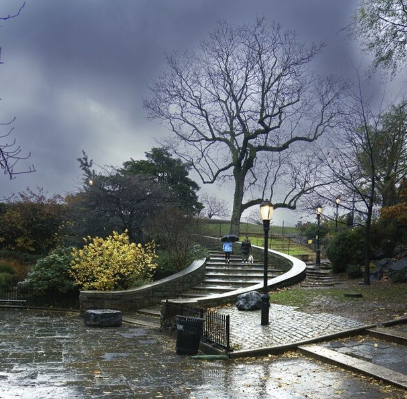
Dec 13, 2022 07:37:32 #
The suggested crop would better enhance picture interest by removing excess base amount.
Also, remove protruding branch left side & upper right corner & slightly darken bright wet base areas & wall section.
Also, remove protruding branch left side & upper right corner & slightly darken bright wet base areas & wall section.
Nov 27, 2022 08:40:25 #
Here 's your center of interest - the rest is negative space.
Nov 12, 2022 09:08:47 #
This cropped version would make another interesting shot of the island.

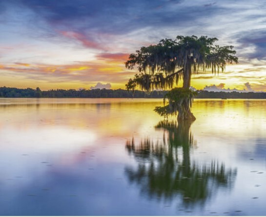
Nov 5, 2022 07:28:40 #
2 cropped versions would better emphasize the dead tree - the center of interest.

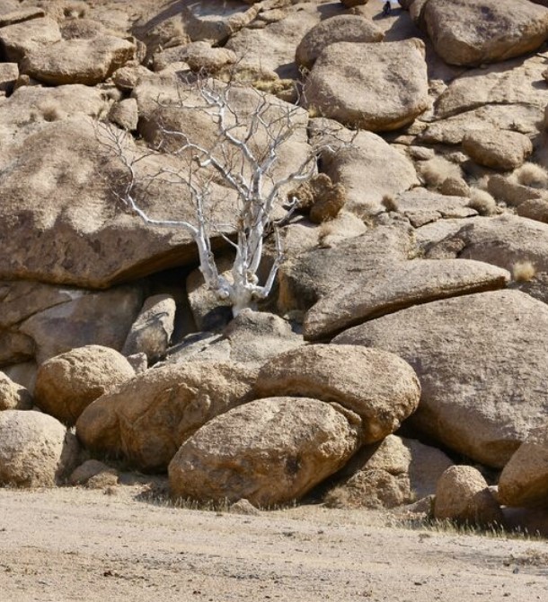
Nov 2, 2022 07:42:09 #
Composition-wise, a tighter crop js preferred to best emphasize the points of interests.

Oct 29, 2022 18:30:59 #
To the nay sayer regarding the cropped version - only this composed pic would be accepted in any photo competition.
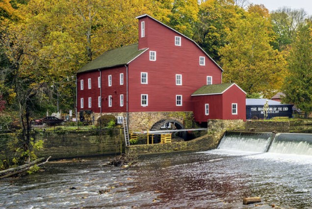
Oct 29, 2022 06:01:44 #
A cropped version - by getting rid of all the negative space, would best cover the the center of interest - the mill.
Oct 20, 2022 07:39:52 #
Sorry, couldn't tell if my cropped version of your #4 pic got attached or not.
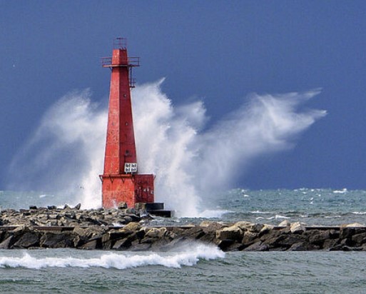
Oct 20, 2022 07:34:09 #
#4 - with a tighter crop would produce a good calendar & competition shot. Also, get rid of the sign or at least darken it & superimpose the gull in #6 above the wave spray right side. The curling wave at the base also adds to picture value. This is a wall hanger!
Oct 13, 2022 06:22:05 #
It's suggested that the local camera club be contacted for assistance.
Oct 11, 2022 07:17:08 #
Although you could have cropped the picture to reduce much of the blank sky & water areas, it's not in sharp focus
& a little too bright. Would have preferred a different viewpoint - to the right, so that more of the tall bldgs. on the left side were included. The mass of out of focus leaf area is also a major distraction.
& a little too bright. Would have preferred a different viewpoint - to the right, so that more of the tall bldgs. on the left side were included. The mass of out of focus leaf area is also a major distraction.

Sep 17, 2022 07:35:27 #
#1 is preferred, but needs to be cropped to improve the composition - too much negative space.
Aug 15, 2022 12:18:20 #
Your idiotic response is what's expected from someone who can't accept obvious picture improvement with just
obvious needed cropping.
obvious needed cropping.