Posts for: ebrunner
Apr 27, 2024 14:46:25 #
Apr 27, 2024 08:53:46 #
NJFrank wrote:
First good to see you back. I was thinking of calling the police and putting in a missing persons report.🥴
As for the photo love the black background. There is no question on which is the main flower out of the bunch. I like the negative space on the left.
As for the photo love the black background. There is no question on which is the main flower out of the bunch. I like the negative space on the left.
No need to call the gendarmes; but thanks for the concern. I agree with you about the photo. Our club does not have any more black and white competitions this year. In the fall, though, I think it will find its way into one of our club competitions. Thanks.
Erich
Apr 27, 2024 08:42:42 #
Linda From Maine wrote:
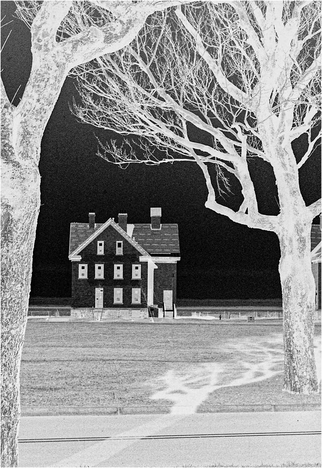
The negative image is spectacular. Deep black sky, spooky house with spookier windows, framed by bare-limbed trees, the scene further accented by an otherworldly shadow...all work wonderfully together to produce a high-impact creative edit.
I was originally drawn to the contrasts. Hence the title. I can, however, see your point about the spooky aspect. I also really like the shadow. Thanks for your comments. Much appreciated.
Erich
Apr 27, 2024 08:40:52 #
William wrote:
the darkroom view
good perspective@
good perspective@
it is a nice little trick that Photoshop allows us to use. I use the technique a lot and with the right photo, it can be striking.
Erich
Apr 27, 2024 08:39:44 #
BassmanBruce wrote:
It looked very familiar to me.
At any rate, I did like the first photo from this area, but this presentation has a very unique draw.
At any rate, I did like the first photo from this area, but this presentation has a very unique draw.
agreed.
Erich
Apr 27, 2024 08:38:52 #
jaymatt wrote:
I like it, Erich! Welcome back.
Thank you...on both counts. It is fun to be back.
Erich
Apr 27, 2024 08:38:10 #
Apr 27, 2024 08:37:44 #
Linda From Maine wrote:
The textures, composition and contrast make this highly attractive and pleasurable to view.
Re the "creative PP" section Digital Artistry, Carol and I have decided to exit the managment end. Too frustrating trying to make everyone happy, given the constantly shifting winds.
Playing is a lot more fun than managing
Re the "creative PP" section Digital Artistry, Carol and I have decided to exit the managment end. Too frustrating trying to make everyone happy, given the constantly shifting winds.
Playing is a lot more fun than managing
I think you are right to step back from Digital Artistry if it is becoming frustrating. I was lucky in FYC to find Jim willing to take over the "My Image Your View" challenge each week. For me it was becoming tedious and I needed to step back and let someone take over the challenge. I can totally understand your decision.
Erich
Apr 27, 2024 08:33:11 #
Linda From Maine wrote:
The textures, composition and contrast make this highly attractive and pleasurable to view.
Re the "creative PP" section Digital Artistry, Carol and I have decided to exit the managment end. Too frustrating trying to make everyone happy, given the constantly shifting winds.
Playing is a lot more fun than managing
Re the "creative PP" section Digital Artistry, Carol and I have decided to exit the managment end. Too frustrating trying to make everyone happy, given the constantly shifting winds.
Playing is a lot more fun than managing
Also a good point. The fact that it fades to "out of focus" is a positive element for me. A judge might see this differently. The front flower, which is the largest, is in focus and you can really see the details. Then, as it loses focus, the background elements become more about the shapes rather than details. If I had done this with a digital camera I would have been tempted to focus stack the image to make it sharp front to back. I wonder which version I would prefer?
Erich
Apr 27, 2024 08:29:46 #
R.G. wrote:
It's OK. You're among friends. You won't be judged (much) .
For flowers that look like sculptures, B&W is perfect. We can catch up with the colour versions whenever....
.For flowers that look like sculptures, B&W is perfect. We can catch up with the colour versions whenever....
That is a very good point. If the composition emphases the shapes of a flower (tulips were well here) rather than a splash of color dominating the frame, then black and white is, for me, a good choice. Thanks for the input.
Erich
Apr 27, 2024 08:26:52 #
I've been trying for a while now to get to grips with minimalism. I entered a photo a few months ago and I was told by a judge that I had a photo, even though it hat "minimal" in the title, was just too much negative space. I don't want to hijack your thread, so I won't post it unless you want me to.
Your photo strikes me as a bit abstract. I'm not sure what I'm looking at. The glass or plastic element at the top looks like an insulator you might see on an outside electrical fixture like a transformer. The colors are eye popping and extremely vivid. I love that about this photo. The contrast between the bright yellow then the warmer reds and the very deep blue is really nice. To make a suggestion about cropping, I viewed it cropped from below so that it was cut off where the red bars make a "T". Then I cropped from right to make the frame a square. I liked how that looked. Having said that, I also really like those red bars in the original. Tough call.
Erich
Apr 26, 2024 21:03:48 #
I don't think I have posted this exact house before. There are several houses in this section of the fort that look pretty much the same. I know I have posted photos from this location before; but this is a fairly recent photo from March. If I did use this photo, though, I don't believe I posted it as a negative image which I think works pretty well. Thank you for taking a look and commenting.
Erich
Erich
Apr 26, 2024 20:28:04 #
luvmypets wrote:
Nice!! Love the composition and that it's B&W!!
Dodie
Dodie
Black and white can sometimes really work well with flowers. I think it works well in this image. Glad you agree. Thanks.
Erich
Apr 26, 2024 20:27:06 #
BassmanBruce wrote:
Glad to see you post again. 
It’s a very nice image.
It’s a very nice image.
thank you. Glad you liked it.
Erich
Apr 26, 2024 20:16:03 #
At the end of the New Jersey "Shore" is a narrow spit of land that juts out into the lower part of New York Harbor. At the end of that peninsula is Fort Hancock which used to be a missile base. This is one of the officer's houses. Most of them are in really poor shape these days; but this one is still basically intact. Mamiya Sekor SLR with a Rikenon 50mm lens Kentmere 100 film converted to a negative image in Photoshop.
Erich
Erich