Posts for: Snap Shot
Sep 12, 2019 15:22:46 #
Sylvias wrote:
#1 for me today Bill especially like the composition and the colours. Lovely set. 

Thanks so much Sylvia for commenting and your vote! Always appreciated!
Sep 12, 2019 14:05:23 #
crafterwantabe wrote:
I really like the colors of #1.
#2 pretty
#3. Beautiful.
I think today’s pick. Is #1
#2 pretty
#3. Beautiful.
I think today’s pick. Is #1
Thanks for the helpful comments and votes Crafter! Much appreciated!
Sep 12, 2019 14:00:48 #
Fotoartist wrote:
All nice.
Thank you Fotoartist! Glad you looked in!
Sep 12, 2019 13:59:50 #
Earnest Botello wrote:
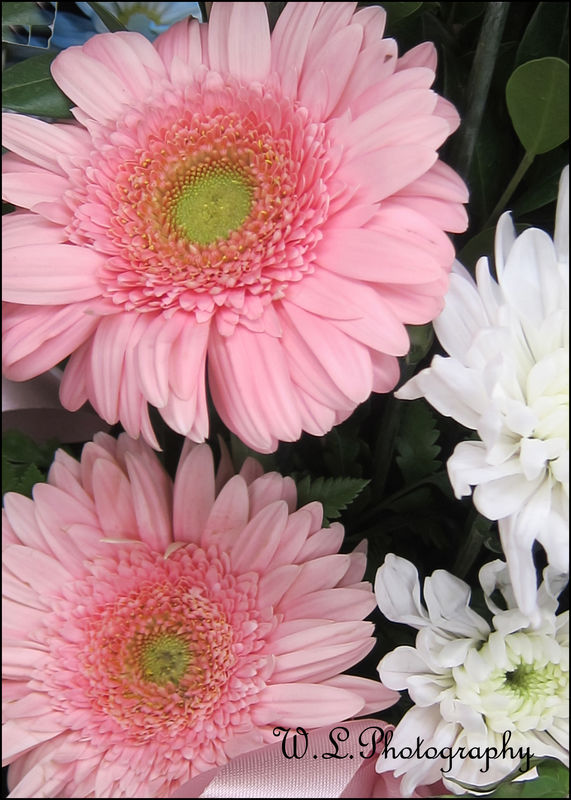
#3 for me, Bill.
Thanks for the vote Earnest! Always appreciated!
Sep 12, 2019 13:58:59 #
randave2001 wrote:
Very nice Bill.
Thank you Dave! Always look forward to your replies!
Sep 12, 2019 13:58:04 #
Sep 12, 2019 13:56:24 #
Carolina Wings wrote:
Lovely set
Thanks so much Jan! Much appreciated!
Sep 12, 2019 09:19:18 #
roder10 wrote:
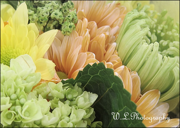
Love the sunflower, Bill
Thanks for voting Rowedean! Always appreciated!
Sep 12, 2019 09:17:10 #
photophile wrote:
I like 2 and 3.
Thanks for the votes Karin! Much appreciated!
Sep 12, 2019 09:16:21 #
Tazzy wrote:
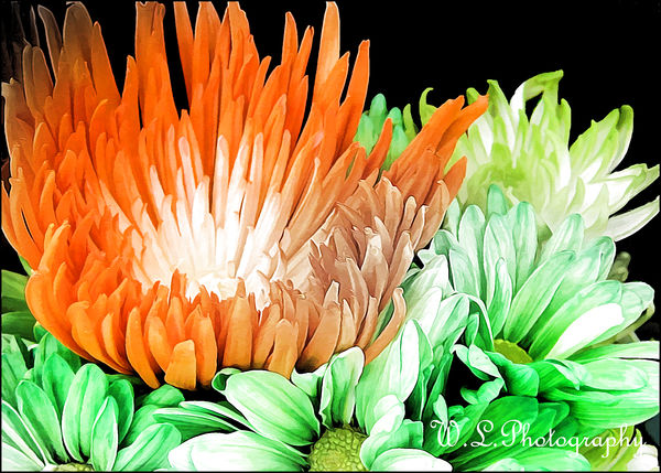
All are nice but love the last one. Color & composition appeal to me
Thanks for voting and commenting Tazzy! Much appreciated!
Sep 12, 2019 06:22:15 #
dpullum wrote:
Photos #2 & #3 are very good and pleasant colo... (show quote)
Thanks for the thoughtful critique Don! Always appreciated!
i screwed up and posted the wrong photos!
Sep 12, 2019 06:02:00 #
CLF wrote:
Bill, another great set and DDLs resulted with number two being my favorite for no reason in particular.
Greg
Greg
Thanks so much for commenting and your vote Greg! Always helpful and appreciated!
Sep 12, 2019 06:00:01 #
Sep 12, 2019 00:29:38 #
Annie-Get-Your-Gun wrote:
Beautiful. Yes, that's what I said - BEAUTIFUL! Thank you for showing your BEAUTIFUL work, Snap Shot.
Thank you for your kind replies and encouraging support Annie-Get-Your-Gun! Very much appreciated!
Sep 11, 2019 19:27:01 #
Sylvias wrote:
Excellent set of lovely flowers,colours and pp.Bill. Difficult choice today. #3 it is.
Thanks for your thoughtful commenting and your vote Sylvia! Always appreciated!