Posts for: abc1234
Sep 11, 2011 20:00:07 #
Toni, save your time from Photoshop. It is too hard to learn, has too many features, and lacks some of simpler yet powerful tools. Since I only use Adobe Bridge for the initial edits, I am unfamiliar with other simpler programs that are specific for photography. You want one that "thinks" like a photographer. I can recommend Corel Photo-Paint because it has many of Photoshop features and is much easier to learn. I do not remember what camera specific tools it has.
Bottom line is that if you want to do better work, then you have to use a program.
Good luck.
Bottom line is that if you want to do better work, then you have to use a program.
Good luck.
Sep 11, 2011 11:12:24 #
In the days of black and white film, I used various colored filters. Today, in the era of digital photography, I use only one: polarizer.
If the day is not bright and sunny and you are not shooting so the sun is about parallel to the front of the lens, leave the polarizer off. Otherwise, it can be a great help in darkening the sky and increasing apparent foreground contrast. However, you can still get this later with your software.
The only other time it works is to reduce reflections, inside or out.
To complicate matters, the filter makers have come out with polarizers for every day of the week now.
Good luck.
Sep 11, 2011 10:53:46 #
Regina Berryman wrote:
I Don't know if it is my camera or me but having trouble making photos "pop" in overcast conditions. Very fustrating:(
Depending upon which camera you have, you may or may not be able to improve the picture in the camera. Rather than take a lot of time fiddling with camera settings, I prefer to fix things up later with software. Also part of my 40+ years in the darkroom. Unless you want to be a purist or not invest the time and money, be glad that software can take an ordinary picture and make it very much better.
Pictureman did just that by bringing out color and detail. You might also try increasing the saturation and sharpness a bit.
Good luck.
Sep 11, 2011 10:43:17 #
These are good examples of what you get in your camera is only the beginning. I would pass on the flower. The wilted ones detract from the main one. By time you fix up the picture, you can probably find others that are better. Or just wait for next summer.
The other two have great potential. I would strengthen the contrasts in the butterfly a bit. It could also use a little lightening and perhaps sharpening. Then, it will really pop more from the background. I agree with bobmielke about the green stalk but think he cropped this too tightly. However, he is right in getting rid of the unwanted material in the lower right.
As for the bird, the same comments apply here. You have two problems. The distractions at the bottom and behind the bird. That is great how you captured the bird in flight. Cropping may be difficult because it might wind up too tight. I would darken the background and add a little negative vignette. That will make the bird pop. A little sharpening and color/contrast manipulation should increase the detail on the bird and make it pop more from the background.
On the other hand, you might want to keep the background as is. This is where science becomes art and anyone can interpret your pictures in many different and valid ways. It is all a matter of taste.
As you see, taking the picture is just the beginning. In addition to learning the camera, you have to learn a program for improving and cataloging the images. I use Adobe Bridge and then Photoshop. However, I am sure many other programs will work just as well.
Good luck.
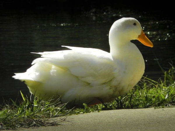
Sep 10, 2011 06:44:28 #
This is a fun picture with a lot of potential. I like strong colors and contrasts. In this case, I like the blinding white against the dark background. Everyone will have her or his own take on what to do with the picture. Here is mine.
I use Adobe Bridge for making coarse changes. I used the gradient tool (exposure, brightness, clarity, and sharpness) to tone down the background, upper right corner and foreground. To emphasize the duck further, I added a little negative vignetting. Finally, a little tweaking with the tone curve to improve the duck. I am not happy with the foreground or the color cast in duck; you could improve these in Photoshop. Finally, the cropping is a little too tight for my taste.
Two lessons here: use a decent program for tweaking and cataloging your photos and that file out of the camera is just the start of getting a good photo.
Have fun.
Sep 10, 2011 06:38:27 #