Posts for: Rich1939
Feb 8, 2016 13:14:37 #
I have many photos that I want to go back and re-shoot. I'm sure that we all have the same collections of "Someday".
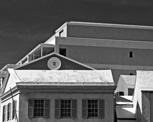
This is one of mine taken about 5 years ago with a Nikon P100. Not a bad camera but it doesn't provide raw files and the original of this needed help. I intend to be in the area this summer and I will try this again. (With better equipment)
This is one of mine taken about 5 years ago with a Nikon P100. Not a bad camera but it doesn't provide raw files and the original of this needed help. I intend to be in the area this summer and I will try this again. (With better equipment)
Feb 8, 2016 12:06:22 #
Suspicions confirmed, thank you sir!
Where I am in Pike county we have the remnants of the D&H canal system so, that looked similar.
Where I am in Pike county we have the remnants of the D&H canal system so, that looked similar.
Feb 8, 2016 10:47:17 #
bigalw wrote:
no probs, I weren't sure if that was a place that I didn't know ?? (LOL) Leicester is more or less mid way in the country, top to bottom annd left to right. I'm a biker and there's a pub near Leicester we meet at occasionally, it's name is "The Gate Hangs Well" please don't ask how it got it's name as I haven't got a clue ??? (LOL)
Looks like my kind of place! Well at least it would have 'back in the day'
Feb 8, 2016 09:57:09 #
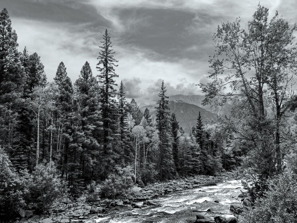
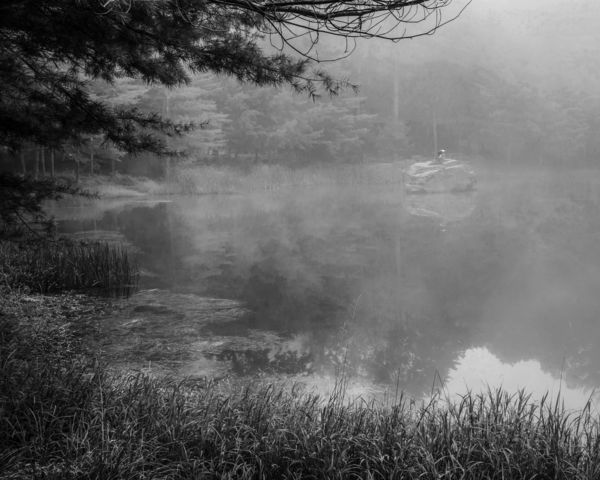
If I may, where along the Delaware was that taken? It looks like it once was used as part of a canal (tow path) or had a railroad along it's banks.
Feb 8, 2016 09:50:24 #
bigalw wrote:
sorry but where is Liechester(S?) or did you mean Leicester ?
I will take your local knowledge over my lack of it. I was guessing at the spelling, hence the (S?) :lol:
Feb 8, 2016 09:28:20 #
RiverNan wrote:
thank you Linda
Minnie you are the second person who suggested blue...and as I already made it but did not like it as much two recommendations must be considered so Ill show you and hope to hear your thoughts.
McVeed...I couldn't ESCAPE the idea that this image was more of a Canalscape then a Landscape. What drew me to it were the sycamores that hung over the canal white in the right light, which I was actually a bit to early for.
I feel that the blue tint needs to be subtle to give a hint of "cold". In your photo it is too strong and approaches being colorized rather than being tinted.
Feb 8, 2016 09:23:56 #
CatMarley wrote:
Not really. You have to believe it is the best opinion, otherwise you wouldn't hold it! We are so damned Politically correct these days, nobody is willing to say, "You're wrong, and I'm right!".
Isn't that the truth! Even when all the facts are are your side, PC insists that you play nice and give the other side the benefit of the doubt.
Feb 8, 2016 09:20:57 #
Mimi123 wrote:
Cannot find anything about release priority.... what would it be under in manual?
For the D600; in the custom settings menu both A1 and A2 should be set to release.
Feb 8, 2016 08:45:06 #
Cockney?? LOL I grew up in NJ and spent a good portion of my life in the south and in the west. Where did I pick up Cockney? Maybe it's in the genes me grandfather was Liechester(S?) England
Feb 7, 2016 09:44:13 #
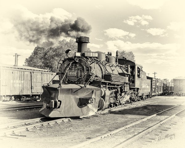
Dave Chinn wrote:
Now here is one that stands out because of the composition !!! Well done Rich.
Dave
Dave
Thank you Dave! This one also felt like it should be in B&W because of the age of the equipment. (I had posted this B4 on UHH)
Feb 7, 2016 08:25:38 #
Dave Chinn wrote:
While I agree with you I'll have to say, anymore, when I see that a conversation is turning into an argument, my mind pushes the ignore button.
Dave
Dave
Dave, I agree with both you and Linda as I find with most threads that after a certain point I'm not learning anything and I 'unwatch' after that point. (This thread is at 18 pages and I'm still watching, something good must be going on here.) :)
Feb 6, 2016 15:10:51 #
minniev wrote:
Thank you for a varied set, all converted well. So... (show quote)
Thank you for your input. I appreciate your advice and will play around with the images a bit.
Feb 6, 2016 14:07:08 #
Pixelmaster
All I can say is, "I wish I had seen that!" some subjects do talk to you don't they?
All I can say is, "I wish I had seen that!" some subjects do talk to you don't they?
Feb 6, 2016 13:44:46 #
This because of the subject just screamed black and white
Feb 6, 2016 13:42:58 #
Linda None of these were shot with the intention of using "gray scale". All of them were lacking something in color but were telling me that there was a decent image in there somewhere.