Posts for: magnetoman
Jul 17, 2018 03:00:35 #
Heather Iles wrote:
Hi Dave,
I do like most of the photo, especially the Sunset. It is a cracker, but the pony seems a bit big. Aren't the ponies more stocky with big rumps? You shouldn't have said anything and we wouldn't have known.
I do like most of the photo, especially the Sunset. It is a cracker, but the pony seems a bit big. Aren't the ponies more stocky with big rumps? You shouldn't have said anything and we wouldn't have known.
Hello Heather, good to hear from you. Hmmm, it’s the size of the pony that gives the impact for me, but it may be a bit too unconventional. As for form, I think the Welsh is a tad smaller in stature than the Dartmoor - and are possibly more like an Exmoor? You would know that better than me. Without all three stood together I couldn’t be sure what I was looking at. Of course, I could do a composite that brings them all together, that would sort things out! Thanks for looking in, it’s apprecisted.
Jul 17, 2018 02:51:23 #
Horseart wrote:
I am not a qualified critic of photography but as ... (show quote)
As an artist you are several steps ahead of a photographer, and I often envy you that. You see, you have total freedom to create any image you can imagine, in any composition, light, colour and so on. I seldom take shots with an actual composite in mind, sometimes but seldom. Mostly I shoot for my own stock then, when the mood takes me I run through them to find something that might fit the bill for my latest idea. Hence, I cannot turn the horse round as much as I may wish. Flipping is very limited - most people struggle to imagine a flipped image accurately and think far more will happen than actually does! As it happens the pony is flipped from original in this case. As for things that face out of frame, yes I agree convention says not, but rules must be broken at times and here, for me, it works fine. I understand it will jar with some though, and accept that.
Your critique is very much appreciated and thought provoking, many thanks for joining-in.
Jul 17, 2018 02:39:32 #
rmalarz wrote:
I really like this one. The lighting / shading is exceptional.
--Bob
--Bob
Thank you Bob, glad you like it.
Jul 17, 2018 02:38:30 #
Dave Chinn wrote:
Dave, I agree with Bob (rlaugh) "Any time we ... (show quote)
Well it’s always down to the viewer for sure Dave, and this image has fallen all ways - some like, some not so much, some forgive its inaccuracies and some would prefer a pro job. All of which I accept willingly. Even some of the Old Masters took liberties at times and put it down to ‘artist’s licence’. I don’t think we can get away with quite so much of that as photographers, even when compositing. Folk are used to seeing superb pro photos in every publication they pick up, so why shouldn’t they expect perfection from us mere amateurs? Keeps us striving, which is a good thing. Thanks for your thoughts on it, they are valued.
Jul 16, 2018 14:33:44 #
cambriaman wrote:
Great image! I wouldn't try to change it. (Sorry, Linda from Maine).
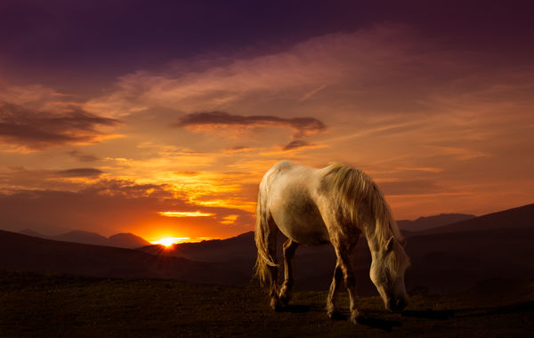
Thanks cambriaman. Have you had a look at the revision about half way down page 1? It does sort some of the points raised (but I still like the original).
Jul 16, 2018 09:38:34 #
rlaugh wrote:
Any time we do composites or extensive PP work, our success or failure is greatly determined by the target viewer! While your first post is very fine work, and is exceptional for most viewers, it has some flaws that keen eyed talented people, as we have here can spot! Your revised work is much more spot on and very very good!! Keep em coming!!
Yes, FYC is a great place for keeping you on your toes, and that’s how it should be. Glad you approve of the revision, although I still like it big! Thanks for commenting rlaugh.
Jul 15, 2018 15:51:40 #
Uuglypher wrote:
Hi, Dave,I like your revision a lot!
In keeping with Ron’s observation I think the pony’s topline ought be as dark as the top of its neck... but to suggest further alterations would be egregious picking of the tiniest of nits.
It’s a beautifully conceptualized image very well executed. Terrific impact!
Dave
In keeping with Ron’s observation I think the pony’s topline ought be as dark as the top of its neck... but to suggest further alterations would be egregious picking of the tiniest of nits.
It’s a beautifully conceptualized image very well executed. Terrific impact!
Dave
Thanks Dave, glad you approve. Not sure I shall do much more with it now, it’s not one for printing, but I do agree it does require some more considered work on the light source.
Jul 15, 2018 15:48:09 #
artBob wrote:
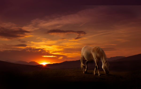
The suggestions are definitely possibilities, but I like the nearness of the pony, taking away from just another scenic. I also looked closely at the lightfall on the pony, saw potential problems, realized light also could be coming from clouds, and thought it okay.
I like the feel of the shot, and don't see any deal-breakers in technique or composition.
I like the feel of the shot, and don't see any deal-breakers in technique or composition.
Bob, that nearness is due to the sunset shot. Too dark now to see, but in the original the foreground is short and then drops away abruptly. The attraction, apart from the sunset, was the viewpoint with layers of receding hills. So, I simply set the pony close to the front as there wasn’t much ground to plonk him on. In the second version I’ve extended the ground backwards using the grass the pony was standing on. Keeping things dark hides a lot of sins! I went with you when considering the light problem and relied on light from the clouds. Maybe it’s helped a little to reduce the pony, I’m not sure, but I do like him large.
Many thanks for taking the time to consider it, and the comments.
Dave.
Jul 15, 2018 15:39:19 #
Linda From Maine wrote:
Very nice! Regarding R.G.'s mention of "light on the pony that can't be accounted for," I wonder if the key is to decide early on whether to go as realistic as possible, or to make it more obvious that intent was a more fanciful result.
That question seems to come up a lot in my mind now that I've been made aware - over the past year - that often my playful pp wasn't taken far enough. Folks like Dave Chinn and rborud make it all seem effortless!
That question seems to come up a lot in my mind now that I've been made aware - over the past year - that often my playful pp wasn't taken far enough. Folks like Dave Chinn and rborud make it all seem effortless!
Not a problem Linda, I’m just getting to know the standards you set!
This one was actually a spur of the moment thing whilst perusing some holiday shots. Not too much thought as to where it was going, but I shouldn’t admit that!
Jul 15, 2018 13:05:58 #
magnetoman wrote:
Not until Iâd finished it Linda. Then just as I was posting it, I thought âLindaâs going to suggest adding a bit more foreground - not far off was I? I think your right, reducing the size of the pony will probably sort the problem out. Iâll give it a go a bit later. Thanks for the shove, itâs always appreciated.
Here's a quick revision Linda, which does address some of the issues I think. I know its not spot-on, but Ill call it practice!
Jul 15, 2018 11:34:13 #
R.G. wrote:
The pony has light on it that can't be accounted for by the sun. If the sun was higher and more to the left it would probably look OK. The composition's a bit cramped, but it does create a feeling of intimacy with the subject. And the horizon's a bit low in the frame. Adding more foreground would solve both of those issues.
Thought somebody would pick-up on the light direction RG. It bothered me from the outset but I convinced myself I’d get away with it. Not so! I reckon Linda’s suggestion is the way forward regarding space. Not convinced the light problem can be overcome in a reasonable time scale versus value of image, if you see what I mean. I do have other ideas for the pony though.
Jul 15, 2018 11:30:16 #
Linda From Maine wrote:
The nearness of the horse to the edge of the frame and its size give me a bit of unease, and don't promote the feeling of serenity I'd like with this sunset. I'm curious if you tried a smaller pony? 
Not until I’d finished it Linda. Then just as I was posting it, I thought ‘Linda’s going to suggest adding a bit more foreground - not far off was I? I think your right, reducing the size of the pony will probably sort the problem out. I’ll give it a go a bit later. Thanks for the shove, it’s always appreciated.
Jul 15, 2018 11:27:10 #
lamiaceae wrote:
Well, I really like that image. I can use my own ... (show quote)
 The elements go together fine to me. I have no idea where it could be. Piedmont to a grassy bluff overlooking the Mojave Desert (say if it were in the USA somewhere). But as far as fussing over locale and specific breeds, that is way too anal-retentive for even me, a Biologist who might find a zebra out of place in Wales, but any pony? Being in California, USA, we have all sorts of breeds of horses and ponies from all over the world, so we would not care where a Welsh or Dartmoor pony was photographed.


I don’t think anyone will be too bothered either. Glad you enjoyed it, thanks for commenting.
Jul 15, 2018 04:41:08 #
A sort of 'mixed metaphors' image! The sunset it taken above Blaenau Ffestiniog and I felt needed something to set it off. The pony was under Haytor on Dartmoor. Whilst I like both Welsh and Dartmoor ponies, whether anyone could tell the elements of the scene don't really go together, I have no idea. Do you think they work? Any critique always welcome.
Jul 14, 2018 16:40:00 #
UTMike wrote:
Thanks for sharing this tour of a remote venue most of us will never see.
Thanks for looking Mike, glad it caught your interest. There may be more to come in October.