Posts for: Frank2013
Sep 2, 2017 18:06:32 #
Nalu wrote:
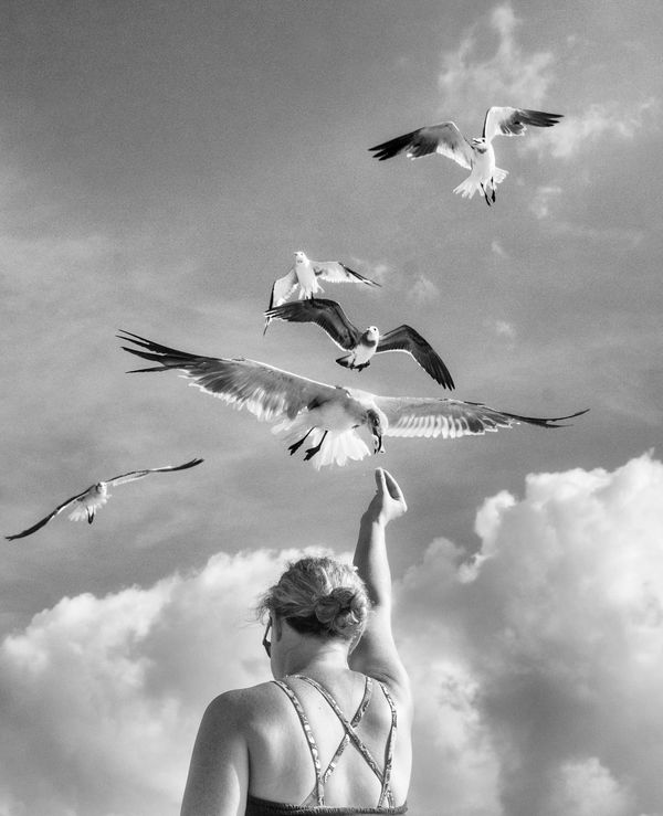
Thank you for looking and giving me you thoughts Nalu, it is appreciated....I like the image. If I were trying to get creative with it, I would consider loosing the other birds in that they are distracting to me and not having having them there would allow more focus on the boy and the gull and his experience with the bird. I like the B&W presentation, and a little noise to me is not an issue, probably actually helps.
Anyway, nice photo and have jun with it. I can see it on the wall of a beach house.
Anyway, nice photo and have jun with it. I can see it on the wall of a beach house.
Uuglypher wrote:
Thank you Dave...you mean similar to this..Hi, Frank, a well-staged shot...suggests it could have been repeated to get a better perspective onnthe gull's wing-spread.
Dave
Dave
Sep 2, 2017 08:12:47 #
ebrunner wrote:
Thank you Erich for comment....When I saw this in another forum, it looked to me like it had lots of noise grain. Here it seems much cleaner. That seems a bit strange to me; but I guess it is to be expected that each site is going to be a bit different. So, pay no attention to my comments on the other forum. This is spot on and really impressive.
erich
erich
chaman wrote:
To get the result I was after...looking at the exif you won't find auto, it was shot in manual, thanks for looking..Why the increased ISO in a scene with that much of light available? My guess....AUTO ISO.
repleo wrote:
Thank you for the compliment, and your time to give it...Excellent shot
Sep 1, 2017 20:53:38 #
Check out People Photography section of our forum.
Sep 1, 2017 19:34:01 #
Much better rendition Mr. Chinn...congratulations.
Aug 31, 2017 22:30:51 #
Nominate and or vote for August.....got to "The Gallery Project"
Aug 30, 2017 11:49:17 #

Aug 30, 2017 08:58:04 #
Linda2 wrote:
Thank you for comment Linda2, interesting about your photo..I have another version with less dramatic sky and space to the left as most mention..still on the fence about which I prefer...Just my 2 cents worth-love the image! Reminds me of one I have of myself and my Daddy over 60 years ago that I cherish now. Normally I would agree about leaving walking space to the left but I really don't mind the lack of it on this image- maybe because the shadows help balance it out.
Check out Infrared Photography section of our forum.
Aug 29, 2017 17:30:39 #
srt101fan wrote:
Thank you for the compliment and welcome to the section...Wonderful image! Reminds me of Eugene Smith's "The Walk to Paradise Garden".
AzPicLady wrote:
I am glad you enjoyed it and thank you for comment....This is a very striking image. I love the emotions it depicts - the story it tells. Not sure about the clouds. I probably wouldn't have thought about them if someone hadn't mentioned them. The lighting is very good, and the tones used are most appropriate. I'd say, "well done!"
ebrunner wrote:
Thank you Erich a re-work is in progress....I looked at the title and clicked the thread open ... (show quote)
Aug 28, 2017 17:42:49 #
Great documentation R.G., your consistency of processing always amazes me......
Aug 28, 2017 17:41:02 #
Aug 28, 2017 10:55:18 #
I think it's well done Pops...for me it seems a touch off balance light wise with the right darker thread...
Check out Street Photography section of our forum.
Aug 28, 2017 10:52:06 #
I like one and two Erich, three has potential but I think a fresh start might be in order. As presented #1 is the winner for me...possibly cropping up from the bottom a bit might improve..#2 could easily win me over, I like the soft look but feel it's just a tad too soft, there are dark areas around the tree tops I find distracting and the light area on the background hillside right of the trees seems a touch bluish or off color...I am with Mr. Chinn on presenting what I want rather than what I actually saw...
Aug 28, 2017 09:10:24 #
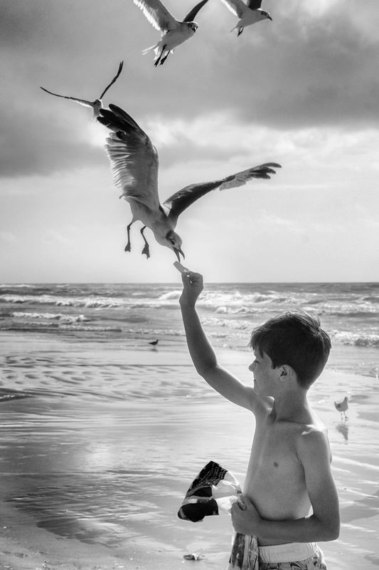
NJFrank wrote:
Thanks NJ...understoodFrank I really like the feel of this shot. Big brother with his reassuring hand on his little sisters shoulders. "It's ok don't be afraid of the waves."
What I think distracts from the shot are the clouds. They caught my eyes and I could not look away from them. I know it has already been pointed out but they don't look real to me.
What I think distracts from the shot are the clouds. They caught my eyes and I could not look away from them. I know it has already been pointed out but they don't look real to me.
Aug 28, 2017 08:24:05 #
StevenG wrote:
Cousins...thank you for comment and good to see you in the section again...a similar image of brother and sister can be found here..http://www.uglyhedgehog.com/t-342537-1.html#5748676I think this is a great picture! The boy's expression is priceless and his tender, loving feeling toward the girl (his sister?) is just so evident. You captured a beautiful moment that these kids can cherish for a lifetime.
Steve
Steve
Aug 28, 2017 07:57:30 #
fuminous wrote:
Thank you very much fuminous..see my reason above for framing...Agreed... a little more space on the left... tonality is good, subject matter, excellent... well done..
Check out Panorama section of our forum.