Mini Theme: Roofscapes
Mar 1, 2019 08:52:47 #
Tomcat5133
Loc: Gladwyne PA
As for the comment on steps. In Italy's hill towns we say many older women
gingerly climbing the steps. They looked old but had great energy and streghth.
gingerly climbing the steps. They looked old but had great energy and streghth.
Mar 1, 2019 09:32:07 #

My goodness!! I never anticipated so much interest in these. Thank you all so much for your comments. I will have to go through my archives - I'm sure I have many more.
BTW - Tom Daniels - no drone shots - just convenient vantage points. PeterCBrant - thanks for the suggestions. I'll give them a try. I have another one of Cairo somewhere showing a sea of abandoned satellite TV dishes that I think that would work well on.
BTW - Tom Daniels - no drone shots - just convenient vantage points. PeterCBrant - thanks for the suggestions. I'll give them a try. I have another one of Cairo somewhere showing a sea of abandoned satellite TV dishes that I think that would work well on.
Mar 2, 2019 06:23:30 #

Mar 2, 2019 06:26:01 #
Mar 2, 2019 06:50:07 #

While I appreciate the documentation of all beyond #1, #1 stands alone as a masterpiece work of art. I recall a story about Richmond Broadstreet Station when being built had to import workers from Italy to do specialized work. The story teller's husband was one.
The masonry work in #1 is a work of love designed and done by masonry sculptures who loved and had pride in their work.
Thank you for sharing that image with us.
PS: Those in awe of expensive equipment being needed to do excellent photography should realize that #1 was taken with a "Sony Cyber-shot DSC-H5" 7.2 mp, 1/2.5" (5.744 x 4.308 mm) sensor.** This camera can be had refurbished at $200. As often said the photographer must be a "full-frame individual"... the camera is secondary.
**[EXIF Data]
Mar 2, 2019 07:01:33 #

Mar 2, 2019 07:23:16 #

repleo wrote:
I am always on the lookout for interesting roofscapes on my travels. One can often find interesting shapes and textures - some of these could be cubist paintings. Feel free to add your own roofscape here. Feedback always appreciated or feel free to add your own roofscape here.
I really like these.

Mar 2, 2019 08:25:20 #

repleo wrote:
I am always on the lookout for interesting roofscapes on my travels. One can often find interesting shapes and textures - some of these could be cubist paintings. Feel free to add your own roofscape here. Feedback always appreciated or feel free to add your own roofscape here.
A great study of different locales. Extremely well done, except you promised "Roofscapes" and delivered buildings. While "Roofscapes" are a parts of buildings buildings might not be parts of "Roofscapes." Try this scenario: A rooftop overlooking Manhattan on a sunny evening with a small group of people standing around listening to the Beatles play a semi-private, intimate gig. I saw that photograph just the other day, in an article titled "Roofscapes of Manhattan." There are differences.
Mar 2, 2019 09:28:13 #

repleo wrote:
I am always on the lookout for interesting roofscapes on my travels. One can often find interesting shapes and textures - some of these could be cubist paintings. Feel free to add your own roofscape here. Feedback always appreciated or feel free to add your own roofscape here.
interesting subject, great shots, and enjoyable series, repleo!

Mar 2, 2019 10:42:44 #
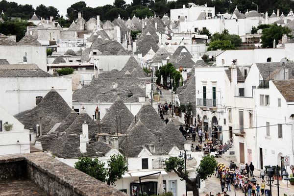
LXK0930 wrote:
Puglia, Italy
Ahh - yes. the Trulli of Alberobello. Definitely on my bucket list. Thanks for posting
Mar 2, 2019 10:42:56 #
Mar 2, 2019 10:56:14 #

Mar 2, 2019 11:08:25 #
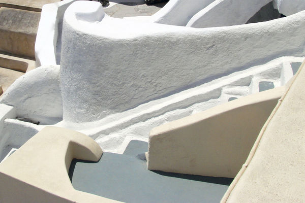
petercbrandt wrote:
Nice idea to zone in on roofs, just a suggestion: Photo#1, in f/g lower right corner, is a grey deck surrounded by beige walls, behind that a white staircase and white wall, try cropping in tighter for a graphic look. Pic#2 try a very contrasty look by making the shadows go black but keep highlight area normal. My thoughts are to simplify the images.
Peter, I think this is what you mean. I like it.
Mar 2, 2019 12:02:25 #

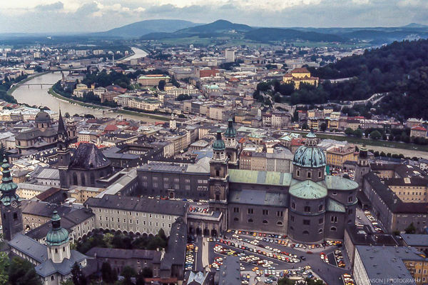
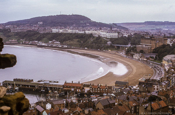
Some from my travels.
Salzburg
Scarborough
Nice
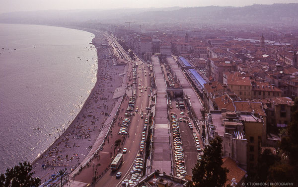
Paris
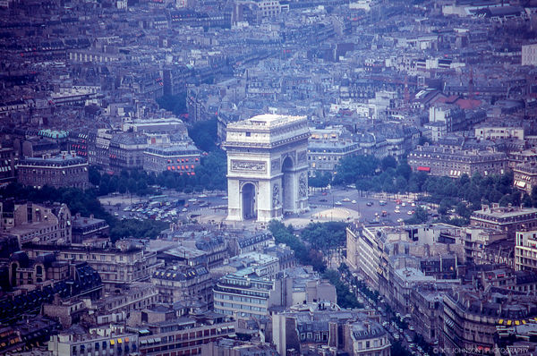
Fira, Santorini
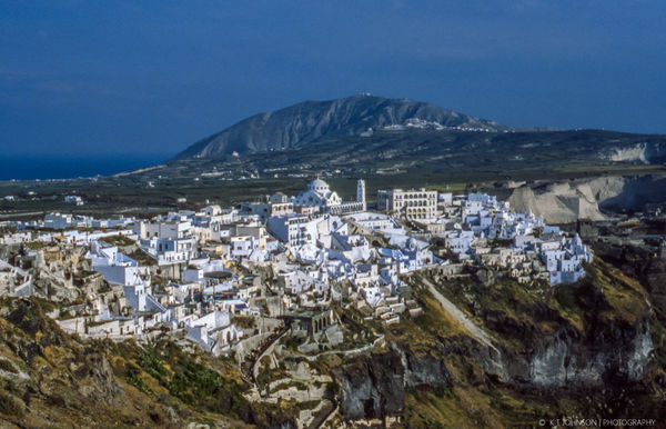
Venice
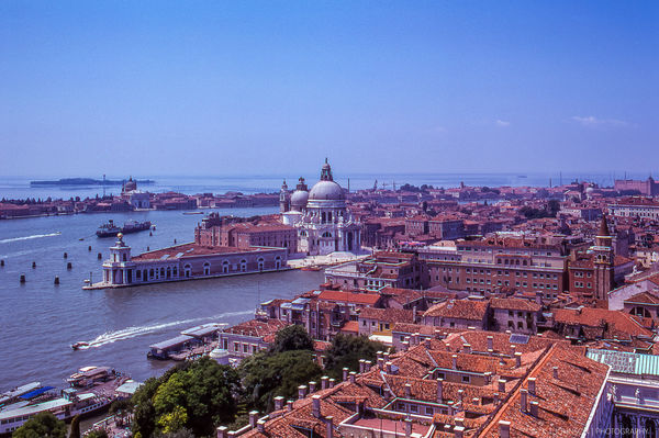
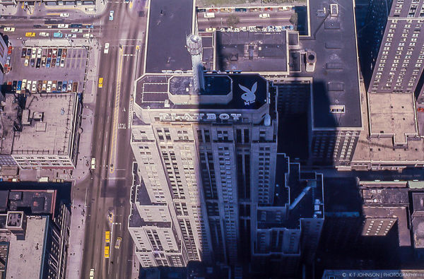
Chicago
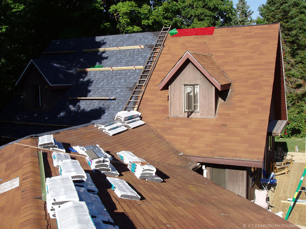
Our House
Mar 2, 2019 16:53:43 #
arperry
Loc: Miami/Florida
Such an interesting perspective, beautifully composed, I enjoyed this series a lot.
If you want to reply, then register here. Registration is free and your account is created instantly, so you can post right away.