Check out Black and White Photography section of our forum.
Fun in Post
Feb 20, 2019 12:01:30 #

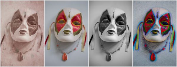
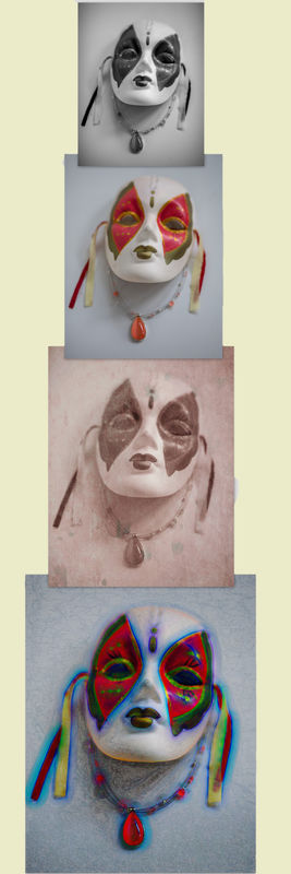
Had a little post processing fun with these on the actual photo, as well as presentation...and as I am sharing I see potential for improvement on #2.
Feb 20, 2019 12:48:25 #

#2 is a clever and eye-catching presentation. What would you like to improve on that one, Diane?
Feb 20, 2019 13:00:11 #
Linda From Maine wrote:
#2 is a clever and eye-catching presentation. What would you like to improve on that one, Diane?
i think a different background, other than plain white, might be more pleasing but it did not occur to me to try that possibility until i uploaded.
Check out Infrared Photography section of our forum.
Feb 20, 2019 13:10:36 #
EyeShootWideOpen wrote:
Ah yes. And that gives me an opportunity to link an old thread on mat colors:i think a different background, other than plain white, might be more pleasing but it did not occur to me to try that possibility until i uploaded.
https://www.uglyhedgehog.com/t-355222-1.html
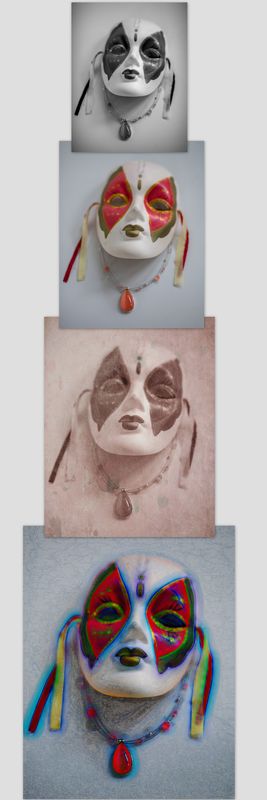
Here are two that I did before I remembered Uuglypher's topic

Feb 20, 2019 13:45:52 #
Linda From Maine wrote:
Ah yes. And that gives me an opportunity to link an old thread on mat colors:
https://www.uglyhedgehog.com/t-355222-1.html
Here are two that I did before I remembered Uuglypher's topic
https://www.uglyhedgehog.com/t-355222-1.html
Here are two that I did before I remembered Uuglypher's topic
Thank you, I will have to check that out. I think I like the red best. I often use the eye dropper and choose a color in the image, makes it quick and easy to try different colors.
The article really does a good job of showing the point! Thanks for sharing, I will give this more thought going forward.
Feb 20, 2019 14:13:52 #
EyeShootWideOpen wrote:
Glad the article fit your topic! Thank you, I will have to check that out. I think I like the red best. I often use the eye dropper and choose a color in the image, makes it quick and easy to try different colors.
The article really does a good job of showing the point! Thanks for sharing, I will give this more thought going forward.
The article really does a good job of showing the point! Thanks for sharing, I will give this more thought going forward.
I used the eye dropper and paint bucket for a single click fill - was pleased how well that worked (nice contrast to delineate). With the red I took the color from the mask. The green was a little bright, so after choosing from the mask, I opened the swatch and went with slightly more subdued.
Feb 20, 2019 14:56:19 #
Linda From Maine wrote:
Glad the article fit your topic!
I used the eye dropper and paint bucket for a single click fill - was pleased how well that worked (nice contrast to delineate). With the red I took the color from the mask. The green was a little bright, so after choosing from the mask, I opened the swatch and went with slightly more subdued.
I used the eye dropper and paint bucket for a single click fill - was pleased how well that worked (nice contrast to delineate). With the red I took the color from the mask. The green was a little bright, so after choosing from the mask, I opened the swatch and went with slightly more subdued.
Yep, I like to see all my options before I decide, makes it easy.
Check out Traditional Street and Architectural Photography section of our forum.
Feb 20, 2019 19:33:33 #
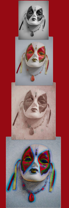
I love the second presentation also, Diane. The red background that Linda provided really sets it off well.
Feb 20, 2019 21:53:11 #
lensbaby007 wrote:
I love the second presentation also, Diane. The red background that Linda provided really sets it off well.
Thanks lensbaby. I do like the red also. I think I should have used better spacing as well to allow some red at the top and bottom. I did it on the fly, not much planning just play - next time tho.
Feb 21, 2019 00:31:53 #
EyeShootWideOpen wrote:
i think a different background, other than plain white, might be more pleasing but it did not occur to me to try that possibility until i uploaded.
One of the things I like to do when posting images to UHH,
is to change the background color to match the page color
of UHH.
To do this, use the following settings:
R=236
B=235
G=201
Tim
Feb 21, 2019 07:54:14 #
Rolk wrote:
One of the things I like to do when posting images to UHH is to change the background color to match the page color of UHH. To do this, use the following settings:
R=236
B=235
G=201
R=236
B=235
G=201
Guyserman gave an example a couple of days ago:
https://www.uglyhedgehog.com/t-579302-1.html
Tim, thanks for providing the numbers!
Check out Professional and Advanced Portraiture section of our forum.
Feb 21, 2019 08:27:08 #
Guyserman
Loc: Benton, AR
EyeShootWideOpen wrote:
Had a little post processing fun with these on the actual photo, as well as presentation...and as I am sharing I see potential for improvement on #2.
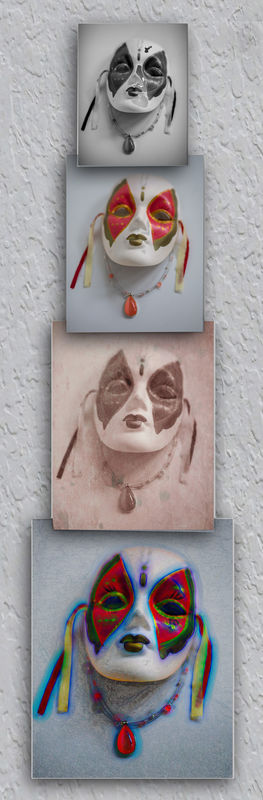
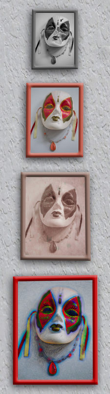
I did some dressing up on #2. Gave it a little more room at the top, bottom & right side. I put an off-white texture on the background to make it look like a sheetrock wall. I separated it into four images so I could give each one a drop shadow and make them look like they were hung individually. Hope you like it.
Guy
Feb 21, 2019 09:46:33 #
Thanks for the tip Rolk, that is a great idea. Nice work Guy, that makes me wish I had put space between the pictures but I like it.
Feb 21, 2019 10:50:18 #
Guyserman
Loc: Benton, AR
EyeShootWideOpen wrote:
Thanks for the tip Rolk, that is a great idea. Nice work Guy, that makes me wish I had put space between the pictures but I like it.
You want more space? I'll give you some space. Since I had already created a layer for each one and I had saved my PSD file it was easy. I couldn't recreate the area covered by the overlap so I put them all in simple beveled frames to cover that up. I matched the frame color to the left edge of the pendant in each one.
Guy.
Feb 21, 2019 10:53:14 #
Guyserman
Loc: Benton, AR
Guyserman wrote:
You want more space? I'll give you some space. Since I had already created a layer for each one and I had saved my PSD file it was easy. I couldn't recreate the area covered by the overlap so I put them all in simple beveled frames to cover that up. I matched the frame color to the left edge of the pendant in each one.
Guy.
Guy.
Just to be perfectly clear, what I call a simple beveled frame is actually an inner beveled stroke outline. I think I had more fun than you did.
If you want to reply, then register here. Registration is free and your account is created instantly, so you can post right away.
Check out Software and Computer Support for Photographers section of our forum.