Throw On A Filter!
Jan 25, 2019 12:20:27 #

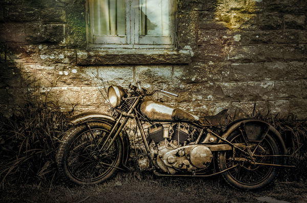
This heap is a 1936 Brough Superior, currently yours for £67,000. While it was leaning against a friends less than pristine house, it all looked rather in keeping. The sun was setting but not throwing much in the way of good light so I've added a filter or two. The main bright spots are from an accidental shutter moment last week some time which looked like it might come in useful. Hope Dave Chinn looks in - not for the pp, but the bike might get him drooling? Do feel free to comment, those that know me from FYC know I can take it on the chin.
Jan 25, 2019 13:25:36 #
magnetoman wrote:
This heap is a 1936 Brough Superior, currently you... (show quote)
There is really only one thing that sticks out with me. The house, lawn and bike are pretty much all the same color. That makes them meld together pretty much. I get that the effect was to give a kind of grunge look or an old photo effect; but I can't help think that the bike, which is more interesting to me than the house (I like bikes), should be more prominent. Love the bike and the house is a perfect backdrop for it.
Erich
Jan 25, 2019 13:51:16 #
Another winner, the house and bike complement each other, both look to need a bit of TLC a big plus is that it leans against the wall and not on its stand adding to the overall effect. Keep em coming, allways enjoy your posts.
Jan 25, 2019 14:00:28 #

Very engaging work, Dave! I have to leave in a moment, but will be back with questions and observations. If you read this in the meantime, would you want to share some of your processing steps? Many thanks.
Jan 25, 2019 14:07:49 #
ebrunner wrote:
There is really only one thing that sticks out with me. The house, lawn and bike are pretty much all the same color. That makes them meld together pretty much. I get that the effect was to give a kind of grunge look or an old photo effect; but I can't help think that the bike, which is more interesting to me than the house (I like bikes), should be more prominent. Love the bike and the house is a perfect backdrop for it.
Erich
Erich
Processed to give the ‘same colour’ effect Erich. And I accept you either like it or not. I understand your preference, but there’s supposed to be some irony here - the bike is in need of as much care as the house and yet is the most expensive make of classic bike you’re likely to stumble across in the U.K. This one is on offer as a restoration project. As an aside; It’s a Brough Superior - a make inextricably linked with Lawrence of Arabia, who lived and died just a few minutes ride from where the photo was taken. Thanks for commenting Erich, you know it’s appreciated.
Jan 25, 2019 14:09:09 #
Bigal wrote:
Another winner, the house and bike complement each other, both look to need a bit of TLC a big plus is that it leans against the wall and not on its stand adding to the overall effect. Keep em coming, allways enjoy your posts.
You’re definitely getting the intent Bigal, thanks for commenting.
Jan 25, 2019 14:17:53 #
Linda From Maine wrote:
Very engaging work, Dave! I have to leave in a moment, but will be back with questions and observations. If you read this in the meantime, would you want to share some of your processing steps? Many thanks.
Fairly simple stuff Linda. I used Lightroom to do the initial pp, bringing it to something like an HDR effect but with more contrast, then desaturated quite heavily and added split toning. Took it into Photoshop and added two or three filters (can’t remember exactly) and a layer to add some yellow to the left and blue to the right. Then back to LR for a touch of vignette. I much prefer Lr’s Vignette to Ps’, which I find can lead to problems, particularly with plain skys. I wonder if others have a preference of programme for vignettes?
Jan 25, 2019 15:29:19 #
magnetoman wrote:
You’re definitely getting the intent Bigal, thanks for commenting.
Thanks, great minds think alike, I did write a comment about him but scrubbed it not wanting to go off in a different direction. As you mentioned it I am near to Cranwell where he was in the RAF and Lincoln where the he lodged and was alleged to have written part of his book
Ps one of the best films ever, I think they turned the heating up as he was crossing the dessert to Accaba and then had the interval, increasing the sale of ice-cream

Jan 25, 2019 16:53:30 #
Bigal wrote:
Thanks, great minds think alike, I did write a com... (show quote)
I read recently that O’Toole went off to the desert three months before filming started in order to learn camel riding - he complained that they were uncontrollable and made his backside bleed! Watching some camel racing last summer, I can sympathise - they seem to take whatever line they fancy! I have a fancy to do a composite with a Brough and a camel. It may come off but don’t hold your breath.
Jan 25, 2019 17:00:24 #
magnetoman wrote:
LOL, easy for you to say, Dave Fairly simple stuff Linda...

A fascinating study with all the textures and details. I particularly like how you directed the light. Regarding vignettes, Nik Color Efex has a filter called darken/lighten center that I often use in place of a vignette. It has a lot of control as to placement of brightest area and opacity of both the dark and light portions.
Many thanks for your inspiring work!
Jan 26, 2019 10:18:04 #
I simply loved it but did find myself mildly distracted by the contrasting window. Very nice! 👍
Jan 26, 2019 12:43:51 #
47greyfox wrote:
I simply loved it but did find myself mildly distracted by the contrasting window. Very nice! 👍
Catches the eye a little too much I think? Thanks for commenting, its appreciated.
Jan 26, 2019 14:44:43 #

A classic up against a backdrop that I think fits in well with this motorcycle. Love the tones and the composition is simple but very fitting. Well done
Jan 26, 2019 15:01:48 #
NJFrank wrote:
A classic up against a backdrop that I think fits in well with this motorcycle. Love the tones and the composition is simple but very fitting. Well done
Thanks Frank, glad you approve.
Jan 27, 2019 11:57:45 #


If you want to reply, then register here. Registration is free and your account is created instantly, so you can post right away.