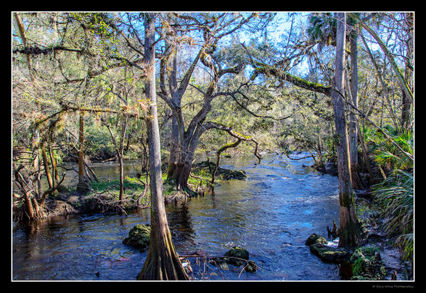
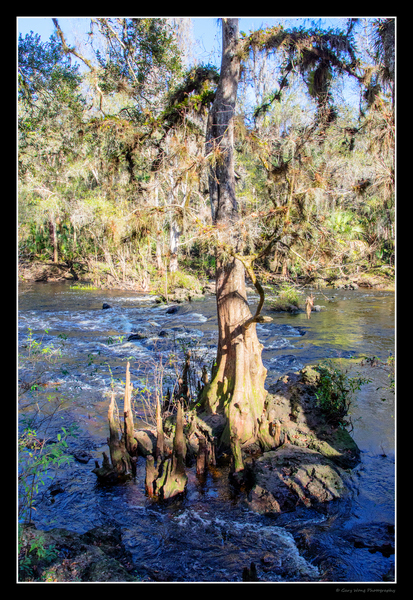
Hillsborough River State Park
Jan 9, 2019 06:22:27 #
I normally am a wildlife photographer and have lately tried to do more landscapes. I have processed these completely different than I do my wildlife shots and am looking for feedback. Looking forward to everyone's comments. Thank you, Gary
Jan 9, 2019 06:32:05 #

Saturation is always a matter of taste,but I'd say the blue doesn't have to be so strong. You can get away with greens and browns that are well ramped up, but blue will look unnatural if it's overdone. Apart from that they are both well spotted shots.
Jan 9, 2019 07:30:13 #
Guyserman
Loc: Benton, AR
R.G. wrote:
Saturation is always a matter of taste,but I'd say the blue doesn't have to be so strong. You can get away with greens and browns that are well ramped up, but blue will look unnatural if it's overdone. Apart from that they are both well spotted shots.
Agree on saturation. On he second shot, a little space on one side of the tree woul be nice. Love the first shot.
Jan 9, 2019 07:40:00 #

Jan 9, 2019 08:39:59 #

Nice work on both of these--I like them. I also agree that the blue is a little heavy.
Jan 9, 2019 09:33:12 #

Living in an area of low humidity and ridiculously blue skies, I am attracted to your colors  Happy and full of energy.
In #1 if there wasn't an element you were avoiding, I'd like to see a little more of the base of the foreground tree. Any chance you can re-post #2 to this thread in a larger size? 800 pixels wide + click "store original" before hitting the "attach" button. Thank you!
Happy and full of energy. In #1 if there wasn't an element you were avoiding, I'd like to see a little more of the base of the foreground tree. Any chance you can re-post #2 to this thread in a larger size? 800 pixels wide + click "store original" before hitting the "attach" button. Thank you!
Jan 10, 2019 08:09:37 #

gwong1 wrote:
I normally am a wildlife photographer and have lately tried to do more landscapes. I have processed these completely different than I do my wildlife shots and am looking for feedback. Looking forward to everyone's comments. Thank you, Gary
Cutting off the bottom of the foreground is a bit like cutting off feet - a no no. IMO the frame is too large and detracts. A few pixels of the black is all that is needed to separate the subject matter from the light yellow.
Jan 10, 2019 19:52:54 #

These are really pretty. The brilliant blue doesn't bother me: I'm used to it. In fact, I hunt for it! I like the first shot best. If it were a perfect world, in my opinion that front tree wouldn't be there. The large tree behind it is SO interesting, I'd really like it to be the star of the show.
Jan 10, 2019 20:54:55 #

gwong1 wrote:
I normally am a wildlife photographer and have lately tried to do more landscapes. I have processed these completely different than I do my wildlife shots and am looking for feedback. Looking forward to everyone's comments. Thank you, Gary
I like how you frame the scene with the two closest trees.
Jan 11, 2019 05:53:57 #
Thank you, working on a new processing method. Gary
R.G. wrote:
Saturation is always a matter of taste,but I'd say the blue doesn't have to be so strong. You can get away with greens and browns that are well ramped up, but blue will look unnatural if it's overdone. Apart from that they are both well spotted shots.
Jan 11, 2019 05:54:30 #
Thank you, working on a new processing method. Gary
Guyserman wrote:
Agree on saturation. On he second shot, a little space on one side of the tree woul be nice. Love the first shot.
Jan 11, 2019 05:54:46 #
Thank you, working on a new processing method. Gary
Longshadow wrote:
Especially the first.
Especially the first.
Jan 11, 2019 05:55:04 #
Thank you, working on a new processing method. Gary
jaymatt wrote:
Nice work on both of these--I like them. I also agree that the blue is a little heavy.
Jan 11, 2019 05:57:37 #
Thank you, working on a new processing method. Gary
Linda From Maine wrote:
Living in an area of low humidity and ridiculously blue skies, I am attracted to your colors Happy and full of energy.
In #1 if there wasn't an element you were avoiding, I'd like to see a little more of the base of the foreground tree. Any chance you can re-post #2 to this thread in a larger size? 800 pixels wide + click "store original" before hitting the "attach" button. Thank you!
Happy and full of energy. In #1 if there wasn't an element you were avoiding, I'd like to see a little more of the base of the foreground tree. Any chance you can re-post #2 to this thread in a larger size? 800 pixels wide + click "store original" before hitting the "attach" button. Thank you!

Jan 11, 2019 05:58:11 #
Thank you, working on a new processing method. Gary
wham121736 wrote:
Cutting off the bottom of the foreground is a bit like cutting off feet - a no no. IMO the frame is too large and detracts. A few pixels of the black is all that is needed to separate the subject matter from the light yellow.
If you want to reply, then register here. Registration is free and your account is created instantly, so you can post right away.