Grain elevator, two versions
Dec 31, 2018 17:04:52 #

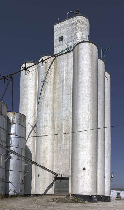
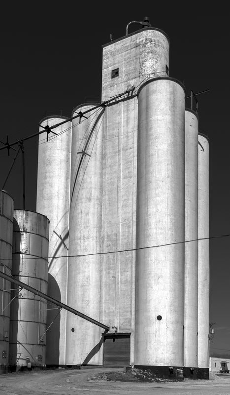
These are two versions of a grain elevator in the little town of Nickerson, Nebraska. Let me know if this type of image is not appropriate for the Landscape section.
Have a healthy and prosperous New Year.
JackM
Have a healthy and prosperous New Year.
JackM
Dec 31, 2018 18:33:11 #
kenievans
Loc: Dallas
I like the b&w. I think it gives it a more menacing mood and brings out more of the texture in the metal. I think I would have tried to straighten it some though.
Dec 31, 2018 18:46:24 #
kenievans wrote:
I like the b&w. I think it gives it a more menacing mood and brings out more of the texture in the metal. I think I would have tried to straighten it some though.
Thanks Keni. It's straightened about 95%. When I shoot something that's obviously looking up, I prefer (for better or worse) to not 100% correct the perspective. I actually straightened this one more than usual for me.
JackM
Dec 31, 2018 19:46:50 #

Dec 31, 2018 19:55:21 #
jackm1943 wrote:
Thanks Keni. It's straightened about 95%. When I shoot something that's obviously looking up, I prefer (for better or worse) to not 100% correct the perspective. I actually straightened this one more than usual for me.
JackM
JackM
The converging verticals add to the image. Great job.
Andy
Jan 1, 2019 00:53:45 #

I am the other way - The color - I like the contrast with the blue sky.
Jan 1, 2019 08:15:59 #

1. Nice photo--I prefer the black and white because it gives the scene more character for me.
2. I had a discussion here last week about this topic of what makes a landscape, and I learned from the comments that almost anything is a landscape if you choose to call it such. Personally, I’d call I an architecture shot (and a nice one), but per other folks’ comments, yes, it is indeed a landscape. -- John
2. I had a discussion here last week about this topic of what makes a landscape, and I learned from the comments that almost anything is a landscape if you choose to call it such. Personally, I’d call I an architecture shot (and a nice one), but per other folks’ comments, yes, it is indeed a landscape. -- John
Jan 1, 2019 13:28:55 #

The B&W version reminds me of the robot in the movie The Day the Earth Stood Still - Gort 
Jan 1, 2019 13:36:32 #

tommystrat wrote:
The B&W version reminds me of the robot in the movie The Day the Earth Stood Still - Gort
I've seen that movie several times!
About time for it to come back.
I prefer the second image!!
Pat
Jan 2, 2019 05:28:05 #

I think the b&w rendering suits the subject well - but I wouldn't call it a landscape! The converging verticals do add something. if possible, I'd back-off the crop a bit and not try to straighten (straightening the right hand side has tipped the whole lot to the right). Might also be worth seeing if there's more to be had from the mid-tones contrast. Plenty of potential and an interesting subject.
Jan 2, 2019 11:18:40 #

I agree with tommystrat - normally I'm color all the way in our world of color, but in this case b&w is perfect.
ron
ron
Jan 4, 2019 09:50:00 #

jackm1943 wrote:
These are two versions of a grain elevator in the little town of Nickerson, Nebraska. Let me know if this type of image is not appropriate for the Landscape section.
Have a healthy and prosperous New Year.
JackM
Have a healthy and prosperous New Year.
JackM
Both-

Jan 7, 2019 21:29:31 #
Jan 7, 2019 21:30:14 #
AndyH wrote:
The converging verticals add to the image. Great job.
Andy
Andy
Thanks Andy.
JackM
Jan 7, 2019 21:32:15 #
Dave327 wrote:
I am the other way - The color - I like the contrast with the blue sky.
Thanks Dave. The thing I like most in the color version is the blue tint of the metal tanks, probably reflecting the blue sky.
JackM
If you want to reply, then register here. Registration is free and your account is created instantly, so you can post right away.