Check out Street Photography section of our forum.
Black and White effort
Jan 4, 2019 12:30:54 #

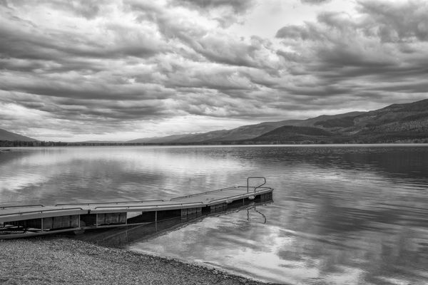
I would love some input as to how I could improve on this image. I see so many wonderful b&w images here, particularly bmalarz work, and would love to apply some of those techniques to what I am doing. Be constructively critical, but be kind... 
Jan 4, 2019 13:12:57 #

Jan 4, 2019 13:56:31 #

Technically, I see nothing wrong with this image.
Since you're posing this question, you must think it's weak in some way. Why do you think it's not as good as it might be? If you can identify what is bothering you, you're 80% of the way to fixing it. Ultimately, you're after an image that pleases you first and foremost. The best way to get from one that doesn't quite succeed to one that does is by asking what could be improved. If you can't identify what is bothering you, play with the image in post to see what improves it. Play with the crop, and see if you can make the composition stronger (that is, more to your liking.) Play with contrast, both global and local, and see if you like the results better. By doing it yourself, you'll learn what matters to you.
There are some very good photographers on this site who will be able to give you better advice than can I, but in the end, it's what you like that matters.
Check out Panorama section of our forum.
Jan 4, 2019 13:57:45 #

Jan 4, 2019 14:22:23 #

I find it highly appealing - serene, but with lots of details to enjoy. The conversion is really nicely done IMO. The only teensy-tiny thing that I might change is to crop a small amount of sky. That would eliminate the brightest spot at the top and move your horizon out of center. With less sky you give more visual importance to the dock and foreground.
Jan 4, 2019 14:34:24 #
Linda From Maine wrote:
I find it highly appealing - serene, but with lots of details to enjoy. The conversion is really nicely done IMO. The only teensy-tiny thing that I might change is to crop a small amount of sky. That would eliminate the brightest spot at the top and move your horizon out of center. With less sky you give more visual importance to the dock and foreground.
I see what you mean, Linda, and I fully agree. I didn't even see the 50% sky/land ratio, and I usually studiously try to avoid that! So may details, so little time... I also added a touch of contrast to the clouds for a slightly more ominous look...

Jan 4, 2019 14:36:56 #
htbrown wrote:
Technically, I see nothing wrong with this image. ... (show quote)
Thanks, ht! I think you hit the nail on the head, and what was bugging me is that I was looking for ways to increase the contrast and the separation between the brightest and darkest parts of the image. I see a lot of grays, and not a lot of pure blacks and whites. Poor explanation, but that's what was in my mind's eye. Thanks for taking the time to post, and happy shooting!
Check out Landscape Photography section of our forum.
Jan 4, 2019 15:01:22 #

tommystrat wrote:
......I see a lot of grays, and not a lot of pure blacks and whites......
The main difference between your shot and what rmalarz does is the amount of contrast.
Jan 4, 2019 15:36:05 #

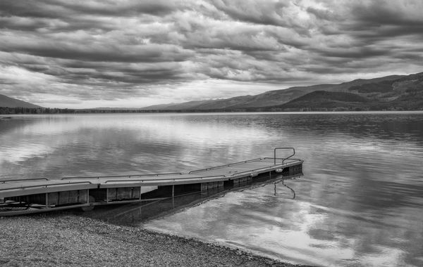
Dramatic well-composed image with a nice diagonal and good tonality. I actually prefer the expansiveness of your first edit. 
Jan 4, 2019 19:44:18 #

tommystrat wrote:
I would love some input as to how I could improve on this image. I see so many wonderful b&w images here, particularly bmalarz work, and would love to apply some of those techniques to what I am doing. Be constructively critical, but be kind...
I looks attractive to me.
Jan 5, 2019 08:14:36 #

I like it a lot, and I don’t see much you could do to it, maybe increase the contrast a bit or poke around in Nik Silver Effects if you have it.
Check out Astronomical Photography Forum section of our forum.
Jan 5, 2019 09:42:55 #

Jan 5, 2019 10:34:55 #

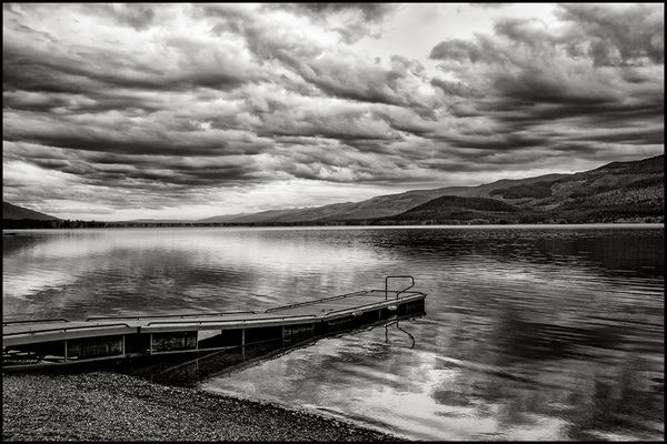
The majority of b&w images benefit from using contrast. I used a Curves Adjustment and some burning-in to improve on contrast. I am submitting the image for your consideration.
By the way, make sure that you convert your Adobe RGB images to the sRGB color space for posting and printing.
By the way, make sure that you convert your Adobe RGB images to the sRGB color space for posting and printing.
Jan 5, 2019 13:03:54 #

This is quite nice, and thank you for the compliment. The only thing I think I'd do to this image is just a bit of burning the darker under parts of the clouds. Perhaps a bit also in areas that are darker in order to provide just a bit more contrast to scene.
--Bob
--Bob
tommystrat wrote:
I would love some input as to how I could improve on this image. I see so many wonderful b&w images here, particularly bmalarz work, and would love to apply some of those techniques to what I am doing. Be constructively critical, but be kind...
Jan 5, 2019 18:51:48 #
rmalarz wrote:
This is quite nice, and thank you for the compliment. The only thing I think I'd do to this image is just a bit of burning the darker under parts of the clouds. Perhaps a bit also in areas that are darker in order to provide just a bit more contrast to scene.
--Bob
--Bob
Can you tell me what "burning" is? I presume that is using the Burn tool in PS? Thanks!
If you want to reply, then register here. Registration is free and your account is created instantly, so you can post right away.