My color, Your black & white?
Jan 3, 2019 12:58:47 #

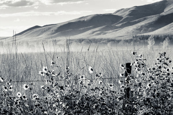
Credit goes to UHH member melueth for this challenge. Please use photo #2 and create a black and white version. Then we'll compare pros and cons to my color interpretation 
Many thanks!
Many thanks!
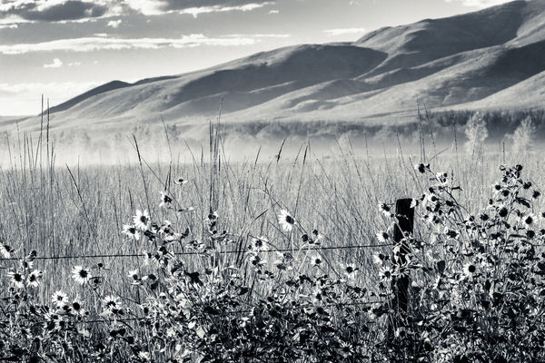
Don't edit this one, use #2
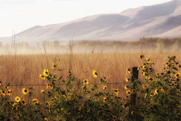
The raw was too large to load; this is a converted, unedited jpg.
(Download)
Jan 3, 2019 13:15:46 #
Linda From Maine wrote:
Credit goes to UHH member melueth for this challenge. Please use photo #2 and create a black and white version. Then we'll compare pros and cons to my color interpretation
Many thanks!
Many thanks!
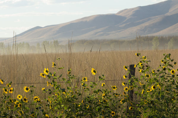
Here's my contribution. It will be fun to see what others come up with. Thanks for the challenge.
jak
Jan 3, 2019 13:29:23 #
jak86094 wrote:
Thank you! This is really nice - a feeling of lightness that's appropriate to the scene IMO. The flowers and leaves contrast beautifully.Here's my contribution. It will be fun to see what others come up with. Thanks for the challenge.
jak
jak
Jan 3, 2019 15:02:21 #
kenievans
Loc: Dallas
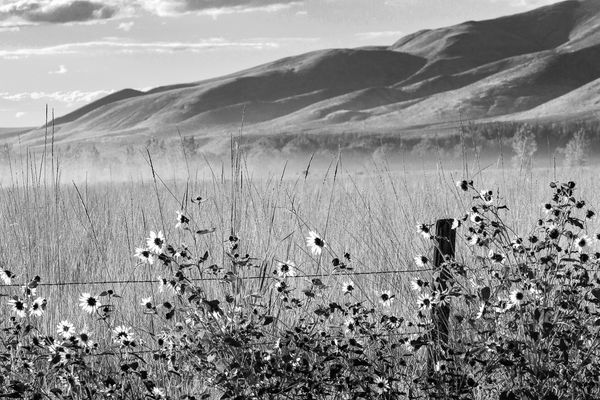
Here is my attempt. I'm not sure a B&W can surpass your original color version but I am willing to try.
Jan 3, 2019 15:06:48 #
kenievans wrote:
Thanks Keni! I like the darker hills and the luminance (maybe wrong term) of the flowers. I shouldn't have used "pros and cons" in my opening. I really only meant that there are likely some very different stories here once we remove color. Do you think Admin would increase the hour limit on editing our words to four hours? Here is my attempt. I'm not sure a B&W can surpass your original color version but I am willing to try.

Jan 3, 2019 15:35:26 #
kenievans
Loc: Dallas
Linda From Maine wrote:
Thanks Keni! I like the darker hills and the luminance (maybe wrong term) of the flowers. I shouldn't have used "pros and cons" in my opening. I really only meant that there are likely some very different stories here once we remove color. Do you think Admin would increase the hour limit on editing our words to four hours?
Luminance is a good word. I tried hard to capture the "glow" in B&W. Not as easy as it is in color I think.
Jan 3, 2019 16:50:52 #
Linda From Maine wrote:
Credit goes to UHH member melueth for this challenge. Please use photo #2 and create a black and white version. Then we'll compare pros and cons to my color interpretation
Many thanks!
Many thanks!
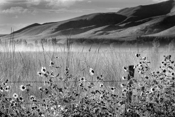
Here's one.
Jan 3, 2019 16:53:32 #
GrandmaG wrote:
Thanks Christina! I like how you gave more definition and contrast to the tall grasses.Here's one.
Jan 3, 2019 16:55:59 #
Linda From Maine wrote:
Thanks Christina! I particularly like how you gave more definition and contrast to the tall grasses.
Thanks. I used a new technique that I just learned.
Jan 3, 2019 16:56:23 #
GrandmaG wrote:
Please feel free to share the info here!Thanks. I used a new technique that I just learned.
Jan 3, 2019 17:23:46 #
Linda From Maine wrote:
Please feel free to share the info here!
First, create a graduated radial filter, with the check mark in "show selected mask overlay".
Then, click on Brush WITHIN the radial tool and select ERASE that is below all the sliders. Erase areas you don't want affected by the filter.
Third, turn off the overlay mask and adjust sliders for the look you want.
Fourth, for more precise control, use the Range Mask (below the brush size and feather). Turn the overlay mask back on; then choose color or luminance. Reduce feather to 0. Click on the dropper and select the area with the color you want to control; then reduce the density until just the area you wish to change is shown in the mask.
Lastly, turn off the mask overlay and adjust the sliders for the desired affect.
This is a really neat trick for faces when using the round radial filter, especially for exposure, saturation and clarity. Also, if you have multiple faces to adjust, you can right click the filter to copy it, then drag to another face and adjust. This saves having to reinvent the filter for every face.
The attached photo is where I applied this to the sky. Have fun with it.
Jan 3, 2019 17:38:09 #
kenievans
Loc: Dallas
GrandmaG wrote:
First, create a graduated radial filter, with the ... (show quote)
Christina what program were you using?
Jan 3, 2019 18:19:14 #
kenievans wrote:
Christina what program were you using?
Oh, sorry...Lightroom Classic.
Jan 3, 2019 18:36:18 #

Jan 4, 2019 00:12:49 #
What an interesting and fun exercise! I vote for Keni's as the best so far... it presents an entirely different aspect to the shot, and illustrates the differences in mood possible between b/w and color.
Great color image as the starting point, Linda.
Andy
Great color image as the starting point, Linda.
Andy
If you want to reply, then register here. Registration is free and your account is created instantly, so you can post right away.