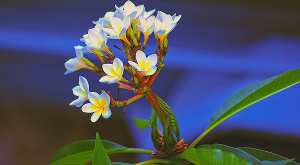
Nice colours?
Dec 12, 2018 15:07:48 #
WessoJPEG wrote:
Down load is beautiful. Pay no attention to him. Always picky.
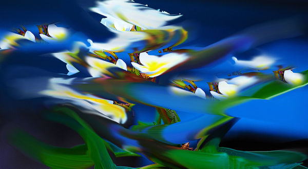
Pay no attention? Do you think that is good advise? Of course he should pay attention, especially if someone points out things that should be avoidet! Yes the color palette in the image is beautiful, as is the color contrast, setting the lights against the darks! But as was pointed out, the individual colors are not pleasing, they are too harsh and a lot of them are blown out!
Dec 12, 2018 16:42:05 #
hobbit123
Loc: Brisbane, Australia
The tendency to obsess over the technical correctness of an image is an easy trap to fall into. But the more astute of you have correctly identified that it is this very exaggeration that gives this image appeal. No it's not a perfect rendition of what the eye sees (that would be an average Frangipani flower in front of a very ordinary blue box trailer), it's what the camera has interpreted in the particular set of lighting conditions when the image was shot. Yes I could go back and take the shot again without the faults but if I then presented the image to you I think you'd ask me why I bothered.
Dec 12, 2018 17:21:11 #

Beautiful colors for sure. But that may be the problem. Writing as a conductor of crits and juror of shows I would note the following (please know that other judges might disagree--I suggest you try to get people to state where they are coming from, what principles and why they do or don't apply):
The colors, especially of the background, are too strong (technically, "over-saturated"). You most likely did this on purpose because you liked them, but too much of a good thing is a bad thing, especially if the purpose is not clear. As a total abstraction, you would get by with this, because the color is clearly the focus. [see attached]. As a photo of something real, the problem is the background overwhelms everything (like a bit player upstaging the star), and the color itself looks cartoonish, "Disneyesque,
"pretty" rather than beautiful.
Your eye for composition and subject is great, not simplistic at all. I suggest you keep working to get beautiful color by looking at photos that you think have it, then telling yourself what color schemes, intensities, and values are used.
Keep it up!
Dec 13, 2018 02:54:25 #
hobbit123
Loc: Brisbane, Australia
Of interest (to me at least) was the fact that this was one of the first photos produced by my new camera, a D700. I bought this after watching a YouTube video by The Angry Photographer where he lauded this model. He made some bold statements including this one:
"Nobody has made anything that has the output and the colour rich saturation and beauty of the Nikon d700 "
"Nobody has made anything that has the output and the colour rich saturation and beauty of the Nikon d700 "
Dec 13, 2018 08:56:50 #

"Nice colors? yes, but just a tad intense and the highlights seem to be blown out especially in the download."
I am entirely in agreement. Critique, when honestly done, helps considerably the improvement of photography. The OP asked what "blown out" the highlights was and in simple terms it means that the highlights are overexposed. In digital photography the exposure should ALWAYS be based on an important highlight and since the exposure meter makes the file grayish in color some exposure correction on the plus side is needed to arrive to the correct exposure and I would say in this case it is around 1 stop of overexposure over what the meter indicate from a reading of the bright leaves which ideally should be done using spot metering.
It is a great shot and very beautiful too. If it were mine I would cut down a little its saturation and contrast but the guidelines I had just mentioned are important for the perfect exposure of the subject.
Addendum: The sensor of the D700 is exactly the same sensor of the professional D3. I do not know if the processor is also the same. Its 12 megapixels excels in quality and the colors are of the first generation Nikon colors preferred by many photographers for their pastel like qualities.
In spite of its age the camera is still very popular among photographers.
Dec 13, 2018 09:16:27 #

Dec 13, 2018 10:18:07 #

Dec 13, 2018 11:11:52 #

Dec 13, 2018 11:50:58 #

hobbit123 wrote:
I thought so...
I too like the shot and colors. I also see the critiques made (it's how some of us can learn) and I myself would be glad to hear what others see. But in the end it's what you like most.
Dec 13, 2018 15:33:19 #

Dec 13, 2018 19:25:14 #

hobbit123 wrote:
Thanks. What exactly does this mean "the highlights seem to be blown out" in layman's terms?
"Blown out," "overcooked," the descriptive vocabulary of photogs. Don't you love it!

Dec 13, 2018 20:37:49 #
Dec 13, 2018 21:04:09 #
If you want to reply, then register here. Registration is free and your account is created instantly, so you can post right away.