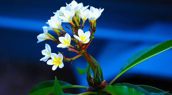
Nice colours?
Dec 12, 2018 05:22:23 #
Dec 12, 2018 06:03:46 #

hobbit123 wrote:
I thought so...
Nice colors? yes, but just a tad intense and the highlights seem to be blown out especially in the download.
Dec 12, 2018 06:07:15 #
hobbit123
Loc: Brisbane, Australia
Thanks. What exactly does this mean "the highlights seem to be blown out" in layman's terms?
Dec 12, 2018 06:17:47 #

hobbit123 wrote:
Thanks. What exactly does this mean "the highlights seem to be blown out" in layman's terms?
Down load is beautiful. Pay no attention to him. Always picky.
Dec 12, 2018 06:21:44 #
WessoJPEG wrote:
Down load is beautiful. Pay no attention to him. Always picky.
Your darn right I'M picky,
Dec 12, 2018 06:23:40 #
hobbit123 wrote:
Thanks. What exactly does this mean "the highlights seem to be blown out" in layman's terms?
There is almost no detail in the white of the petals. Just a little over exposed!!!
Dec 12, 2018 06:30:31 #
hobbit123
Loc: Brisbane, Australia
WessoJPEG wrote:
Down load is beautiful. Pay no attention to him. Always picky.
Hahaha - thanks for the moral support. I don't disagree with his judgement, and I don't claim it's a perfect exposure, but for a learner I think the colours are beautiful (which was the whole point)...
Dec 12, 2018 06:48:10 #
hobbit123 wrote:
Hahaha - thanks for the moral support. I don't disagree with his judgement, and I don't claim it's a perfect exposure, but for a learner I think the colours are beautiful (which was the whole point)...
It is beautiful.😂😜✌️
Dec 12, 2018 06:51:15 #

Dec 12, 2018 06:52:40 #

Not perfect, true, but I REALLY like it. Remember that photography is a journey, and we all started out the same, bad. <grin> We are all on the same road to improving ourselves in photography. Some rest at different intersections on that road and enjoy the view. Some of us take detours while en route. Others are driven to excel and to perform "perfectly". There is no such animal as "perfect" on this quest. For the most part, the folks here on UHH are interested in sharing and teaching. Continue to learn and submit the best examples of your art. Most of all, enjoy your photographic journey. Bravo Zulu, JimmyT Sends.

hobbit123 wrote:
I thought so...
Dec 12, 2018 07:41:24 #

I can certainly attest to the difficulty and skills needed to capture as much contrast and tonal range as this shot encompasses. I struggled mightily trying to learn digital processing with similar shots. You’re doing great. Fear not, keep after it. & have fun.
Dec 12, 2018 07:47:07 #

Nice art work with attractive colors.
But, as a photo capturing a scene the whites are in fact over exposed (blown out - no detail - just white) to the point of smudging around the edges.
I like the "art" of it but being an old guy on the photojournalism side of the hobby I also have a problem with over-saturating this shot.
But, as a photo capturing a scene the whites are in fact over exposed (blown out - no detail - just white) to the point of smudging around the edges.
I like the "art" of it but being an old guy on the photojournalism side of the hobby I also have a problem with over-saturating this shot.
Dec 12, 2018 07:50:57 #

Dec 12, 2018 09:14:43 #

Go to your highlights slider and move it to the left. It will tone down the whites and perhaps give some detail to your flowers. You might slide your exposure or brightness sliders to the left a bit also.
Dec 12, 2018 12:05:47 #

I like it. I agree it's a bit "overcooked", but it works for this image. Keep at it.
If you want to reply, then register here. Registration is free and your account is created instantly, so you can post right away.