Applecross Kirk
Nov 25, 2018 16:43:06 #

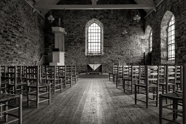
R.G.'s recent picture of Applecross reminded me of my visit there in 2011. This is the interior of the Kirk.
Nov 25, 2018 17:08:02 #

Oh wow! Did they know how photogenic it would be to place those chairs at an angle, or did you smile and ask nicely?  The textures and light of the elements here are so engaging. Love the image.
The textures and light of the elements here are so engaging. Love the image.Nov 25, 2018 17:27:27 #
Linda From Maine wrote:
Oh wow! Did they know how photogenic it would be to place those chairs at an angle, or did you smile and ask nicely? The textures and light of the elements here are so engaging. Love the image.
The textures and light of the elements here are so engaging. Love the image.Just straight lines would have suited me but herringbone fashion was the icing on the cake
Nov 25, 2018 21:21:52 #
Graham Smith wrote:
R.G.'s recent picture of Applecross reminded me of my visit there in 2011. This is the interior of the Kirk.
Beautiful and very nicely photographed. Black and White seems a natural for this composition. Very nicely done.
Erich
Nov 26, 2018 06:56:08 #

Superb. I could spend a long time looking at that, but not if it were colour. For me, the simplicity of the shot, the lighting, the accurate camera placement or cropping, and most importantly your handling of monochrome make it a pleasure to view.
Nov 26, 2018 07:42:34 #

Nov 26, 2018 08:02:49 #

Yes, everything that John N says. And I just know that had I taken this shot I’d have over-processed it - you’ve got it spot-on Graham.
Nov 26, 2018 08:36:57 #

Ditto to everyone's comment.
And, to add my own, a leading line that actually leads to something!!!
So glad you're back, Graham!
And, to add my own, a leading line that actually leads to something!!!
So glad you're back, Graham!
Nov 26, 2018 08:38:52 #

Spectacular shot, composition and exposure spot on, PP tastefully done (as has been pointed out above). What camera were you using for this?
Nov 26, 2018 09:04:44 #
DaveC1 wrote:
Spectacular shot, composition and exposure spot on, PP tastefully done (as has been pointed out above). What camera were you using for this?
Thanks Dave, it was a Nikon D700 with the much, and wrongly maligned, 24 - 120 f/3.5
Nov 26, 2018 09:18:38 #

This is beautiful, Graham. I was struck first by the wonderful toning. The contrast is perfect. The DOF is perfect. Would you mind sharing your settings and what (if any) PP work was done?
Nov 26, 2018 09:35:12 #
Graham Smith wrote:
Thanks Dave, it was a Nikon D700 with the much, and wrongly maligned, 24 - 120 f/3.5
Thank you Graham, I would have guessed all day and not hit on the D700 (and I have one.) Many images that get posted on this and other sites have a bunch of digital artifacts that become visible if one downloads the image and hits the +, I don't see any of that in your image here. Once again, very good work.

Nov 26, 2018 10:20:49 #

Nov 26, 2018 10:50:55 #
AzPicLady wrote:
This is beautiful, Graham. I was struck first by the wonderful toning. The contrast is perfect. The DOF is perfect. Would you mind sharing your settings and what (if any) PP work was done?
I don't mind sharing my settings but I'm never quite sure of what use they are to another person in a different situation

Nikon D700 Nikkor 24 - 120 f/3.5 @ 24 mm
f/8.0 1/200 sec. IS0 1600 Aperture priority.
In LightRoom I adjusted exposure, contrast and saturation. I also corrected some distortion.
In PhotoShop I used Nik Software (can't get used to it being DXo) "Paper Toner" plugin, this, if the colour version is right, gives a nicely tinted monochrome... used sparingly!
The rest of the work consisted of "burning in" the top and the two vertical edges of the frame to help guide the eye to the altar table. I then dodged the floor to accentuate the light from the window... simple... it has to be for me
Nov 26, 2018 11:23:22 #
If you want to reply, then register here. Registration is free and your account is created instantly, so you can post right away.