critique please
Aug 20, 2018 17:47:33 #
Aug 21, 2018 15:21:36 #

dancingbear wrote:
few shots of wedding we attended Any critique is welcome
Not bad for snap shots.
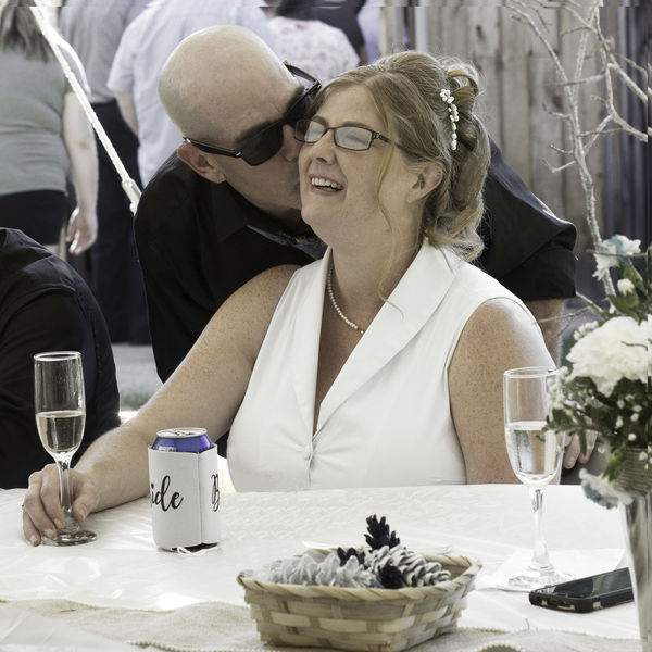
First one has too busy of a background. Takes attention away from the bride and groom.
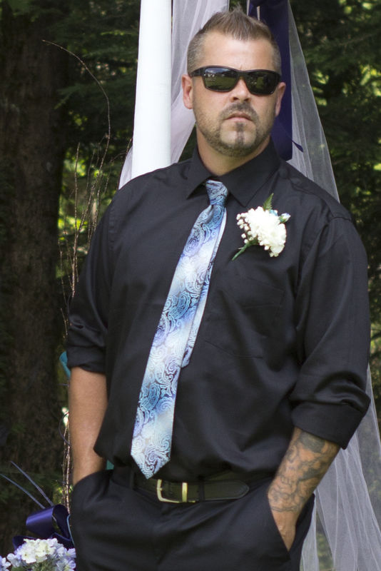
Second one is the only one with good colour and contrast . . but the pose is not great.
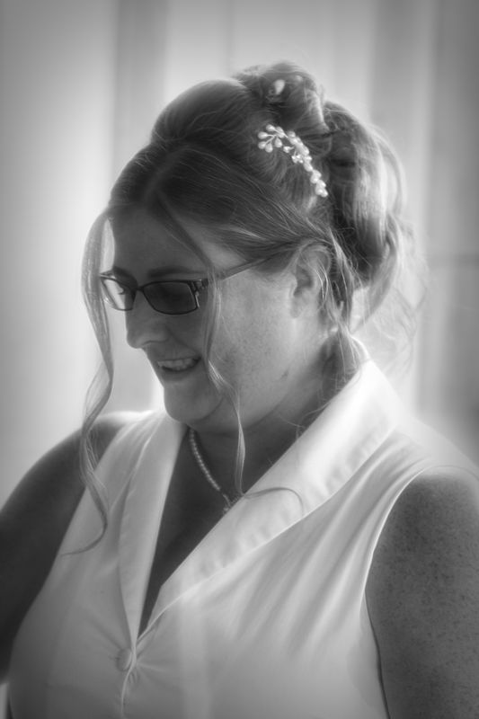
Third is very bad lighting.
You obviously were a guest and not the official photographer, so under those circumstances you don't really have the control to direct people to the best light.
Aug 22, 2018 15:49:30 #
Here goes.
1. Love the emotion of the first one, but not sure if it is the compression from the upload or the UHH site, but the color is off. Depending on how much time you have, possibly burning the background so it doesn't distract so much, may help, but it's not awful as it is. The only thing that really jumps out is the color.
2. I've done weddings like this (maybe more than I care to remember) Where the groom is more concerned about looking cool, than showing that magical first glimpse of the bride. I always have someone stationed with a camera pointed directly at the groom for that moment, and sometimes, the groom will be all stoic and cool... Oh well, I digress. Good color and good exposure. The "pose" is what it is. I'm assuming it is a shot of him waiting for his future bride to come down the aisle.
3. The biggest issue is that the light is on the back of her head, and that puts her face in shadow. Since the bride is the star of the day, you want the focus to be on her. A reflector, or better yet, some off camera flash would have made a huge difference. I like the premise of the photo, but would have preferred to see her looking at something, a bouquet, her ring, a flower girl, or ring bearer, etc.
Thanks for sharing, so everyone can learn. All in all, good start.
bk
Aug 22, 2018 19:07:10 #
The color shifted during upload
The best man is just a candid shot while waiting
Bride is actually taken in food line
I went with just a 50 on camera No equipment Didn't want to get in way
The best man is just a candid shot while waiting
Bride is actually taken in food line
I went with just a 50 on camera No equipment Didn't want to get in way
Aug 23, 2018 11:59:56 #
1. To busy of a background. Rather bland, no color. Appears the background is cleaner to the right. No use of thirds which in this case could of added substantially.
2. Picture is out of balance, use of thirds would of helped. The pole behind is head is a distraction.
Lighting is a mess. If you were to keep this composition I would of exposed properly for her face and the the background blow out. When a gal has a double chin you have her look up a bit and extend her face.
You need to start somewhere and you did ... that is the first step. Now you need to decide if you like weddings. Either you do and will get better or you won't want to deal with the stress. After years of doing weddings I no longer stress but those first few years I did ....
If you want to reply, then register here. Registration is free and your account is created instantly, so you can post right away.