Check out Close Up Photography section of our forum.
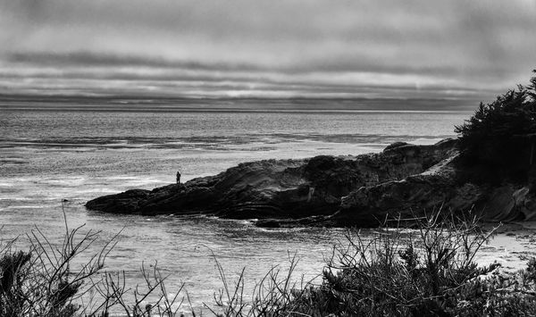
Fisherman with lots of texture in the image
Aug 15, 2018 23:24:58 #
AnthonyM
Loc: Pasadena, CA
I've been working on this for a while. I'm tired of it and I can't seem to make the midtones what I'd like. I think it's OK but see what you think, I'd like to know...
Thanks,
Anthony
Thanks,
Anthony
Aug 16, 2018 07:03:58 #
Most of the photo consists of mid-tones. The darker tones don't show the detail as well as I'd like. Nicely composed, and interesting shot. djt
Aug 16, 2018 08:20:54 #
I like it. One thing you may wish to try is starting from the RAW file make all the corrections to bring up the mid tones and do the B&W transition as the last step.
Check out Digital Artistry section of our forum.
Aug 16, 2018 08:30:04 #
DaveC1 wrote:
I like it. One thing you may wish to try is starting from the RAW file make all the corrections to bring up the mid tones and do the B&W transition as the last step.
I like Dave's suggestion of making corrections first. That might add enough contrast to make the whole image pop more. As it is, it is a bit flat. I think that is the problem. The composition, however, is really good. Don't give up on this one. Put it away for a few days and then start from the RAW or original image. There is a lot of potential here. The sky is wonderful and really adds to the photo. The rocks also point out how determined this person was to find just the right place to present his lure/bait to his prey. It's a good image.
Erich
Aug 16, 2018 11:05:43 #
AnthonyM
Loc: Pasadena, CA
djtravels wrote:
Most of the photo consists of mid-tones. The darker tones don't show the detail as well as I'd like. Nicely composed, and interesting shot. djt
Thank you for looking. And for your compliments. I will try to open up the shadows a little more when I start again with the raw image.
Aug 16, 2018 11:07:35 #
AnthonyM
Loc: Pasadena, CA
ebrunner wrote:
I like Dave's suggestion of making corrections fir... (show quote)
Thank you Erich.
I tried some things to emphasize the sky but they seemed to overcook the image. I will start with the raw again and see about corrections first.
Regards,
AM
Aug 16, 2018 11:08:59 #
AnthonyM
Loc: Pasadena, CA
DaveC1 wrote:
I like it. One thing you may wish to try is starting from the RAW file make all the corrections to bring up the mid tones and do the B&W transition as the last step.
Thank you Dave.
Tonight I'll open the raw file again and do everything I think the image needs prior to B&W conversion. Great idea.
AM
Check out Film Photography section of our forum.
Aug 16, 2018 11:58:13 #

AnthonyM wrote:
Thank you Dave.
Tonight I'll open the raw file again and do everything I think the image needs prior to B&W conversion. Great idea.
AM
Tonight I'll open the raw file again and do everything I think the image needs prior to B&W conversion. Great idea.
AM
And when you’ve done that, it often happens a touch of clarity (if you’re in Lr) helps the b&w conversion. Nice shot.
Aug 16, 2018 14:28:58 #

Are you starting off your edit by ramping up the contrast quite a lot? If you are it might be an idea to ease off with the contrast and try to give it more contrast by using the tones sliders (shadows/highlights/blacks/whites/brightness).
If you add too much contrast too soon it can force too much of the mid-tones into the shadows and highlights. Do you think you're losing too much to the shadows? if so you could try giving it an overall lightening and then proceed from there with the tones sliders.
If you add too much contrast too soon it can force too much of the mid-tones into the shadows and highlights. Do you think you're losing too much to the shadows? if so you could try giving it an overall lightening and then proceed from there with the tones sliders.
Aug 16, 2018 14:34:20 #
AnthonyM
Loc: Pasadena, CA
magnetoman wrote:
And when you’ve done that, it often happens a touch of clarity (if you’re in Lr) helps the b&w conversion. Nice shot.
Thank you magnetoman. I DID use clarity here, I don't like the funny halos I get sometimes, but should be interesting as I start over on this image.
Aug 16, 2018 14:40:10 #
AnthonyM
Loc: Pasadena, CA
R.G. wrote:
Are you starting off your edit by ramping up the c... (show quote)
Thank you for looking R.G.
I'm fairly certain I did add too much contrast, and this is indeed the most likely reason I'm unsatisfied with the midtones of this image. Contrast was used before and after conversion. Generally I reduce highlights and increase shadows prior to conversion. I do like the idea of increasing the light/exposure as I work on the raw file again.
Regards,
AM
Check out Digital Artistry section of our forum.
Aug 16, 2018 17:59:25 #
Aug 16, 2018 19:55:29 #
If you want to reply, then register here. Registration is free and your account is created instantly, so you can post right away.
Check out Sports Photography section of our forum.