I've learned a new trick! Thanks, Wuligal!
Aug 13, 2018 19:00:24 #

Thanks to Wuligal, I've learned a new trick. Actually, I've been trying to do this for a year, almost.
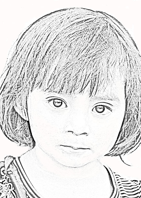
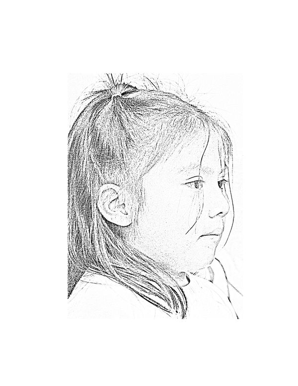
When I was in Chiapas, I photographed some children and young folks (and a couple of old folks, too.) I wanted to do their faces as drawings. I have finally found a method that seems to work - with a bit of work added on at the end. The initial conversion takes about 15 minutes. Cleaning it up afterward takes about another 30. I'm printing these as 5x7 images centered on 8.5 x 11 watercolour paper. I have a whole series to do. These are two I've done today. One of the quandaries is just how much "dirt" to leave on their faces. They have quite browned-toned skin, and some of shows up just because it's dark. Some shows up because it's dirt. I wanted to leave the dirt!
Comments and critiques welcomed and appreciated.
Aug 13, 2018 19:15:26 #
AzPicLady wrote:
Thanks to Wuligal, I've learned a new trick. Actu... (show quote)
Very nice, AzPicLady
Aug 13, 2018 19:42:00 #
Aug 13, 2018 20:30:03 #
They are wonderful! I would love to do this with my grandchildren's photos. Can it be looked up on youtube?
Aug 13, 2018 22:07:01 #
Katydid wrote:
They are wonderful! I would love to do this with my grandchildren's photos. Can it be looked up on youtube?
It's actually WRITTEN steps on a site called photoessentials. I think that's the name. He even includes screen shots so you can find everything. And it works.
Wuligal posted the direct link in her post.
Thanks!
Aug 13, 2018 22:36:29 #
Aug 13, 2018 22:46:18 #
Retired CPO wrote:
I like that a lot!
Thank you! And I'm liking that it works! I've tried lots of different methods and some of them work sometimes. I also liked that this wasn't a video, so I can print it out.
Aug 14, 2018 06:36:52 #

I really like what you are doing with these. I used to do a lot of graphite portraits so there are just a few things that strike me about these. All pencil sketches are a little soft, so these seem a little harsh. At least in my opinion, they would benefit from just a little blurring. The first one is really precious. The second one bothers me with the wide white boarder. Its clearly defined on the top and left, but not at all on the right, and not so much on the bottom. The effect is for me awkward and unbalanced. I cropped tight left and top, leaving the right as is, and just a little off the bottom. The composition seems better that way to me. Another idea that occurred to me, was to give the picture a light gray value so that the boarder made sense. Inevitably, a drawing in pencil or charcoal gets a little smudged and takes on a value a little darker than the paper.
Aug 14, 2018 06:37:55 #

Aug 14, 2018 07:15:34 #

AzPicLady wrote:
Thanks to Wuligal, I've learned a new trick. Actu... (show quote)
Kathy, sounds like a whole lot of hard work, however, just about everything in this world that is worth anything usually takes a lot of hard work. This is an excellent example of what I mean.

Greg
Aug 14, 2018 07:43:46 #

Fergmark has a great point about the border in #2. All I see on my brightly lit 13" Chromebook screen is a sharp vertical separation between her hair and the left side, with the other borders just barely visible when I download onto the black.
But you are printing, so the "issue" may not be one. Similar with the dirt vs skin pigment.
Now that you have the technique mastered, maybe a little research into sketches in other mediums that show how darker skin is addressed. I really like pen and ink drawings (over watercolor too!) and often the less detail, the more a piece interests me.
What a wonderfully artistic and interesting project to expand your photo editing interests!
Aug 14, 2018 08:20:48 #
asicit
Loc: New Hampshire
They are wonderful AzPicLady. Like them a lot I'd love to learn how to do that with pics of my granddaughter.
Aug 14, 2018 09:16:17 #
fergmark wrote:
I really like what you are doing with these. I us... (show quote)
Thanks, Fergmark. Your reply is interesting and enlightening. Actually I have one that's soft because it's cropped a LOT, and I really didn't like it. I got it all done and discarded it because it's soft. I worked hard to get things sharp! Maybe I'll rethink that. About the space, that's intentional. As I explained, these are 5x7's prnted on 8.5 x 11 paper. My intention was that the actual background in the photo would just blend into the unprinted paper so that one couldn't tell where the photo began and it would look like the "drawing" was done on the larger paper. This was sort of the format requested by my gallery owner where I hope to place these for sale.
Aug 14, 2018 09:16:52 #
Aug 14, 2018 09:18:56 #
CLF wrote:
Kathy, sounds like a whole lot of hard work, however, just about everything in this world that is worth anything usually takes a lot of hard work. This is an excellent example of what I mean.
Greg
Greg
Thanks, Greg. It IS actually a lot more work than I expected. The actual conversion is pretty simple. It's cleaning up the background that's tedious. The background on some of these was the wall of an old church. The paint was peeling and it was an odd color - sort of egg yolk. Hard to clean that up!
If you want to reply, then register here. Registration is free and your account is created instantly, so you can post right away.