Georgia.....Four Of My Favorite Photo Locations
Aug 6, 2018 11:28:52 #
We moved to Georgia from Idaho about 2.5 years ago. I was not aware of the photo ops in Georgia before moving here, for the most part. Here are 4 locations that are some of my favorites. I am rather fond of waterfalls.
Amicalola Falls
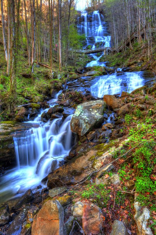
(Download)
Minnehaha Falls
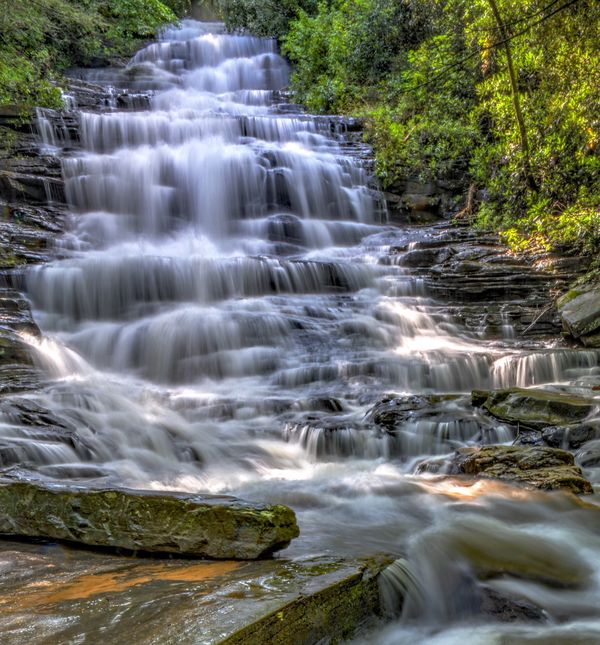
(Download)
Tallulah Falls
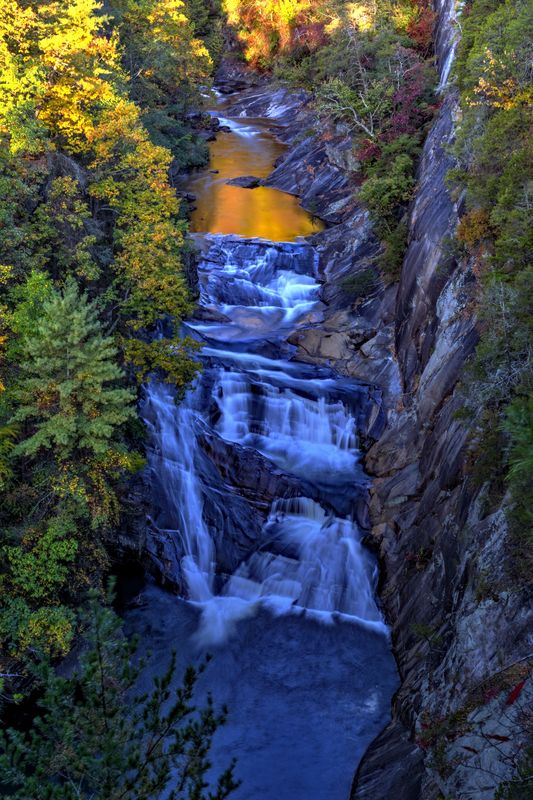
(Download)
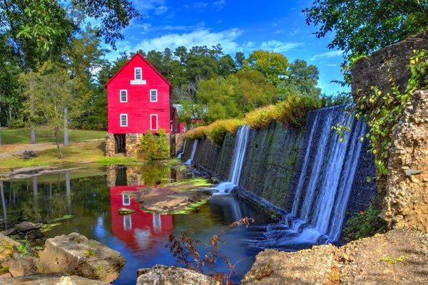
Starr’s Mill
(Download)
Aug 7, 2018 07:54:32 #
Nice group, its nice to find special places to take pictures. Every state has hidden gems people can explore.
Aug 7, 2018 08:43:02 #
gary8803 wrote:
Nice group, its nice to find special places to take pictures. Every state has hidden gems people can explore.
Thanks Gary.
Aug 7, 2018 10:04:25 #
I'm normally very fond of blue, but I think you went a little too far on 1, 3, and 4. Number 2 was realistic. Also, in your processing of number 4, the barn came out as a florescent pink instead of the normal red. But that is just my opinion.
Aug 7, 2018 10:19:02 #

Fuji Velvia did the same thing with the "Blues", but I kinda like it. Hoping to get down that way this Fall, so thanx for the location ideas.
Aug 7, 2018 10:23:01 #

Very good work on all four of them. I assume we are talking about north GA.
Aug 7, 2018 11:58:29 #
cameraf4 wrote:
Fuji Velvia did the same thing with the "Blues", but I kinda like it. Hoping to get down that way this Fall, so thanx for the location ideas.
Thank you very much.
Aug 7, 2018 12:01:30 #
DaveC1 wrote:
Very good work on all four of them. I assume we are talking about north GA.
Thank you, Dave. Yes, the first three are in North Georgia. Starrs Mill is about an hour south of Atlanta.
Aug 7, 2018 12:31:36 #
DragonsLady wrote:
I'm normally very fond of blue, but I think you went a little too far on 1, 3, and 4. Number 2 was realistic. Also, in your processing of number 4, the barn came out as a florescent pink instead of the normal red. But that is just my opinion.
DragonsLady, Thank you for your review. On No. 4, I’m seeing the barn a deep saturated red, as I intended. We made a metal print of this and it hangs on our wall....the barn looks red to me.
I also like the “blues” in the others and that is my opinion.
Aug 8, 2018 17:35:06 #

These are all winners especially photos 2 and 4. Looks like "Georgia is on your mine..."
Aug 8, 2018 20:03:15 #
SteveLew wrote:
These are all winners especially photos 2 and 4. Looks like "Georgia is on your mine..."
Thank you, Steve.
If you want to reply, then register here. Registration is free and your account is created instantly, so you can post right away.