Check out Astronomical Photography Forum section of our forum.
Sand Patterns
Jul 31, 2018 02:07:37 #
tnste
Loc: New Westminster, BC
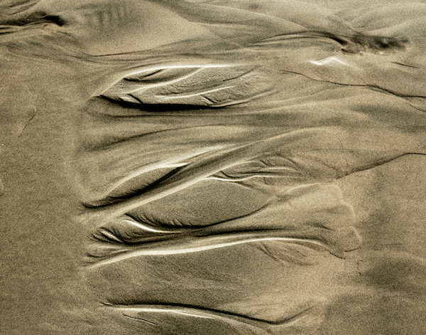
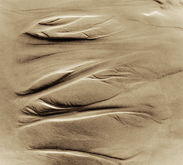
I am submitting three photos of sand patterns to my photography club and would appreciate opinions from the UHH forum on what photos to submit. I have submitted one so I have 2 more photos to submit and have 4 photos to consider with different versions of each photo.
Here are the four photos and their versions. Which 2 photos and version do you like best? What suggestions do you have to improve the photos?
Here are the four photos and their versions. Which 2 photos and version do you like best? What suggestions do you have to improve the photos?
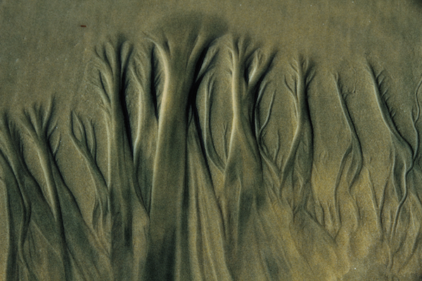
#1
#2a
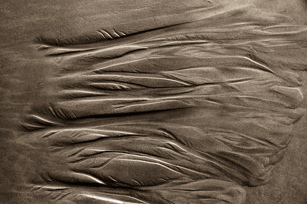
#2b
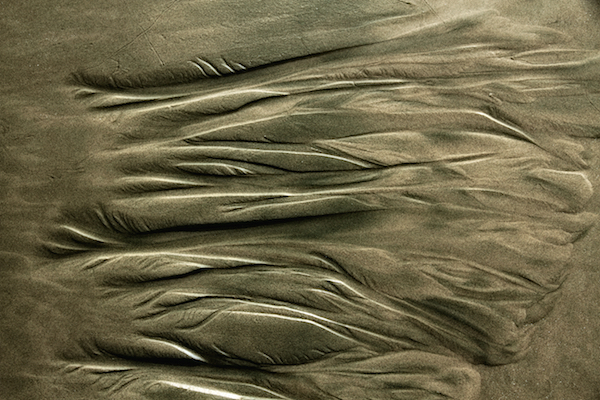
#2c
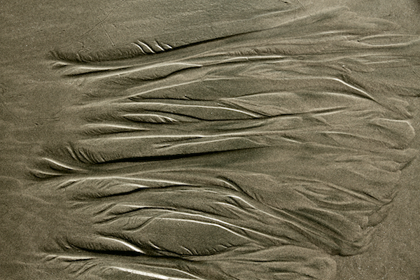
#3a
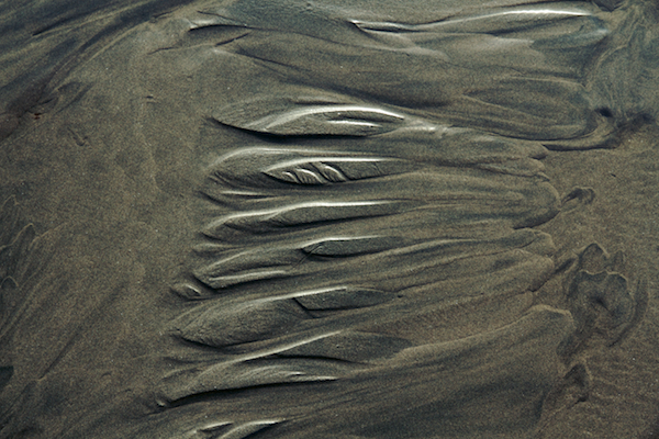
#3b
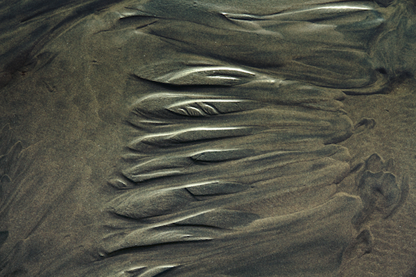
#3c
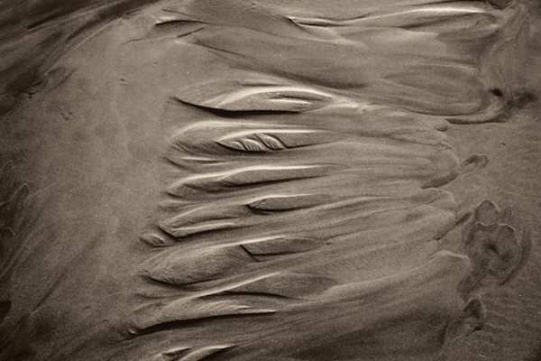
#4a
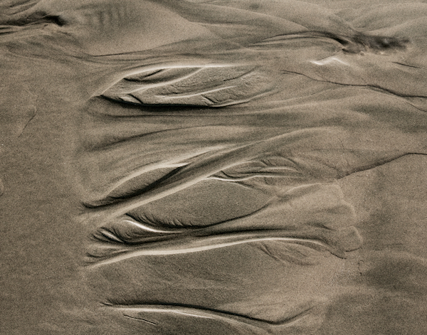
#4b
#4c
Jul 31, 2018 05:46:45 #
These are all very well done photos. Number one is my favorite of the bunch. May I suggest that you try flipping all these horizontal shots and see if that helps you in your choices.
Jul 31, 2018 06:04:28 #
bedouin wrote:
These are all very well done photos. Number one is my favorite of the bunch. May I suggest that you try flipping all these horizontal shots and see if that helps you in your choices.
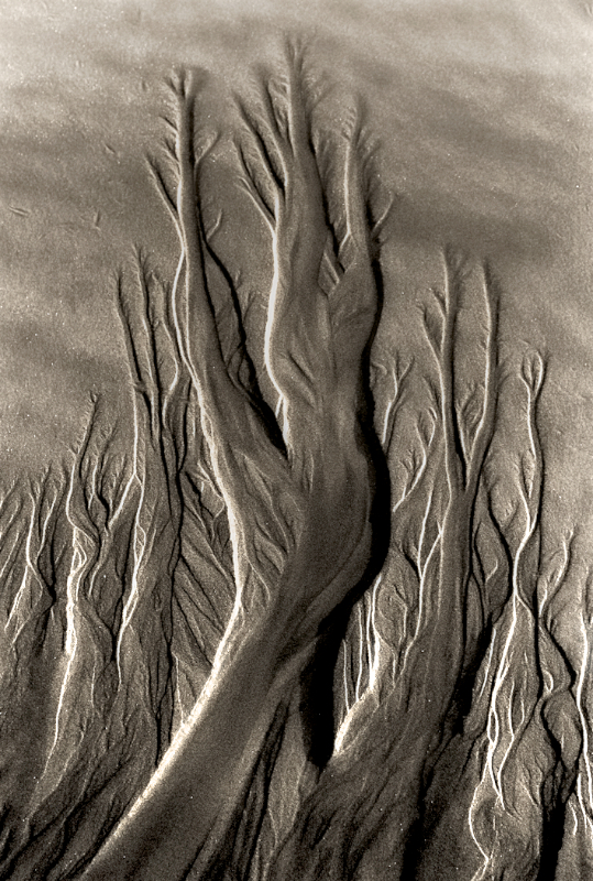
Agreed, and the roots should be down as we are use to seeing them.... amazing how organic the inorganic sand looks.... so plant like. You, tnste, are among those who have learned to see the ordinarily unseen. Congratulations on developing the curse of being beyond reality.
Jul 31, 2018 06:28:22 #
tommy2
Loc: Fort Worth, Texas
My selection is no. 1. The way it's posted looks organic and flipped 180 degrees it looks like fire. For some reason the color leaves me with an uneasy feeling.
I'd like to see it flipped 180 and have a red tint; however, as it is would most likely be remembered most. Certainly the significant one to me in the batch.
My opinion comes from several years of direct contact with the Modern Art Museum of Fort Worth. https://www.themodern.org/
I'd like to see it flipped 180 and have a red tint; however, as it is would most likely be remembered most. Certainly the significant one to me in the batch.
My opinion comes from several years of direct contact with the Modern Art Museum of Fort Worth. https://www.themodern.org/
Jul 31, 2018 08:51:34 #
tnste
Loc: New Westminster, BC
tommy2 wrote:
My selection is no. 1. The way it's posted looks organic and flipped 180 degrees it looks like fire. For some reason the color leaves me with an uneasy feeling.
I'd like to see it flipped 180 and have a red tint; however, as it is would most likely be remembered most. Certainly the significant one to me in the batch.
My opinion comes from several years of direct contact with the Modern Art Museum of Fort Worth. https://www.themodern.org/
I'd like to see it flipped 180 and have a red tint; however, as it is would most likely be remembered most. Certainly the significant one to me in the batch.
My opinion comes from several years of direct contact with the Modern Art Museum of Fort Worth. https://www.themodern.org/
Thank you very much for your response. I will rotate the image as you suggest but will not add a red tint and just go with the natural colours of the sand for this particular theme which is The Sands of Time. There is still one more photo to submit. What would be your second choice and which version?
Jul 31, 2018 09:01:42 #
tnste
Loc: New Westminster, BC
bedouin wrote:
These are all very well done photos. Number one is my favorite of the bunch. May I suggest that you try flipping all these horizontal shots and see if that helps you in your choices.
Your opinion is appreciated. I will submit #1 as you and others have suggested and flip it. I was thinking of that anyway. We are allowed to submit three photos. Still one more photo to submit for this theme The Sands of Time as I have already submitted one as shown.
Jul 31, 2018 09:06:07 #
tnste
Loc: New Westminster, BC
dpullum wrote:
Agreed, and the roots should be down as we are use to seeing them.... amazing how organic the inorganic sand looks.... so plant like. You, tnste, are among those who have learned to see the ordinarily unseen. Congratulations on developing the curse of being beyond reality.
Thank you for the kind words and your suggestion. As already stated to others in this forum I will flip the image. I have one more photo to submit for this theme. Of the photos I posted, which other photo and version do you suggest I submit?
Check out Black and White Photography section of our forum.
Jul 31, 2018 09:22:31 #
tnste
Loc: New Westminster, BC
tnste wrote:
Your opinion is appreciated. I will submit #1 as you and others have suggested and flip it. I was thinking of that anyway. We are allowed to submit three photos. Still one more photo to submit for this theme The Sands of Time as I have already submitted one as shown.
Flipping the photo completely changes the look. I changed the tone as well. Does not suggest roots as in the original photo.

Jul 31, 2018 09:40:09 #
kenievans
Loc: Dallas
I agree with the other comments about rotating them. I think it is a stronger image. I like 2b as your third submission. It brings out the subtle changes in color tone of the sand the best.
Aug 1, 2018 09:51:30 #
Aug 1, 2018 10:28:57 #
I like #4. Doing it as a vertical would make it fit nicely with your others. I'm not fond of toning, so I would do it in "normal" colour.
If you want to reply, then register here. Registration is free and your account is created instantly, so you can post right away.
Check out The Dynamics of Photographic Lighting section of our forum.


