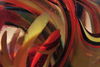
Down the Stretch
May 11, 2018 08:25:08 #
Thinking about putting this photo up for sale online.
Curious what you might do it? Did I miss anything?
I included the watermark simply to see what you think. It is intended as a marketing ID only, not any sort of protection, as watermarks donâÂÂt do that. ðÂÂÂ.
I feel this photo needs a strong sense of motion, so being tack sharp isnâÂÂt necessary or even detracting. However, perhaps I could sharpen up small parts of it, like a jockeyâÂÂs head, number, etc.
Thanks for the feedback.

May 11, 2018 08:44:13 #
I made a quick photo update right after posting, I messed up LOL, so if you saw the first one, my apologies.
May 11, 2018 13:25:51 #

Maybe remove the distracting stuff in the distance just above the leading horses' heads. And make the rear jockey less eye-catching. Is the aspect ratio fixed? If not you could crop in a little from the top (and maybe a very small skim off of the bottom). A more elongated frame would enhance the feeling of movement and speed.
May 11, 2018 16:45:15 #
R.G. wrote:
Maybe remove the distracting stuff in the distance just above the leading horses' heads. And make the rear jockey less eye-catching. Is the aspect ratio fixed? If not you could crop in a little from the top (and maybe a very small skim off of the bottom). A more elongated frame would enhance the feeling of movement and speed.
Thanks. Will give it a try.
May 12, 2018 08:26:45 #
unless you already have business insurance for your photography equipment this sale could jeopardize your insurance coverage.
May 15, 2018 01:06:28 #
To me, the real "tension" is in the lead 2 horses. I'd zoom and crop out the back two horses; their heads are very indistinot anyway, and the yellow jockey I find a bit distracting rather than adding to the excitement. If you "need" those horses for the story, only their heads are really necessary. The viewer gets the point without the rest. Nice pic full of action!
May 29, 2018 12:33:12 #
You did a really good job of panning with the #3 horse, and your choice of shutter speed is spot on. Unfortunately you don't get to choose the positioning of the others. I'd crop out as much of the yellow hat guy as possible getting rid of the distracting background blobs at the same time; change the helmet of your subject to yellow so he stands out; change the helmet color of the rider behind your subject to a drab blue, complementing the yellow but not competing; and finally, blur the background jockey to set him apart from your subject. Sounds like a lot of stuff, but you have an excellent capture so I think the extra work will be well worth the effort. It's a hanger.
May 29, 2018 17:53:03 #
Jun 7, 2018 14:32:16 #

i like the shot very much. You have focus on the front foreground runner and the rest is motion blur. Nicely done. I wouldn't change a thing. I like the yellow hat guy because it adds tension to the photo. Somebody is closing in on #3. Just my POV for what it's worth.
If you want to reply, then register here. Registration is free and your account is created instantly, so you can post right away.