Flower
Jul 31, 2012 22:08:23 #
Jul 31, 2012 22:12:29 #

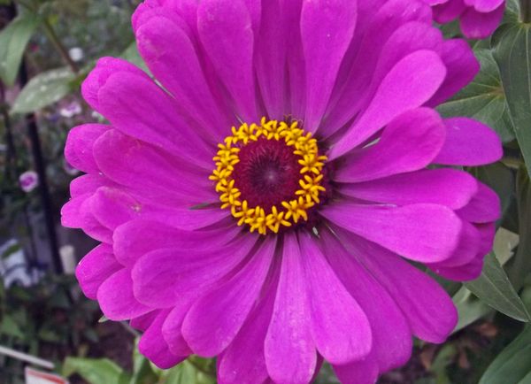
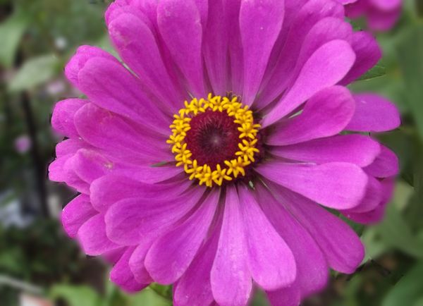
It's a beauty. The only thing I can say is that it's cropped a little tight. But other then that that is a great shot.
Jul 31, 2012 22:52:49 #
Aug 1, 2012 08:07:27 #
I don't mind the open composition. It may be the compression on the way the board shows images, but it looks out of focus to me.
On the second one, there are a number of places you either missed blurring the background or got the edges of the petals; In this case, I prefer the original. You could try to crop out the area to the right (along the edge of the petals) - maybe a square format.
On the second one, there are a number of places you either missed blurring the background or got the edges of the petals; In this case, I prefer the original. You could try to crop out the area to the right (along the edge of the petals) - maybe a square format.
Aug 1, 2012 23:11:23 #

Aug 1, 2012 23:15:21 #
If you want to reply, then register here. Registration is free and your account is created instantly, so you can post right away.