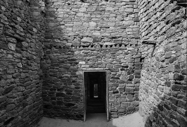
Aztec Ruins in Aztec, NM
Apr 19, 2018 23:22:41 #
F/11
1/200
Iso 800
18-55mm kit lens @18mm
Nikon D3300
PP with Photoshop
Ok I'm ready for the critical critique, and its always critical here! Lol!
1/200
Iso 800
18-55mm kit lens @18mm
Nikon D3300
PP with Photoshop
Ok I'm ready for the critical critique, and its always critical here! Lol!
Apr 20, 2018 00:14:51 #
Great photo. Glad you did it in B&W. Download is magnificent. Mahalo for sharing.
Apr 20, 2018 06:27:13 #
Apr 20, 2018 09:24:39 #
Nice symmetrical shot with good texture. Since you asked for criticism -it is three walls with a door. Could be anywhere. Some context would tell the story better.
Apr 20, 2018 10:23:09 #
repleo wrote:
Nice symmetrical shot with good texture. Since you asked for criticism -it is three walls with a door. Could be anywhere. Some context would tell the story better.
LOL I knew someone would say that, that is basically all there was, just the walls and the door. I figured good texture, good light, perfect for black and white. Thank you for your critique! 😊
Apr 20, 2018 11:51:19 #

Replying to the calls for a "story," I don't agree. There are innumerable photos that create a space in the mind, touching our universal feelings but in a unique way, as this does. I suggest bringing out the strengths a bit more, the dark of the doorway, the texture and range of values in the rocks.
Good photo in my opinion.
Good photo in my opinion.
Apr 20, 2018 17:39:29 #
I like your image, but had I been there I would have done an HDR set. Why? Its a contrasty scene and HDR would have brought out more detail in the stones and opened up the shadows, especially in the room behind the door.
Apr 25, 2018 20:54:35 #

Everything in the image tends to draw the eye to the doorway but then there's no payoff. You can't see anything in there. Have you considered dodging the area inside the door so we can see what if anything is in there? Otherwise it's an interesting well composed image. There is a nice range of grays all the way to black without overdoing the contrast. Good job.
Jul 29, 2018 08:37:47 #

This is a great shot with even greater potential. Two suggestions: lighten up the far doorway a bit to enhance the notion that this dark corridor is the way - from the grey trap to the liberating light. I love the gradations of grey but feel that a more complete spectrum, from pure black to nearly white would enhance the impact. Perhaps some experimentation with Nik Silver Effects would give the ideal range.
Jul 30, 2018 13:31:31 #

I'm not sure where this was taken, but I pulled up photos from Chaco Canyon before commenting. One of the things that stands out in the good photos was the play of light shining through window, doors, or into rooms. That is one thing that seems to be lacking in this photo. It is, however, a great subject. Sometimes the light is just not cooperating when we're at a particular site.
Jul 31, 2018 14:06:44 #

Yes, I would like to see inside. I think even light would be better and I liked the idea of an HDR shot for this. I'm sure it wouldn't have been easy to do that since other people are probably milling about.
Nov 18, 2018 19:22:05 #

10MPlayer wrote:
Everything in the image tends to draw the eye to the doorway but then there's no payoff. You can't see anything in there. Have you considered dodging the area inside the door so we can see what if anything is in there? Otherwise it's an interesting well composed image. There is a nice range of grays all the way to black without overdoing the contrast. Good job.
"...dodging the area inside the door...". Did you mean burning in? To me it works best without seeing into mystery of what's within the doorway, as it's the unknown beyond what's seen and known.
Nov 29, 2018 12:53:26 #
I think you’ve done a good job with the overall exposure and the textures within the image. The choice of black-and-white worked well. I also agree that a very slight dodging within the doorway might work well, depending on what textures are exposed. If I have a difficulty with the image it is with the placement of the door so low in the frame. Since the door in is the focal point of the image, placing it so low in the frame creates the perception of it being squeezed down from the top and sides. Showing a bit more of the floor in front of the doorway might balance the composition a bit better. I don’t know if you have cropped or if this is the original framing, but if you have the ability to go back and re-crop, or if you have another image of the same scene were the bottom floor shows more, it might be worth seeing if the composition could be tweaked.
Nov 29, 2018 21:58:45 #
papa wrote:
"...dodging the area inside the door...". Did you mean burning in? To me it works best without seeing into mystery of what's within the doorway, as it's the unknown beyond what's seen and known.
No I meant dodging. If you look close there appears to be two or three steps leading up to a window or door inside the passageway. I was thinking that if that area was lightened just a touch it might reveal a little more of what's going on back there. Maybe dodging is another way to go. Make it so black you can't see the hint of steps so the mind has to deal with the fear of unknown places etc. It would be okay to experiment with both approaches. Then again you may find that it's fine just the way it is. I'm not saying the OP should change it. I think it's fine the way it is. I was just wondering if there was anything there that might focus the interest a little more on that doorway that dominates the center of the photo.
If you want to reply, then register here. Registration is free and your account is created instantly, so you can post right away.