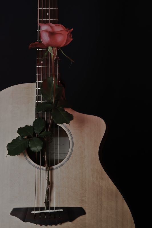
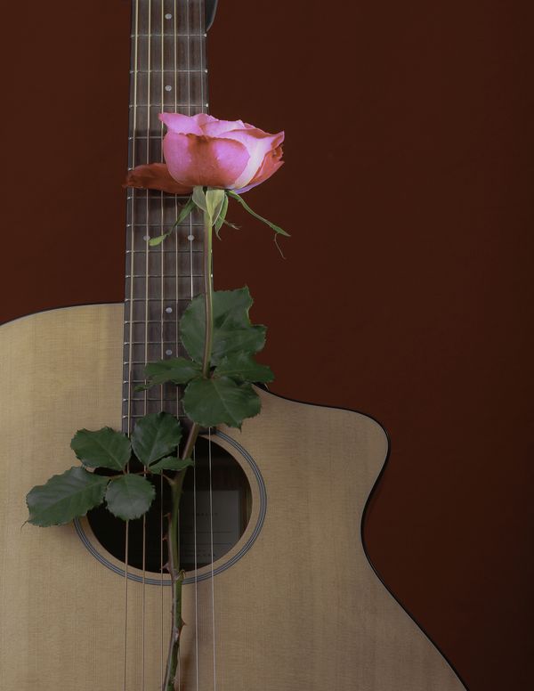
Guitar and rose
Oct 28, 2011 11:10:22 #
Oct 28, 2011 11:41:11 #
Oct 28, 2011 11:43:42 #
Oct 28, 2011 13:05:46 #
Oct 28, 2011 13:15:03 #

Oct 28, 2011 14:33:46 #

Oct 28, 2011 14:36:58 #
Oct 28, 2011 15:04:02 #
I like #1 but if you can put the lighter rose in there it would really POP..... the rose seems to get a little lost in the darkness... could just be my eyes....Great composition..
Oct 28, 2011 15:07:10 #

I think (on MY monitor anyway) the first one is a little too dark, but I love the "cooler" colors. The second one is just right in brightness but is "warm" in colors... not my fave in this instance, but I can at least see the details better.
Compositionally, I think this is a great shot either way!
Therefore, my vote is for the second one.
Compositionally, I think this is a great shot either way!
Therefore, my vote is for the second one.
Oct 28, 2011 16:27:41 #

I like the first - mainly because it shows more of the guitar. I like saturated photos, but in the case, subdued works very well. I agree: Nice composition.
Oct 28, 2011 16:30:27 #
Oct 29, 2011 06:36:12 #
guy145 wrote:
which do you like?
I prefer the second one. To me the first one is way to dark. Perhaps it is my monitor. Vote for #2.
Oct 29, 2011 07:01:25 #

Oct 29, 2011 07:13:42 #
Both - it might depend on the pictures use/surroundings. I think #1 looks more "formal", classy. #2 could be a poster/advertisement. In #2, the rose is too brightly pink for me and doesn't really complement the background hue.
Oct 29, 2011 10:38:42 #
I like both, but best of all I liked reading the replies. Some supported my first thoughts and all made me THINK!
If you want to reply, then register here. Registration is free and your account is created instantly, so you can post right away.