Challenge: Black and White Images-Jan.18-20
Jan 19, 2018 11:13:31 #
Clicker2014 wrote:
Please click on the download. :-)
All are excellent images. I especially like #1. The pano and PP is excellent.
Jan 19, 2018 11:37:21 #
photophile wrote:
I enjoy experimenting with images to see which ones are enhanced by bw conversion.
The courtyard at the Getty Villa Museum in Pacific Palisades, CA. The color version of this pano ended up on the cutting room floor. Converting to B&W revived it.

Jan 19, 2018 11:41:14 #


Jan 19, 2018 11:57:08 #

Jan 19, 2018 12:35:16 #
And now for something completely different. First time posting a picture and ended up with two views. Should do better next time.

Jan 19, 2018 12:40:20 #

I've posted this before, but it's one of my faves. I don't do too much B/W conversion. Taken July, 2015.
Jan 19, 2018 13:55:40 #
I love entertaining on my new deck

Jan 19, 2018 14:16:35 #
Thought I would post 2 from the archives
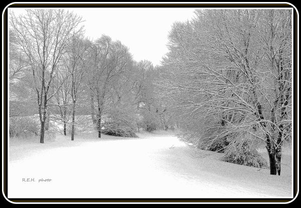
front yard
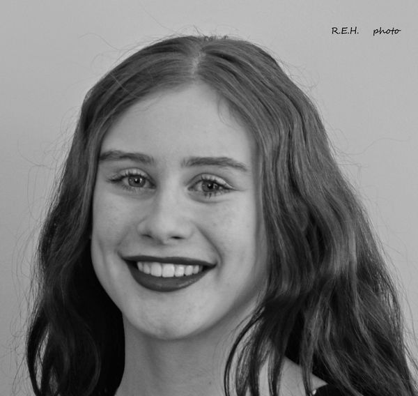
Amy at 15
Jan 19, 2018 14:52:11 #
Jan 19, 2018 15:02:12 #
William wrote:
black and white defined a lot
p7 - Bill! Love this - the style, "the many shades of gray to black" This belongs on a wall.
Jan 19, 2018 15:02:54 #
Jan 19, 2018 15:05:16 #
RichardQ wrote:
This comparison illustrates why I often disliked d... (show quote)
p8. Great example and narrative of how "color" sometimes just doesn't enhance the subject message.
Jan 19, 2018 15:06:51 #
WILLARD98407 wrote:
Late entry.
p8 What a distinctive place this must be. You showcased it well
Jan 19, 2018 15:08:57 #
Clicker2014 wrote:
Please click on the download. :-)
p9 So crisp and clear in download. #1 is awesome and love how the gears /wheels are frames w steam - an illusion of movement or about to be moving.
Jan 19, 2018 15:09:37 #
AnnMurrey wrote:
A few this morning before I go to work.
p9 The deer is especially sweet.
If you want to reply, then register here. Registration is free and your account is created instantly, so you can post right away.