Which Post Process Is Better?
Nov 23, 2017 12:04:59 #
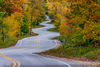
I prefer the look of #1 as it is more natural. The tree leaves and grass in #2 seems over saturated. JMO 
Nov 23, 2017 12:12:34 #

I prefer the second photo because the tree trunks are more detailed and the shadows are sharper in the second photo.
Nov 23, 2017 12:16:44 #

Nov 23, 2017 12:28:46 #
ICN3S
Loc: Cave Junction, OR
Definitely the first one......more natural looking. Would like to see original.
Nov 23, 2017 12:35:00 #
Nov 23, 2017 12:56:19 #
Everyone says the first one looks more natural, or at least a lot of people do. I guess beauty is in the eye of the beholder. To me the sky in the second picture looks much more real and so does the grass and the leaves. The colors are more specific and brighter in the second picture. Also, the second picture seems to me to have more detail. It has probably been sharpened more, and I like that, but sharpening can have pluses and negatives. But as I said before both pictures have some great qualities. It just depends on what mood you want to portray.
Nov 23, 2017 15:18:11 #
Prefer #1, except sky is oversaturated and trees need more contrast. Agree, something wrong with sky in #2 as there are light patches at left side of barn and behind trees. Do like the look of the tree trunks in #2. My guess is #2 is Luminar with some adjustments to sky. Are you going to keep us in suspension to tell which is which?
Nov 23, 2017 19:26:43 #
#1 the colors seem more natural even though you loose a little detail compared to #2.
Nov 23, 2017 20:22:44 #
I prefer the second picture, John, because of the color/brightness on the front of that building. The first one isn't bad; I just prefer the second one. 
Nov 23, 2017 21:14:30 #
Nov 23, 2017 21:15:07 #
I prefer the first. The second one looks almost as if there is chromatic aberration in the leaves against the sky.
Maybe too much contrast/saturation?
Maybe too much contrast/saturation?
Nov 24, 2017 08:03:34 #

Nov 24, 2017 08:11:59 #

Some of you missed my first reply, so I’m re-posting it here:
Thanks to all of you. The first one was done with simple, basic Apple Photos. The second was done with Luminar--my first attempt with that program, and I think I overdid it a bit. Since it was my first photo edit with the program, I still have a lot to learn about it. For those of you who commented about the sky, it was just about that blue the day I took the photo--sort of surreal.
Thanks to all of you. The first one was done with simple, basic Apple Photos. The second was done with Luminar--my first attempt with that program, and I think I overdid it a bit. Since it was my first photo edit with the program, I still have a lot to learn about it. For those of you who commented about the sky, it was just about that blue the day I took the photo--sort of surreal.
Nov 24, 2017 16:11:57 #

Depends on what you were going for. I like the first better. the second appears to have something going on at the left of the barn. Sort of like the halo that is sometimes seen on HDR processed images.
Nov 24, 2017 18:11:33 #
gnawbone
Loc: Southern Indiana
#1 has a lot of 'fringing' in the branches above the barn, also the barn roof at the peak and the left side of the roof and the same 'fringe' - it is not there in #2. Other than that I like the barn and grass in #1 and the trees in #2.
If you want to reply, then register here. Registration is free and your account is created instantly, so you can post right away.