Foreground shadows
Oct 6, 2017 13:49:34 #
Chicflat
Loc: Tulsa, Ok,
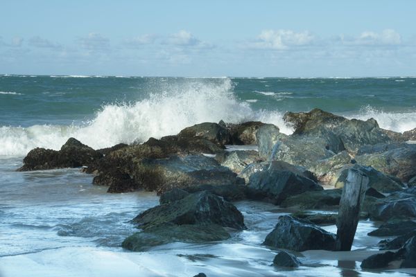
I took this picture while on a cruise so I can't return to the location to retake the picture. I used a Canon T6s with a Sigma 18-200 lens and probably with a UV filter. It was mid-January at 2:30 in the afternoon, but it seemed more like 4:00 in terms of the brightness of the day. The humidity level was moderate and I think the tide was coming in. I usually shoot with aperture priority, so I think that was the mode.
Since I live in the middle of the U.S., I was focusing my attention on the breaker, especially the splash. I have become quite aware of most of the objects when I am framing a shot and adjust my pov accordingly. Thus, the placement of the post while imperfect was intentional if dissatisfying compositionally. What I did like about this shot was the spray of the wave. About this, my personal preference tends away from the longer exposures with the silky waves; i prefer the sharper explosive effect. I also set up my shot to capture the light as it was reflected by the sand. Everything else in the shot was framed to hold (embrace) these.
iI can't recall many of the details of my post processing so what follows is a general review. I use Elements 15 I opened the image in camera raw,adjusted for shadows,contrast slightly, vibrance/clarity slightly, and sharpness. I clearly straightened the image after opening the image in the editor. None of the other adjustments that I made in the editor really were enough to add to the image so those would have been minimal.
I hope this long-windedness will prove useful, since I am now at a standstill. My greatest concern at this point lies with the entire broad swath of shadowed area. It seems almost out of sorts with the more general brightness of the image. So. what can be done to modify that area without detracting otherwise? I include the original shat as well as the version I have come to.


Oct 6, 2017 15:09:02 #

Chicflat wrote:
I took this picture while on a cruise so I can't r... (show quote)
Not knowing much about elements, except that it is supposed to be a "mini" Photoshop, my first thought was to use layers. Blue is the color of shadows, so decreasing saturation and/or increasing luminance ought to greatly reduce that shadow look. You probably cannot do that without layers [PS] or an adjustment brush [LR] because you only want the desaturation to affect that area, not the rest of the image.
Oct 6, 2017 15:51:22 #
I've been using Google SnapSeed since my ancient laptop isn't up for PS just yet (soon to upgrade). I downloaded your original and straightened, did some selective brightening to the shadow area and again to the rocks. A bit different than your edits and I can share back here if you want or send private. Your call.
Oct 6, 2017 16:34:41 #
I might be wrong, but I prefer the original darkness. It seems to be in the shadow of a high cliff. Then the ocean spray is more highlighted in the sunlight!
Oct 6, 2017 18:37:52 #
Oct 6, 2017 18:39:28 #
Chicflat
Loc: Tulsa, Ok,
Thank you for your observation. It may be the pronounced shadow line that I find to be a flaw.
Oct 6, 2017 18:40:36 #
Chicflat
Loc: Tulsa, Ok,
I would be happy to see what you have done. All ideas will help me. Thank you.
Oct 6, 2017 21:55:44 #
Here's my Snapseed edits. Straighten, brightness along shadow line, and second pass on brightness for the rocks.
Looking at them again the rocks may need some selective saturation adjustments to get the color more consistent.
Android Snapseed
https://play.google.com/store/apps/details?id=com.niksoftware.snapseed&hl=en
Apple Snapseed
https://itunes.apple.com/us/app/snapseed/id439438619?mt=8
It looks like there are PC and Mac versions as well... but I have other tools for my PC.
Cheers
1) straightened original & brightened along shadow line (brushed in)
2) added extra brightening to #1 on rocks only
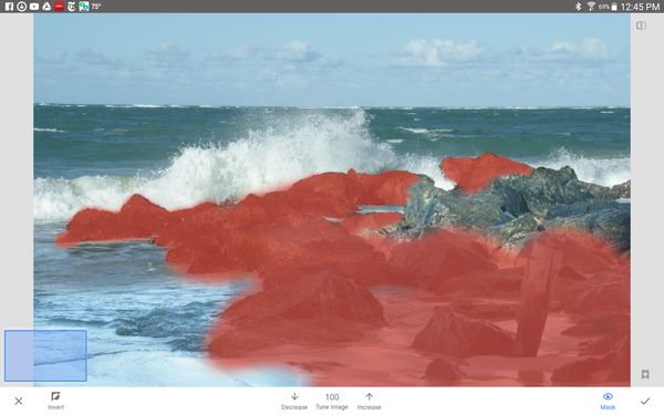
Screenshot showing Snapseed stack of edits applied to #2
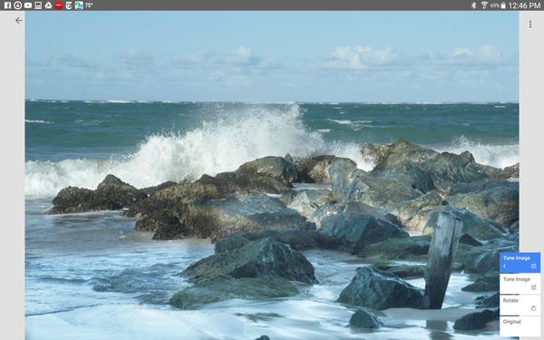
Screenshot showing brushing in lightness on rocks
Oct 7, 2017 13:33:08 #
Chicflat
Loc: Tulsa, Ok,
Thanks so much. You have much more nearly gotten to what I was hoping to get. I really like the the fact that you got the shadows brighter than I was able to while maintaining a blend that I was nor able to achieve. Let me add that using the brush to select the way you did was not something that I had thought to do. I will try to remember to explore my available toolsas I work. Also, thanks for the links; I will try it.
Oct 7, 2017 23:41:49 #

Good shots! I like the second one much better since it's lighter and the horizon is straight.
If you want to reply, then register here. Registration is free and your account is created instantly, so you can post right away.