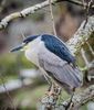
Another go at color vs. B&W . . .
Sep 9, 2017 08:56:19 #
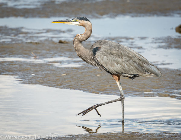
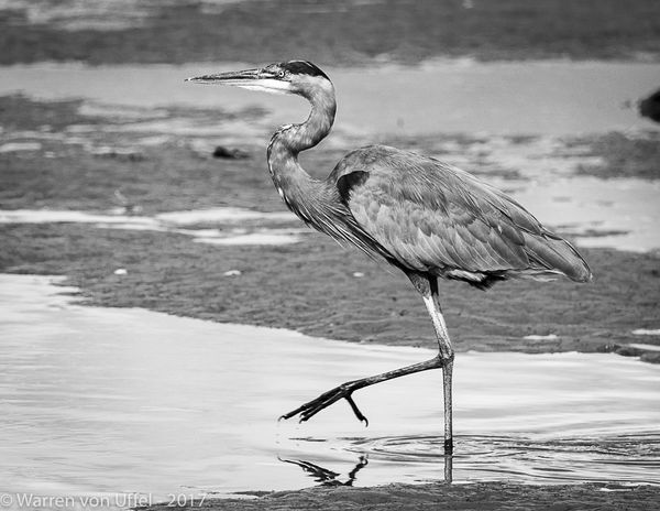
Maybe this will be a far better demonstration of the potential use for B&W.
Here is the same image processed in both color and B&W.
Neither is proposed as the correct way to process this image. What I'm attempting to illustrate is that each has its own message.
Clearly color is the expected while B&W is not. Color presents a more nature GBH and its environment and perhaps one that we've all seen many times.
While the B&W processed image may grab your attention faster and hold it longer while you look at the image content more closely. . . . and perhaps even begin to study the bird in far greater detail.
Just my own take on color vs. B&W . . . .your comments?
Sep 9, 2017 09:08:13 #
danlsmith
Loc: Columbus Ohio
Both are great and create a real mental 'image', not just a photo. However, I prefer the color one best. Good composition.
Sep 9, 2017 09:11:27 #
I also prefer the color. Like both but the b&w for me could use more contrast.
Sep 9, 2017 09:27:52 #
Sep 9, 2017 09:46:33 #

warrenvon wrote:
Maybe this will be a far better demonstration of t... (show quote)
I appreciate the bw image most in this comparison.
Sep 9, 2017 09:49:52 #
Your "B&W" rendition has an overall dull grey look. Had you made a really good B&W photo, perhaps some opinions would be changed.
Sep 9, 2017 10:04:49 #
I still prefer the original b/w since I believe that the background, while true to reality,is a distraction.
Sep 9, 2017 10:07:35 #
What a wonderful set of comments.
Looks like we've a good conversation started .. maybe others would like to add their editions as well.
Looks like we've a good conversation started .. maybe others would like to add their editions as well.
Sep 10, 2017 07:14:44 #
B&W works best with a lot of contrast. There isn't much in the color photo. Maybe get more with spot metering?
Sep 10, 2017 07:57:51 #


Sep 10, 2017 11:53:17 #

Sep 10, 2017 12:23:51 #

Sep 10, 2017 18:21:12 #
Sep 10, 2017 20:39:58 #

Sep 15, 2017 13:01:58 #

oduncan4 wrote:
Another vote for color. I love black and white but it does not seem to work here.
Same here!!
If you want to reply, then register here. Registration is free and your account is created instantly, so you can post right away.