HouseBoat Dock
Feb 1, 2017 01:24:03 #
Acufine3200
Loc: Texarkana USA
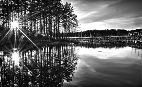
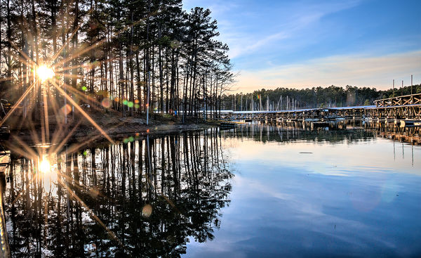
After years of film, and then basic digital I'm finally getting an opportunity to explore HDR...latent artistic skills so to speak. This was shot last fall with a D750, 24-120/f4. Exposure was F/22 @ 1/200: 1250 ISO. Lens was at 24mm. Processed in both Photomatix, and Photoshop CC.
Spent first 30-years of life in a darkroom, so I naturally see most shots in B&W, although I'm starting to see life in color. I understand HDR isn't for everyone, but I figure over the next year as I go from one extreme to the next I'll land somewhere in the middle.
Spent first 30-years of life in a darkroom, so I naturally see most shots in B&W, although I'm starting to see life in color. I understand HDR isn't for everyone, but I figure over the next year as I go from one extreme to the next I'll land somewhere in the middle.
Feb 1, 2017 09:32:07 #

Feb 1, 2017 16:35:48 #
Acufine3200
Loc: Texarkana USA
Thanks!--as badly as I want to feel good about the color shot, I'm with you on the B&W. Having opened it up in this message, and viewing them on a smaller screen I realize a lot of their intensity is lost. I did all of my pp on a 27" screen.
Feb 2, 2017 08:33:54 #

I am not a fan of HDR but do dabble in it sometimes, I take care no to overdo it, your colour photo is spot on and you cannot tell it has been created with an HDR process.
Feb 2, 2017 17:46:51 #

Apr 1, 2017 20:16:48 #
Apr 3, 2017 21:27:53 #

I like them both. The color shot looks slightly overcooked but I still like it. My philosophy on it is if I can tell it's been processed it's too much but that's me. I have seen some indoor architectural photos done in HDR that are obviously HDR but I still like them, as I like your photos. Nice work.
May 3, 2017 20:39:53 #


May 3, 2017 21:26:28 #
Acufine3200
Loc: Texarkana USA
Thanks for feedback. I'm actually ordering large prints of each. One at home, and one at the office. I'll see which friend notices first!
May 3, 2017 21:29:40 #
Acufine3200
Loc: Texarkana USA
10m Player--you've nailed my one concern with HDR--over-cooking. My objective as I work on this side of the medium will be aiming for ultimate tones, as opposed to overtones, lol. Thanks for the feedback.
Jun 1, 2017 09:17:56 #
Acufine3200 wrote:
After years of film, and then basic digital I'm fi... (show quote)
I like your HDR version quite a bit. I come from the graphic printing world and spent a lot of time printing b&W photos. For me it looks like your B&W version is a bit plugged/over exposed not totally sure because we can't see a download version.
I have used Photoshop, Photomatix, and Aurora software to create HDR. My favorite is Aurora but I think it is still only available on Mac. I have found that 90% of the time I can use one exposure to make the HDR and comes out quite well. Although not true if you have blown out areas or extremely dark shadows. I am a fan of HDR when not, as they say, over cooked except for old worn out subjects that need some color pop like rusted things. Found that HDR can be used to bring out some colors on a flat drab landscape photos adding a lot of color detail. Your use here has just the right amount in my book.

Jun 1, 2017 10:59:01 #
Acufine3200
Loc: Texarkana USA
Thanks! My background includes growing up shooting for a hometown newspaper. Our old web press couldn't handle contrast, so I had to throw-out everything I learned about the zone system and learn to make low contrast photos "pop." After landing on the North Texas State campus in 1980 I had to relearn the zone system as our then state of the art press could handle anything. Now we have the giant leaps forward over the past decade. This is fun! As digital and HDR have emerged I've been more apt to work towards opening up areas generally lost through over/under exposures. The B&W print here was an afterthought l, and I was amazed at the results.
Oct 14, 2017 05:28:16 #

I like the double sun stars and lens flares. I really can't tell it's HDR, due to it's very real appearance.
Oct 15, 2017 14:56:22 #
Acufine3200
Loc: Texarkana USA
Thanks, papa! Having followed your comments on a number of posts we're probably cut from the same mold, so your critique is valuable. HDR is quite challenging--improve the image, but don't overcook. Ansel Adams meets Thomas Kinkade. Since I don't shoot for print anymore I'm having to learn to mentally preview my shots for output to digital screens.
Oct 22, 2017 11:48:20 #

Nice choice of a photo for display in Color and B&W. Looks nice in both. I'm not a fan of BIG lens flares but it looks good here.
I also don't print for my self, finding display on a screen is far more flexible and vibrant.
I also don't print for my self, finding display on a screen is far more flexible and vibrant.
If you want to reply, then register here. Registration is free and your account is created instantly, so you can post right away.