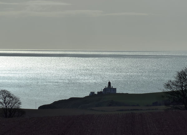
Lighthouse silhouette.
Apr 14, 2017 12:25:25 #

I invested time and effort to get this shot and I like it, but I can't decide if my opinion of it is unbiased or not. What do you think?
-
-
Apr 14, 2017 13:07:51 #

As I'm strangely attracted to small elements in distant and vast settings myself, I like this 
I would enjoy a bit more detail in the foreground (it maybe be there and is just my too-bright living room), but the sparkling water and the composition are appealing to me, with the tree on each side and the color palette adding to a serene feel.
I would enjoy a bit more detail in the foreground (it maybe be there and is just my too-bright living room), but the sparkling water and the composition are appealing to me, with the tree on each side and the color palette adding to a serene feel.
Apr 14, 2017 13:20:41 #
Linda From Maine wrote:
As I'm strangely attracted to small elements in distant and vast settings myself, I like this
I would enjoy a bit more detail in the foreground (it maybe be there and is just my too-bright living room), but the sparkling water and the composition are appealing to me, with the tree on each side and the color palette adding to a serene feel.
I would enjoy a bit more detail in the foreground (it maybe be there and is just my too-bright living room), but the sparkling water and the composition are appealing to me, with the tree on each side and the color palette adding to a serene feel.
Thanks for commenting. The foreground is just bare earth (a ploughed field) so there wasn't anything to bring out. It was the combination of the bright water and the silhouette that caught my eye.
Apr 14, 2017 13:34:43 #
Apr 14, 2017 14:17:44 #
R.G. wrote:
Well, here's one opinion  .
.
-
.-
Oh gheesh, curses to amersfoort for starting that topic
Apr 14, 2017 14:18:36 #
R.G. wrote:
Thanks for commenting. The foreground is just bare earth (a ploughed field) so there wasn't anything to bring out. It was the combination of the bright water and the silhouette that caught my eye.
I assume you like the composition as-is, so no thought to a trim off the bottom?
Apr 14, 2017 14:27:45 #
Linda From Maine wrote:
I assume you like the composition as-is, so no thought to a trim off the bottom?
As I suspected, while it focuses the viewer's attention on the lighthouse, it leaves the shot looking a bit unbalanced. If those trees had been a bit closer I could have given it an overall closer crop but I didn't want to lose them.
-

Apr 14, 2017 14:35:14 #
R.G. wrote:
As I suspected, while it focuses the viewer's attention on the lighthouse, it leaves the shot looking a bit unbalanced. If those trees had been a bit closer I could have given it an overall closer crop but I didn't want to lose them.
-
-
I like this a lot. If you have time, talk about what you mean by unbalanced, please. Are you uncomfortable with so little land? For me, the crop further emphasizes the size of the ocean relative to this tiny lighthouse. Vast and all that
 Thanks, R.G.!
Apr 14, 2017 14:46:25 #

R.G. wrote:
I invested time and effort to get this shot and I like it, but I can't decide if my opinion of it is unbiased or not. What do you think?
-
-
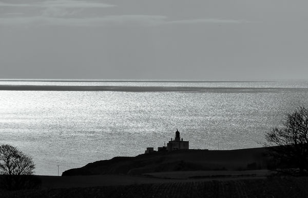
With the muted tones I wonder if this would be better in black and white. S-
Apr 14, 2017 14:52:59 #

R.G. wrote:
I invested time and effort to get this shot and I like it, but I can't decide if my opinion of it is unbiased or not. What do you think?
-
-
I think that the panorama crop and Steve's b&w suggestion is the way to go RG.
Apr 14, 2017 15:01:44 #
Linda From Maine wrote:
I like this a lot. If you have time, talk about what you mean by unbalanced, please. Are you uncomfortable with so little land? For me, the crop further emphasizes the size of the ocean relative to this tiny lighthouse. Vast and all that Thanks, R.G.!
Thanks, R.G.!I usually don't feel comfortable with small, thin slivers of one of the elements (land, sea, sky or whatever) along an edge of the frame. I usually prefer all of the main elements to be given due prominence. But as you say, in this shot the vastness of the sea/sky is a legitimate aspect of the shot so perhaps it's OK to have it emphasised. Perhaps I was being over-cautious.
Apr 14, 2017 15:10:30 #
St3v3M wrote:
With the muted tones I wonder if this would be better in black and white. S-
Graham Smith wrote:
I think that the panorama crop and Steve's b&w suggestion is the way to go RG.
This is a quick conversion with a bit of contrast. It would probably need more careful manipulation of the light levels and contrast for best effect. But I miss the soft colours.
-
Apr 14, 2017 15:24:09 #
Apr 14, 2017 15:46:27 #
R.G. wrote:
As I suspected, while it focuses the viewer's attention on the lighthouse, it leaves the shot looking a bit unbalanced. If those trees had been a bit closer I could have given it an overall closer crop but I didn't want to lose them.
Trimming a bit of sky off the top would re-establish the balance. Of course, to do so may perhaps transform the image to something else than originally intended.
Apr 14, 2017 15:46:48 #
R.G. wrote:
I thought B&W versions got better ratings  .
.
-
.-
Not always apparently
If you want to reply, then register here. Registration is free and your account is created instantly, so you can post right away.