My Image - Your View: Anthony Gormley Statue RESULTS
Mar 3, 2017 18:27:28 #

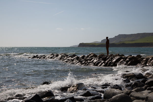
From the post My Image - Your Look: Let's Experiment With Editing we challenged you with Anthony Gormley Statue and made some wonderful edits.
Now it's your turn to vote! Before you do though, look at the original and decide what works best for it from the images below.
- Anthony Gormley Statue
Cast your vote here until midnight, Saturday ET. We'll post the winner soon after and let them decide what goes next! S-
Now it's your turn to vote! Before you do though, look at the original and decide what works best for it from the images below.
- Anthony Gormley Statue
Cast your vote here until midnight, Saturday ET. We'll post the winner soon after and let them decide what goes next! S-
Mar 4, 2017 04:17:05 #

Mar 4, 2017 05:58:26 #
Mar 4, 2017 07:51:22 #

#6 (R.G.'s). Three were missing from the voting earlier; fixed now.
Mar 4, 2017 07:51:58 #
Linda From Maine wrote:
#6 (R.G.'s). Three were missing from the voting earlier; fixed now.
THANK YOU! S-
Mar 4, 2017 08:03:06 #
Mar 4, 2017 08:45:08 #
Oh, man! Now I am going to have a hard time. I like # 7, now. Maybe you should just disqualify me. I am sooo indecisive.
Mar 4, 2017 09:55:35 #

I'm being too picky for words. They're all nice, but each one has something that sort of spoils it for me. So I'll go for the least objectionable and vote for #3. Sorry, guys!
Mar 4, 2017 15:08:25 #
Mar 4, 2017 15:08:43 #

Mar 5, 2017 09:31:51 #

Mar 5, 2017 14:48:14 #
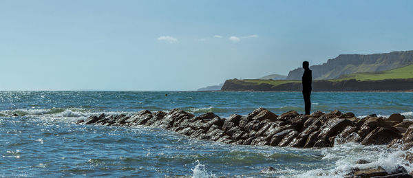
Great job everyone, and thank you! This week's winner is R.G. with 2 votes!
Now it's time to pass the torch and find out how it was done with more to follow.
Thank you again!!! S-
.
Now it's time to pass the torch and find out how it was done with more to follow.
Thank you again!!! S-
.
Mar 6, 2017 11:28:45 #
St3v3M wrote:
Now it's time to pass the torch and find out how it was done with more to follow......
All fairly straight-forward stuff. I used the Adjustments brush in LR to add colour to the washed out bits in the sea and sky. The area round the statue is probably a bit too dark because I tried to get rid of the diffuse haloing surrounding it but it was very persistent and I think I overdid killing the highlights. If I went back to it now I'd ease off on dropping the highlights in that area.
If you want to reply, then register here. Registration is free and your account is created instantly, so you can post right away.