Breaking the rules of composition
Jan 5, 2017 05:22:45 #
wdross
Loc: Castle Rock, Colorado
Linda From Maine wrote:
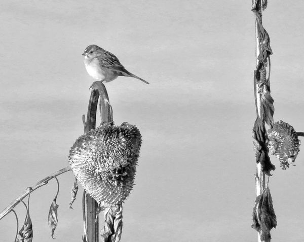
OK, thanks again for your time! Here are two of the several closer shots I was able to capture. I've done several processing experiments, including a b&w with grunge. #1 below has a texture file added. #2 below has a lot of added color and warmth, for MtnMan 
For these two photographs, I think the compositions are stronger than the first set.
The first photograph is very creative from an art point of view. On the first one, I would change it from a horizontal crop to a vertical crop by cropping in from both the the left and right sides, keeping the stalk out of, and from touching, the corner. This would allow the sunflower's stem to lead into the two red winged blackbirds and sunflower which is, in my opinion, a very strong circular composition, keeping one's eye from escaping. I also like the color treatment you applied.
The second is a much more traditional nature photo. On the second, I would crop both from the top and right. This takes away some of the empty space, filling the space with bird and sunflower better, and concentrates the triangular composition by centering it a little more.
Jan 5, 2017 07:12:51 #
Jan 5, 2017 07:31:43 #

Hi Linda-
In my opinion-
Tones in middle image are more balanced and more pleasing, highlights in the sky aren't so washed out- in this case I think color would have worked better giving more definition and separation to the elements in your image.
As far as composition-
Difficult to tell what you intended the subject to be- bird or plant life. The plants overpower the bird. When the bird is looking out of the frame I find it more pleasing to expand the space he is looking towards by repositioning him to the right inside the frame.
But really all just opinions. Whatever pleases you :)
Jan 5, 2017 08:03:32 #

I think this works, but to me it's top heavy and unbalanced. If I were to crop it at all, I'd do so from the bottom until balance was achieved. Balance isn't always necessary or a hard and fast rule, but it generally gives a more pleasing composition. The extra contrast in the second shot works best for me, too.
Jan 5, 2017 08:35:47 #

Before reading other comments. Number 3 is weakest. Low-key photos do very little to draw me into the photo. They remind me of the faded portrait of my grandfather who died when I was three. Number one is very good however, I would tilt in favor of number two because of better and sharper contrast on the pole in the second. The first is almost blown out on the left side of the right pole. Is a fine distinction. The same is true of the stem on the left in the second one. A bit more texture whereas in the first it looks almost blown out.
No critique of the composition. The eyes are drawn in the same direction, up if the glance focuses on the middle third and down and out if focused on the outer third.
Number the two the winner by a split decision.
No critique of the composition. The eyes are drawn in the same direction, up if the glance focuses on the middle third and down and out if focused on the outer third.
Number the two the winner by a split decision.
Jan 5, 2017 08:40:53 #

Linda, some thoughts:
1. I prefer the second offering.
2. I don't see that the right sunflower stalk adds anything to the photo, so I'd get rid of it.
3. That crop also eliminates the bird looking out of the photo rather than into it, which always bothers me. If the bird were facing the second stalk, I might think differently.
4. I always see rules of composition as good starting places rather than requirements. I do what I like rather than what so-called rules tell me to. I might add, however, that my finished product almost always falls within the realm of some rule somewhere, intentional or not.
Jan 5, 2017 08:40:56 #
Linda:
I think the vertical stalk at about the right "one third point" breaks the photo up into two distinct sections. On the left of it, it creates a framing element of sorts that helps focus the eye on the bird, with the bird roughly centred in the left panel. To the right of that vertical, there is really not much to look at other than the drooping bit.
Years ago an instructor suggested to me that it is best to avoid elements like that if they completely cut through the scene (not that one can always have this option) ... but they are OK if they don't cut all the way through if that makes sense. For example, if we could see the top of that vertical piece in the scene, with a bit of background above it, it and the stuff to the right of it becomes more a part of the overall scene.
As a general "rule" I often find myself wanting/needing to break the "rules" of composition. In particular, I have often found myself looking at a scene where the symmetry in the subject makes it a perfect choice (at least in my mind) for locating it dead centre.
Just my two cents ... :)
Jan 5, 2017 08:55:34 #
Rules are guidelines to learn from and not set in stone. The final produce is from the image created by the photographer. Sometimes ignoring the "rules" makes for stronger images. At some level, it all becomes reflexive and then you decide what to follow, how to think differently and in the end make the image that pleases you the best.
Nice work and thoughts. I like the environmental element of the bird in the scene instead of making the bird the focus of the image. I have a nice moose in winter in Alaska, it is a tiny portion of the whole image and works for me, though some others would prefer the moose the subject instead. I also took other images so, the one environmental image does not stand alone, but is part of a series.
Did you make others changing composition to bring other elements in the images. Which of all pleased you the most?
Jan 5, 2017 08:59:57 #
Szalajj
Loc: Salem, NH
I haven't worked with B&W in too many decades, and it was in a darkroom setting.
Understand that I'm viewing these on a tablet, but it's a High Definition screen.
My initial impression of the first 3 shots was that 1 & 3 were both over exposed and lacked sharp details. #2 contains more details because it appears sharper, and isn't over exposed.
Choosing to work in B&W, instead of Color is often a personal choice, but shooting in color affords you a better range of details, then when you convert the shot in post processing to B&W you retain the best possible amount of those details. And as someone suggested, you could add color back to the bird for a creative effect!
If you were trying for the rule of thirds, you nailed it with the vertical lines, but missed the mark with the placement within the shot of the sunflower and bird. I would have placed them just a little lower in the frame.
But like others have commented, the stalk on the right side of the shot is distracting and draws ones eye away from your primary subject, the bird on the sunflower. So the question would be, portrait or landscape orientation, which one should you choose?
I will often shoot both, and make the decision in PP.
I do like the color shot you posted, but my initial feeling was that the Browns were over saturated. There is a fine line between matching the remembered colors, and pushing them over yet line. But again this is a personal preference.
I often see eagle shots here on the forum that I feel are over processed, because all of the feathers appear to be outlined in white.
Beauty is in the eye of the beholder.
Each of us have our own personal preferences and reasons for our choices.
But I'm going to say that you should always start with a shot that's been well thought out, properly exposed, and is in sharp focus. Then you have a good basis to work from in post process. Use the old trick of blocking out a potential shot with your thumbs and forefingers if you're undecided just what to include or crop out of a shot!
It's been said that you should have the birds eyes in sharp focus. So depending on your depth of field, if you focus on the eyes you should end up with good results. My initial feeling was that the stalk on the right was in sharp focus instead of the bird and sunflower on the left. What was your original intended primary subject?
Jan 5, 2017 09:10:54 #
I tried a crop on my iPad and prefer the resulting composition since the bird is more the center of interest.
Jan 5, 2017 09:11:19 #

As you have already noticed Linda you will get many different opinions on these photographs because we all have different ways to see the world. Visual design has guiding rules that can be broken but we have to make sure that doing so we still end up with a pleasant photograph when presented to the viewer.
Of the first three pictures you posted in b&w I would say the first one is the contrasty one. They do not have in my personal opinion a strong composition but they are balanced. It is not always possible but three objects work better than two when it comes to visual design.
In your last two shots I favor the second shot. I have to admit that I do not like the colors but the composition is excellent although at times the flower robs attention to the bird and kind of competes with it. Cover the flower and you should see a different perspective. This is easily critiqued here but in the field things are a little different and many times we have to go with what we have.
I have the tendency toward pastel colors and I have done what I could to obtain those colors with my cameras. It was much easier with the first generation of colors in bodies like the D1X, D200 and D2X. More modern cameras require some work to get to them. Obviously, colors are subjective and each one of us has a preference.
Jan 5, 2017 09:14:05 #
It's somewhat unusual, #2 has the crispness I prefer.
The composition has a certain symmetry, which is interesting.
Viewed as a scene, rather than single object focus works for me.
The composition has a certain symmetry, which is interesting.
Viewed as a scene, rather than single object focus works for me.
Jan 5, 2017 09:15:14 #

tbell7D wrote:
Linda, I first have to say this is not a photo tha... (show quote)


Thank you, Tom. I appreciate being given just a warning this time out
 I also appreciate how hard it is to offer meaningful feedback when the subject and/or pp is not of one's usual area of interest. I very much for your time!
Jan 5, 2017 09:19:11 #
Jan 5, 2017 09:23:24 #
G_Manos wrote:
img src="https://static.uglyhedgehog.com/images/s... (show quote)
 I guess I'm the odd man out, since I like #3 in terms of contrast (or rather, lack of it). As to composition, you surely are breaking the rules! I agree that, with the stalk on the right in the picture, it's hard to figure out what the message is, and what that stalk has to do with it. I/O/W the right stalk adds little if anything to the scene. Like others, I'd crop it out and compose what's left. I also agree that there are no rules, as such, but there are guides - the rule of thirds being one. It seems to work much of the time.
Thank you for your feedback, George! Your question, "what does the right hand stalk have to do with the message" made me go back and look and think further. Perhaps if I'd been able to capture one more stalk & flower in the frame, especially if it was angled and/or tangled and leaning out of the frame, it would have been a stronger visual and also less likely to produce the suggestion to go with just one stalk.
Regarding a more dreamy edit, sometimes I have an idea in my mind, but don't go far enough. It's so helpful to see images through others' eyes in that regard. Your time and opinions are gratefully received.
If you want to reply, then register here. Registration is free and your account is created instantly, so you can post right away.