WPC 1614 - Health CRITIQUE
Apr 10, 2016 00:45:48 #

Bushpilot's WPC Entry has been selected for the Photo Critique Forum* to find out what could have done to make it better.
Be nice, but be honest as this may help everyone with their craft. Thank you everyone!
From WPC 1614 - Health RESULTS http://www.uglyhedgehog.com/photo_contest_ratings.jsp?pcnum=216
* If you are new to the Photo Critique Forum please read the Section Rules http://www.uglyhedgehog.com/t-279264-1.html
.
Apr 10, 2016 01:02:01 #

St3v3M wrote:
Bushpilot's WPC Entry has been selected for the Photo Critique Forum* to find out what could have done to make it better.
Be nice, but be honest as this may help everyone with their craft. Thank you everyone!
From WPC 1614 - Health RESULTS http://www.uglyhedgehog.com/photo_contest_ratings.jsp?pcnum=216
* If you are new to the Photo Critique Forum please read the Section Rules http://www.uglyhedgehog.com/t-279264-1.html
.
Be nice, but be honest as this may help everyone with their craft. Thank you everyone!
From WPC 1614 - Health RESULTS http://www.uglyhedgehog.com/photo_contest_ratings.jsp?pcnum=216
* If you are new to the Photo Critique Forum please read the Section Rules http://www.uglyhedgehog.com/t-279264-1.html
.
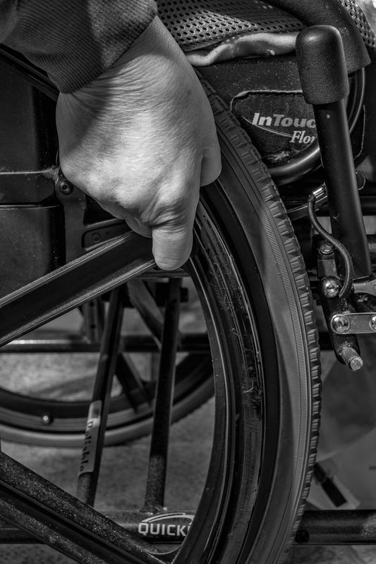
Composition, focus, DOF, and tonality are all spot on. I'd be quite content to same little, if anything needs to be done to improve this image, especially as it relates to the title.
--Bob
Apr 10, 2016 07:13:16 #

I personally would have put this one in first or second place. This is a very powerful image. You have shown just enough to get your message across. The partial arch of the tire leads the eye up and into the photo to the hand gripping the hand bar. This simple composition speaks volumes about someone who has lost their health.
Nicely done.
Nicely done.
Apr 11, 2016 07:15:57 #

Nicely done. I see nothing that I would recommend in the way of change.
Apr 11, 2016 10:05:45 #
Am in complete agreement with rMalarz comment on Bushpilots wonderful image and title. Our 67 year marriage is in its 4th year of the situation described. Superb, iconic photograph.
Apr 11, 2016 12:05:40 #
Canonman333 wrote:
Nicely done. I see nothing that I would recommend in the way of change.
Since this is the critique section what about it is nicely done?
Apr 11, 2016 13:04:27 #

Less is more, Bushpilot. You have just demonstrated that. The composition is very balanced with the hand coming from one corner, the wheel from another and then the lever makes a nice triangle of elements. The black & white rendering is as close as it comes to perfect. Nice tonal range, just enough contrast, but not so much that it looks pushed. That is so important. I see too many b&w portraits these days with the contrast and clarity pushed so far that the person begins to look like a cartoon character. To me it takes away from the realism of the image. I definitely would have voted for this. It would have caught my eye. This is the type of image that catches the eye in a contest.
Apr 11, 2016 13:36:22 #
About the meaning of this imaginative image, its immediate power makes me think, but this power is amplified because the hand is youthful, yet a wheelchair is needed.
The realism of this image spawns dwell time. Maybe it is a downer for most but actually it can be ambiguous if not both an upper and a downer.
The realism of this image spawns dwell time. Maybe it is a downer for most but actually it can be ambiguous if not both an upper and a downer.
Country's Mama wrote:
Since this is the critique section what about it is nicely done?
Apr 11, 2016 14:29:41 #

St3v3M wrote:
Bushpilot's WPC Entry has been selected for the Photo Critique Forum* to find out what could have done to make it better.
Be nice, but be honest as this may help everyone with their craft. Thank you everyone!
From WPC 1614 - Health RESULTS http://www.uglyhedgehog.com/photo_contest_ratings.jsp?pcnum=216
* If you are new to the Photo Critique Forum please read the Section Rules http://www.uglyhedgehog.com/t-279264-1.html
.
Be nice, but be honest as this may help everyone with their craft. Thank you everyone!
From WPC 1614 - Health RESULTS http://www.uglyhedgehog.com/photo_contest_ratings.jsp?pcnum=216
* If you are new to the Photo Critique Forum please read the Section Rules http://www.uglyhedgehog.com/t-279264-1.html
.
This one was my favorite. Very powerful statement. Tones are good Nothing that i would have changed on this one
Apr 11, 2016 15:55:50 #
Nightski wrote:
Less is more, Bushpilot. You have just demonstrate... (show quote)
It catches the eye of those who see excellence in the photo and skill in presenting (tonally, composition, etc.), like a judge, but sometimes I'm not so sure about the general public in these types of contests. Sometimes it seems that these contests are about which thumbnails grab the eye in a very quick scan or maybe at most a second or two. While black and white is perfect for this image, it doesn't get attention as easily as colors for the general population.
As for the image, it is difficult to try to improve this photograph. I might consider making it a tiny bit lighter by bringing up the mid-tones just a tad.
While the main focus of the image is the hand and wheel (and perhaps the hand brake), there is a lot of other things (bracing, etc.) that are all part of the overall image, but become distractions. Since words in the photo catch my eye, I might crop the bottom to just above the word "QUICK". But that is totally a personal opinion that might be just me and many might disagree with.
Jerry
Apr 11, 2016 18:58:10 #

An emotionally charged image, quite powerful. B&W was the perfect way to go as color would have been distracting. It certainly fits the category of "Health". I agree with Erdos 2 (Jerry) about the bottom crop, as there is nothing below that area that adds to the story. Perhaps cloning out or burning that rivet on the back wheel as it became a slight distraction to me.
Apr 11, 2016 22:30:42 #

Thanks to all of you for your positive responses to this image. The subject, the image and the title is an emotional response on my part. This is a photo of my wife's hand on her wheelchair, we have been married for almost 51 years, more than half of which has been dealing with our struggle with her MS.
If you want to reply, then register here. Registration is free and your account is created instantly, so you can post right away.