Rose after the rain yesterday
Mar 16, 2016 08:27:46 #
Mar 16, 2016 08:32:06 #

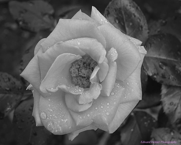
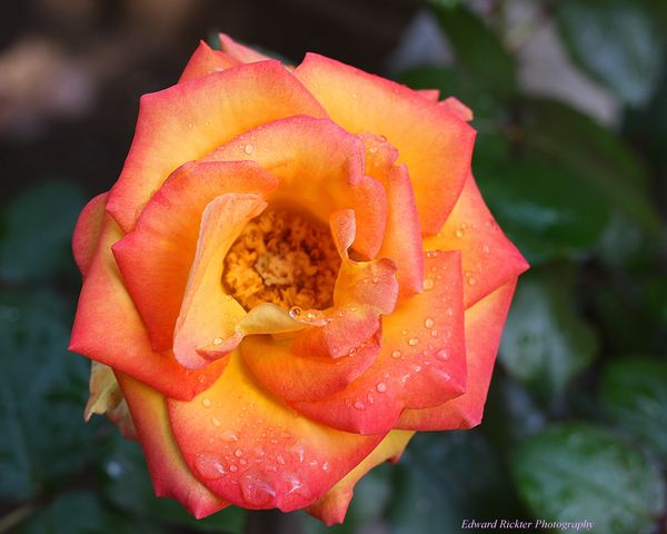
I'm a big fan of black and white, but the color photo here wins a comparison test for me. The b&w looks flat.
Mar 16, 2016 08:37:35 #

It's a tough call. I think the water drops show up better in the black and white. As Jaymatt said it might be a little flat. If you punched up the contrast just a bit it would get my nod.
They are both very nice.
--
They are both very nice.
--
Mar 16, 2016 08:47:20 #

Mar 16, 2016 09:15:44 #

Bill_de wrote:
It's a tough call. I think the water drops show up better in the black and white. As Jaymatt said it might be a little flat. If you punched up the contrast just a bit it would get my nod.
They are both very nice.
--
They are both very nice.
--
I think the water droplets DEFINITELY pop on B&W. Although the color photo is good, it doesn't have the special quality that the B&W offers. IMHO.
Mar 16, 2016 10:33:32 #

If its about the water drops , then I'd chose the b/w ,otherwise I really like the color photo
Mar 16, 2016 17:50:36 #

Mar 16, 2016 18:22:07 #

Love the second rose. Great Capture.
:thumbup:
erickter wrote:
Two versions.
:thumbup:
Mar 17, 2016 06:45:13 #
chazz4623
Loc: Prairieville, La
Really nice, both shots. The color is a bit too shallow in dof IMHO. I'd like to see the pistals in focus (as in the B&W). The B&W is a great example of close up and suitable for a wall hanger. The color is not quite up to that, again, in my opinion.
Mar 17, 2016 10:16:27 #
Mark7829
Loc: Calfornia
erickter wrote:
Two versions.
The black and white is not. It is a grey. You need to expand the tonal range in post so that it pops. Otherwise it is rather dull.
Mar 18, 2016 04:30:32 #

erickter wrote:
Two versions.
Nice images
But the color version seem a bit hot/bright to me.
If you want to reply, then register here. Registration is free and your account is created instantly, so you can post right away.