mixed bag
Mar 12, 2016 14:38:42 #

any pointers would be helpful .....thanks

Mar 12, 2016 21:34:44 #

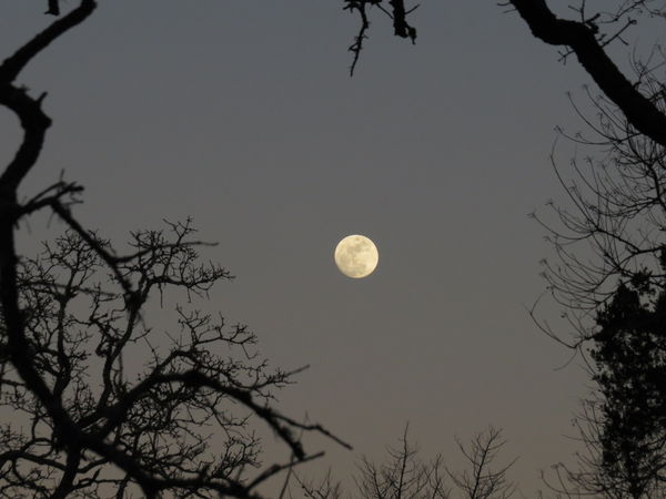
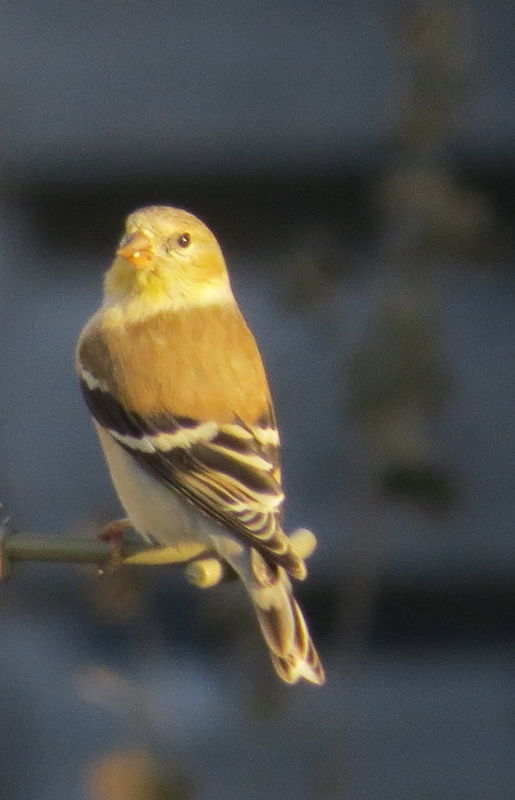
Color (white) balance needs to be corrected in #1. Number 3 is a little soft. I like the composition of #2.
Mar 14, 2016 00:58:56 #

If you want to reply, then register here. Registration is free and your account is created instantly, so you can post right away.