A Friend
Dec 29, 2015 10:00:18 #


Dec 29, 2015 12:21:43 #

She has a lovely expression. The light is soft and very nice. For me the background is a problem. The contrast of the bright white against the darker area of the fireplace distracts from your subject. There is something poking in bottom right corner that is also a distraction. If you don't have a choice in background, I would seat the subject further away and use an aperture that would blur the background. I also think that the fabulous hairdo needs more room. It is intersecting the frame.
Dec 29, 2015 12:27:07 #
Dec 29, 2015 13:38:39 #
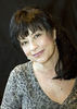
The pose makes me feel uncomfortable because she looks awkward, with her head shoved into the corner. More space in front of her would make it more natural looking.
If her head was not tilted as much she would look more natural too.
If her head was not tilted as much she would look more natural too.
Dec 30, 2015 08:06:18 #
jim hill
Loc: Springfield, IL
balexander101 wrote:
Trying for old school glamor portrait.
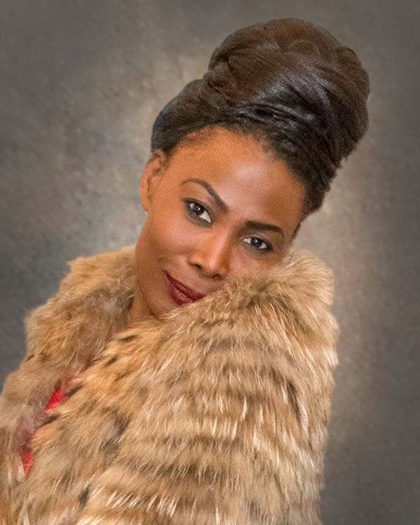
Among a couple other things that have been mentioned, the coat is most of the image. Wouldn't be bad to crop a lot of it out. You could PP out the background And put in something less eye catching. Then I might tend to straighten her up a little - too much of a lean - in this instance.
Very coy. Lovely person. Nice try.
Dec 30, 2015 08:18:15 #
Dec 30, 2015 09:32:29 #

balexander101 wrote:
Trying for old school glamor portrait.
balexander101,
You have a marvelous model to photograph, the lighting is good, the depth of field is good, and the hair style is good.
In this portrait the most important element is the attention the model is giving to the camera, this is of prime importance to your viewers when they look upon the printed product. In this regard consider the following.
1. Re-shoot the model with her hair and coat just as it is.
2. Replace the distracting background with a muslin sheet draped horizontally in front of the fireplace.
a. Use a dark gray, blue, or black sheet.
b. The purpose is to contrast the model from the background, but not distract the eye with bright content.
c. Keep the eye on the subject.
d. Using vertical lines is okay, but looks odd.
e. Using a muslin sheet, draped horizontally creates curved leading lines into your subject.
f. Imagine a standard curtain with soft flowing ripples, now turn the curtain horizontal and drape with the lowest point just behind the subject; in your photo at waist level.
3. Crop the photo half way between the shoulder and elbow, leave room around the hair for movement, and thank the model for being a good friend to the camera.
Michael G
Dec 30, 2015 09:38:43 #
Dec 30, 2015 10:37:09 #

She's beautiful and the pose is interesting and in keeping with old style glamour shots. The background is quite distracting, though. It appears that sections of the coat are OOF. Is that true, or is it simply my eyes playing tricks on me? IMHO there's too much coat and not enough of that lovely face.
Dec 30, 2015 15:23:59 #
Nightski wrote:
She has a lovely expression. The light is soft and very nice. For me the background is a problem. The contrast of the bright white against the darker area of the fireplace distracts from your subject. There is something poking in bottom right corner that is also a distraction. If you don't have a choice in background, I would seat the subject further away and use an aperture that would blur the background. I also think that the fabulous hairdo needs more room. It is intersecting the frame.
I agree with Nightski. This is possibly what she is suggesting. Would be easier to work on if you checked "store original"
Hope this helps . .
Dec 30, 2015 19:53:42 #
jim hill
Loc: Springfield, IL
Weddingguy wrote:
I agree with Nightski. This is possibly what she is suggesting. Would be easier to work on if you checked "store original"
Hope this helps . .
Hope this helps . .
Nicely done, Guy!
Jan 6, 2016 10:33:39 #
Jan 7, 2016 20:11:31 #
Jan 7, 2016 20:19:37 #
balexander101 wrote:
Very good work, how did you remove the background?
I use Topaz Remask 5 and love it. If you shoot on a plain background it makes it very easy and almost as good as green screen . . . best with a medium grey background and hair light.
Jan 7, 2016 22:26:50 #
If you want to reply, then register here. Registration is free and your account is created instantly, so you can post right away.