Check out People Photography section of our forum.
My Grandparents Final ...
Dec 7, 2015 17:33:15 #

Just wanted to thank all my fellow Hoggers for your insight and suggestions. All suggestions were taken into consideration as some were obvious. As to lightening the sconces, I did by about 20%, but I won't go any further as I will most certainly lose it to press gain when it prints on canvas.
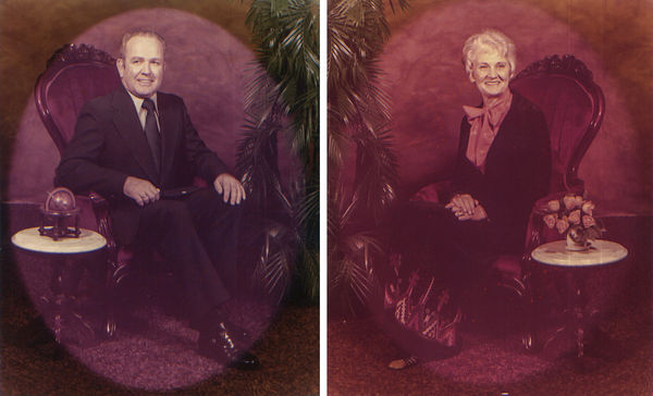
Here is the final that I am most pleased with and I'm sure my mom will also. BTW, if any of you know her, your sworn to secrecy! ;-)
Thanks again.
Here is the final that I am most pleased with and I'm sure my mom will also. BTW, if any of you know her, your sworn to secrecy! ;-)
Thanks again.

Dec 7, 2015 17:40:02 #

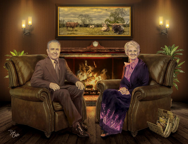
A nice try but may I make some suggestions? Their heads do not look like they belong. The reason is the light is very different on their faces than the rest of the scene.
You need to mute the tones considerably on their faces, making them more antique looking.
Take the brightness down a few notches and see if that helps.
From that point, re-evaluate and ask on the forum if it helped.
You need to mute the tones considerably on their faces, making them more antique looking.
Take the brightness down a few notches and see if that helps.
From that point, re-evaluate and ask on the forum if it helped.
Dec 7, 2015 18:52:46 #
Wendy2 wrote:
A nice try but may I make some suggestions? Their heads do not look like they belong. The reason is the light is very different on their faces than the rest of the scene.
You need to mute the tones considerably on their faces, making them more antique looking.
Take the brightness down a few notches and see if that helps.
From that point, re-evaluate and ask on the forum if it helped.
You need to mute the tones considerably on their faces, making them more antique looking.
Take the brightness down a few notches and see if that helps.
From that point, re-evaluate and ask on the forum if it helped.
Thanks, but I had about 40 folks comment yesterday and know one else reached that conclusion. Remember this is being printed on canvas, it will lose some of that brightness. I do know this from experience.
Check out Commercial and Industrial Photography section of our forum.
Dec 7, 2015 19:30:45 #
donolea wrote:
Thanks, but I had about 40 folks comment yesterday and know one else reached that conclusion. Remember this is being printed on canvas, it will lose some of that brightness. I do know this from experience.
I have had things printed on canvas thinking it would lose some of it's brilliance but to the contrary! It turned out even brighter. I was disappointed and actually took artists crayons to tone down some of the colors.
As far as no one else reaching that conclusion, I guess I am the odd one, but I have a very sensitive eye to color and how those colors interact with other colors. Remember, when you blend photos etc, one of the biggest mistakes is not making sure the colors and light look like the rest of the setting.
I just showed it to my husband and he said 'that looks photoshopped" and I asked how? He said it looks like the heads are pasted on".
Dec 7, 2015 20:00:46 #
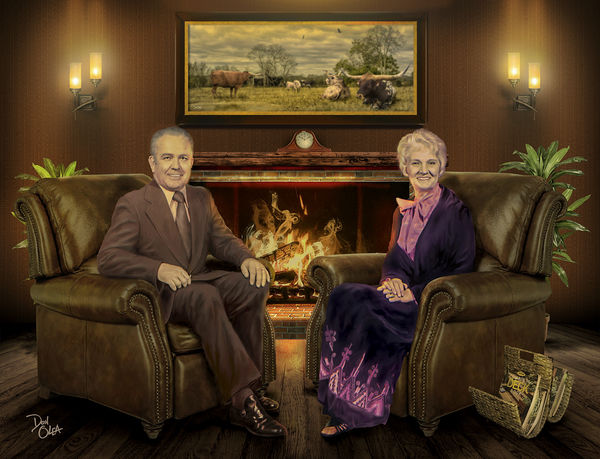
I posted a re-work. I realize some people don't like others doing this and I will be happy to delete it. Let me know if it is OK.
My re-works look very much alike until you download them. Then you can see one is warmer, one is cooler and one is more saturated.
My re-works look very much alike until you download them. Then you can see one is warmer, one is cooler and one is more saturated.
Dec 7, 2015 20:20:38 #
Wendy2 wrote:
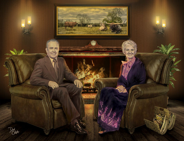
I posted a re-work. I realize some people don't like others doing this and I will be happy to delete it. Let me know if it is OK.
My re-works look very much alike until you download them. Then you can see one is warmer, one is cooler and one is more saturated.
My re-works look very much alike until you download them. Then you can see one is warmer, one is cooler and one is more saturated.
Looks to me like you may have added a warming filter over the entire image? It has a yellowish tint which I don't care for. I'll revisit their faces tomorrow, I know of a few other ways to achieve the same results without changing the tint.
Dec 7, 2015 20:41:44 #
donolea wrote:
Looks to me like you may have added a warming filter over the entire image? It has a yellowish tint which I don't care for. I'll revisit their faces tomorrow, I know of a few other ways to achieve the same results without changing the tint.
No, no warming filter, I believe in part it was saturation. I am going to try to tone that down.
Check out Infrared Photography section of our forum.
Dec 8, 2015 04:31:24 #
I too posted a re-work. I realize some people don't like others doing this and I will be happy to delete it. Let me know if it is OK.


Dec 8, 2015 07:34:15 #

Wendy2 wrote:
I posted a re-work. I realize some people don't like others doing this and I will be happy to delete it. Let me know if it is OK.
My re-works look very much alike until you download them. Then you can see one is warmer, one is cooler and one is more saturated.
My re-works look very much alike until you download them. Then you can see one is warmer, one is cooler and one is more saturated.
Wendy, very nicely done.
Dec 8, 2015 08:23:25 #
Dec 8, 2015 09:24:56 #

As a very unprofessional I totally agree with Wendy. Just my personal observation.
Dec 8, 2015 09:42:49 #
You did a beautiful job. The heads do seem to be a little bright for the rest of the scene but I've seen family portraits done in oil where the faces seem to glow. It seemed to be a popular style in earlier times. It looks like a fine oil painting.
Dec 8, 2015 09:50:45 #
Wendy2 wrote:
I posted a re-work. I realize some people don't like others doing this and I will be happy to delete it. Let me know if it is OK.
My re-works look very much alike until you download them. Then you can see one is warmer, one is cooler and one is more saturated.
My re-works look very much alike until you download them. Then you can see one is warmer, one is cooler and one is more saturated.
Wendy, these are too dark for my taste. The scene has lost it's vibrance and cheerfulness.
Dec 8, 2015 09:56:30 #
Yooper 2 wrote:
Wendy, these are too dark for my taste. The scene has lost it's vibrance and cheerfulness.
Did you download them? The vibrance and cheerfulness is there, just does not show until the download. That it does not show until the download has been a problem with UHH...too bad.
The main objective was to make the heads look like they 'fit in'. The originals (the heads) look out of place. I am going to try to tone down the warming tone a little.
Dec 8, 2015 10:21:27 #
Yooper 2 wrote:
Wendy, these are too dark for my taste. The scene has lost it's vibrance and cheerfulness.
I downloaded them and I agree, no vibrance. And seeing how it's my piece I think I will go with what I like. ;-)
If you want to reply, then register here. Registration is free and your account is created instantly, so you can post right away.
Check out AI Artistry and Creation section of our forum.