Leaves and geometry
Oct 29, 2015 19:55:26 #

I'm new to UHH. I've been doing photography for my own enjoyment for years, but am without training.
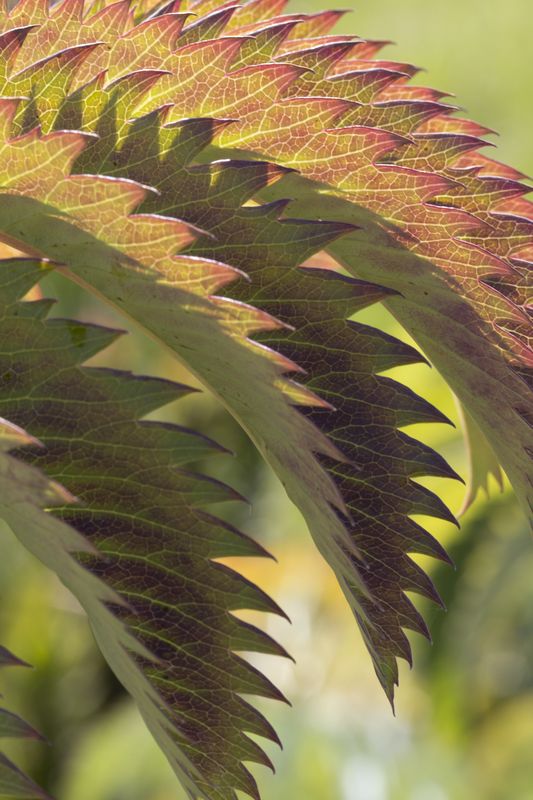
I took this at the University of California Santa Cruz Arboretum.
I used my old Canon T3i with a Canon 100mm Macro L lens, f13, 1/45 sec, ISO 200. I used a tripod, no flash and no post-processing.
Please critique.
I love all the information on UHH.
Thanks very much.
I took this at the University of California Santa Cruz Arboretum.
I used my old Canon T3i with a Canon 100mm Macro L lens, f13, 1/45 sec, ISO 200. I used a tripod, no flash and no post-processing.
Please critique.
I love all the information on UHH.
Thanks very much.
Oct 29, 2015 19:59:41 #

jblazar wrote:
I'm new to UHH. I've been doing photography for my own enjoyment for years, but am without training.
I took this at the University of California Santa Cruz Arboretum.
I used my old Canon T3i with a Canon 100mm Macro L lens, f13, 1/45 sec, ISO 200. I used a tripod, no flash and no post-processing.
Please critique.
I love all the information on UHH.
Thanks very much.
I took this at the University of California Santa Cruz Arboretum.
I used my old Canon T3i with a Canon 100mm Macro L lens, f13, 1/45 sec, ISO 200. I used a tripod, no flash and no post-processing.
Please critique.
I love all the information on UHH.
Thanks very much.
Oct 30, 2015 09:41:54 #
Unusual image with strong content- I like it! Composition is excellent which emphasizes the image's strength of contrast and angularity- of which there's more to be explored. That is, added contrast, sharpening (slightly soft foreground leaf serrations) and color saturation might provide a more robust vehicle to convey the buzz saw like feeling I get from this "action packed" composition but "milk toast" colors... which is a long and awkward sentence...
jblazar wrote:
I'm new to UHH. I've been doing photography for my own enjoyment for years, but am without training.
I took this at the University of California Santa Cruz Arboretum.
I used my old Canon T3i with a Canon 100mm Macro L lens, f13, 1/45 sec, ISO 200. I used a tripod, no flash and no post-processing.
Please critique.
I love all the information on UHH.
Thanks very much.
I took this at the University of California Santa Cruz Arboretum.
I used my old Canon T3i with a Canon 100mm Macro L lens, f13, 1/45 sec, ISO 200. I used a tripod, no flash and no post-processing.
Please critique.
I love all the information on UHH.
Thanks very much.
Check out Digital Artistry section of our forum.
Oct 30, 2015 12:11:09 #
jblazar wrote:
I'm new to UHH. I've been doing photography for my own enjoyment for years, but am without training.
I took this at the University of California Santa Cruz Arboretum.
I used my old Canon T3i with a Canon 100mm Macro L lens, f13, 1/45 sec, ISO 200. I used a tripod, no flash and no post-processing.
Please critique.
I love all the information on UHH.
Thanks very much.
I took this at the University of California Santa Cruz Arboretum.
I used my old Canon T3i with a Canon 100mm Macro L lens, f13, 1/45 sec, ISO 200. I used a tripod, no flash and no post-processing.
Please critique.
I love all the information on UHH.
Thanks very much.
I also think this image would benefit from greater contrast. I find it interesting from a compositional point of view that the image changes completely if you knock out the bottom third (focus is on the saw/teeth aspect) or knock out the top third (focus on the repetitive overlapping droops).
And -- some beautiful colors here.
Oct 30, 2015 15:17:49 #
Thanks, fuminous and pfrancke. As soon as I get some time, I'll play with cropping, contrast, sharpening and saturation, as you suggest.
Thanks for the suggestions.
Thanks for the suggestions.
Oct 31, 2015 10:31:34 #

Oct 31, 2015 10:40:54 #
Here's what I think, JB. I like the angle of your shot very much. The repeating jagged lines are fabulous. The DOF choice is very effective. You have great sharp detail where needed and the background is OOF. The three little jags on the bottom left corner are a distraction. Never let something like that poke into the edge of your frame. I would clone it out. If you take this shot again, take it in softer diffused light. I probably sound like a broken record, but adding contrasty light to lots of detail makes the shot too busy. You lose the impact of the great lines you have. I do like the way you have framed this shot. The light is the biggest issue for me.
Check out True Macro-Photography Forum section of our forum.
Oct 31, 2015 11:20:17 #
Nightski wrote:
Here's what I think, JB. I like the angle of your ... (show quote)
Thanks for the suggestions, Nightski. I will clone out the distracting jags. I find it interesting that a couple of people suggested more contrast and you suggest there is too much. These suggestions would make for very different pictures. Obviously the light was what it was, but I could have used a shade or diffuser. It is nice to get different opinions. Next time I will experiment with these suggestions when I go out. I have a lot of work to do to learn to visualize the possibilities. The nice thing about digital is you can actually try them and see the results in the field.
Oct 31, 2015 12:41:46 #
I didn't say there was too much contrast in the leaves. I said the light was contrasty. In other words, you have the lines of shadows distracting from the lines of the leaves.
Here's a thought. Would you want more contrast in the colours of the leaves or would you want more contrast between the leaves and the background? I wonder what the others were thinking when they say more contrast.
Here's a thought. Would you want more contrast in the colours of the leaves or would you want more contrast between the leaves and the background? I wonder what the others were thinking when they say more contrast.
Oct 31, 2015 12:56:06 #

jblazar wrote:
I'm new to UHH. I've been doing photography for my own enjoyment for years, but am without training.
I took this at the University of California Santa Cruz Arboretum.
I used my old Canon T3i with a Canon 100mm Macro L lens, f13, 1/45 sec, ISO 200. I used a tripod, no flash and no post-processing.
Please critique.
I love all the information on UHH.
Thanks very much.
I took this at the University of California Santa Cruz Arboretum.
I used my old Canon T3i with a Canon 100mm Macro L lens, f13, 1/45 sec, ISO 200. I used a tripod, no flash and no post-processing.
Please critique.
I love all the information on UHH.
Thanks very much.
I think the problem with this picture is that the background is too bright, if the background had been darker the leaves would be given much more impact. The leaf cut off at the bottom saps some strength from the picture too. Perhaps cropping the bottom third might strengthen it so that the eye doesn't follow the lines down and out of the frame? It would become more of an abstract.
HTH Graham
Oct 31, 2015 22:31:36 #
Nightski wrote:
I didn't say there was too much contrast in the leaves. I said the light was contrasty. In other words, you have the lines of shadows distracting from the lines of the leaves.
Here's a thought. Would you want more contrast in the colours of the leaves or would you want more contrast between the leaves and the background? I wonder what the others were thinking when they say more contrast.
Here's a thought. Would you want more contrast in the colours of the leaves or would you want more contrast between the leaves and the background? I wonder what the others were thinking when they say more contrast.
Sorry if I'm being dense. So are you saying I should try to avoid the jagged leaf shadows on the leaves; that they detract from the jagged leaves themselves and make the picture too busy?
As for your second comment above, I'm assuming you think the leaves should be more alike in contrast, and the background should be more in contrast to the leaves. My picture has quite a wide variation in contrast between different leaves, and also quite a wide variation in contrast in the background areas. This is probably not ideal. In the future, perhaps I should think about shading the background and using a diffuser on the leaves for a picture like this. Does that sound like a good plan?
Check out Black and White Photography section of our forum.
Oct 31, 2015 22:35:30 #
Graham Smith wrote:
I think the problem with this picture is that the background is too bright, if the background had been darker the leaves would be given much more impact. The leaf cut off at the bottom saps some strength from the picture too. Perhaps cropping the bottom third might strengthen it so that the eye doesn't follow the lines down and out of the frame? It would become more of an abstract.
HTH Graham
HTH Graham
Graham.
In reading your comment and looking again at my picture, I think you are right. I need a more even background for the lower leaves, perhaps more like the background above the upper leaves. That bright globby background at the bottom is very distracting. Or do you think even the upper light green is too bright?
And yes, I should not have cut off the bottom leaf. I should have spent more time composing.
I really appreciate all these comments. I look at my picture and like it, perhaps seeing a couple of things I could improve, but all your comments and suggestions give me good ideas for future work, and ideas on how to improve my composition.
Thanks very much to you all.
Nov 1, 2015 11:41:41 #
jblazar wrote:
Sorry if I'm being dense. So are you saying I shou... (show quote)
Or just shoot when the sun isn't so bright. Much simpler in my humble opinion, but it's a decision every photographer has to make. It might be that you like the shadows .. that too is a creative decision that only you can make. I merely shared my view of it.
Nov 1, 2015 20:41:34 #
Nightski wrote:
Or just shoot when the sun isn't so bright. Much simpler in my humble opinion, but it's a decision every photographer has to make. It might be that you like the shadows .. that too is a creative decision that only you can make. I merely shared my view of it.
Thanks, Nightski.
Nov 5, 2015 11:49:53 #
Nightski wrote:
McVeed, were you going to say something?
Well, yes, I was going to say something when my computer did a back-flip and dropped the connection. Anyway I was going to say that I liked the picture. I am a bit disappointed that the bottom leaf is soft compared to the other two. I also would lie to see the contrast boosted just a tad, and clone out the intruders in the lower left corner. But the idea is great it deserves a revisit.
If you want to reply, then register here. Registration is free and your account is created instantly, so you can post right away.
Check out Smartphone Photography section of our forum.