Just wanted oppinions
Apr 16, 2012 18:42:54 #

I am trying to creat a postcard type of advertising to leave for my potential clients. What do you like and dislike. The last shot is from my business card I've always used. I get LOTS of ooohs and Aaaahhhhs on it but getting the words to stand out on it is tought.
Front
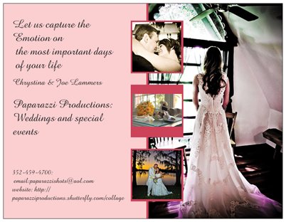
Back

Business card
Apr 16, 2012 19:02:55 #

I like your last one best. Try putting the information on the back and leave the front alone.
Apr 16, 2012 19:07:50 #
Country's Mama wrote:
I like your last one best. Try putting the information on the back and leave the front alone.
So you are saying leave the front as just a picture and put all contact info on back?
Apr 16, 2012 19:12:49 #
I like it. I maybe would try different colors of print, my first thought would be a very dark brown, a ruby or even darker red and or a type that has a shadow effect to it. Looks like a fun project to play with for a few hours and maybe even try a few things that you are sure would not work - sometimes we surprise ourselves..
Apr 16, 2012 19:21:32 #
stina3246 wrote:
So you are saying leave the front as just a picture and put all contact info on back?
Country's Mama wrote:
I like your last one best. Try putting the information on the back and leave the front alone.
So you are saying leave the front as just a picture and put all contact info on back?
Exactly.
Apr 16, 2012 19:46:15 #
Country's Mama wrote:
Exactly.
stina3246 wrote:
So you are saying leave the front as just a picture and put all contact info on back?
Country's Mama wrote:
I like your last one best. Try putting the information on the back and leave the front alone.
So you are saying leave the front as just a picture and put all contact info on back?
Exactly.
Well I want to at least leave the company name on the front along with Let us capture the emotion but I don't see whay we HAVE to have all the contact stuff on the front.
Apr 16, 2012 20:52:15 #

Love the third pic but I dont like the idea of putting any print on it. The first one is best for a post card. I would leave the tree in the middle out, makes it busy. Try the fist one with out the tree middle ones maybe add your third pic to the blank are 2/3 of the way down. Hard to explain whats in my head. Hope you dont mind but this is a quick PS of what Im trying to say

Apr 16, 2012 22:18:49 #
stina3246 wrote:
Well I want to at least leave the company name on the front along with Let us capture the emotion but I don't see whay we HAVE to have all the contact stuff on the front.
Country's Mama wrote:
Exactly.
stina3246 wrote:
So you are saying leave the front as just a picture and put all contact info on back?
Country's Mama wrote:
I like your last one best. Try putting the information on the back and leave the front alone.
So you are saying leave the front as just a picture and put all contact info on back?
Exactly.
Well I want to at least leave the company name on the front along with Let us capture the emotion but I don't see whay we HAVE to have all the contact stuff on the front.
That could look nice too. It just would be so cluttered and take away from the image that is an example to your customers of what you are going to provide them, if you leave all the contact info on the front also.
Apr 16, 2012 22:27:58 #

Country's Mama wrote:
I like your last one best. Try putting the information on the back and leave the front alone.
The last one does it for me as well.
Apr 16, 2012 22:52:15 #

I personally like the front of the first one, but same informaion on back is repetative. Front is Company Name, and your Quote. Back is for phone number and address, and other information. The card I would just put your company name acrost the top edge, and everything else on the back, just my thoughts.
stina3246 wrote:
I am trying to creat a postcard type of advertising to leave for my potential clients. What do you like and dislike. The last shot is from my business card I've always used. I get LOTS of ooohs and Aaaahhhhs on it but getting the words to stand out on it is tought.
Apr 16, 2012 23:09:13 #

Personally, I find color backgrounds on business cards chintzy. Think about it this way. How many times have you visited a web site and had a difficult time reading the info due to a color background on the page?
Change the pink to white and the print should be OK.
The text needs alignment work on both front and back.
Let us capture the Emotion on the most important days of your life.
Should be: Let us capture the emotions on the most important days of your life.
There is more than one emotion; not one emotion. Lose the Cap on e in emotion.
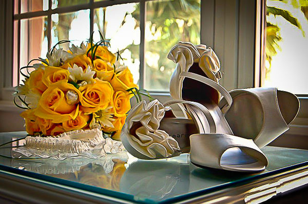
Here's what I would do. Lose the pink and all images on the front. Make it a standard white/off white business card with business name and contact info on one side and the photo with the flowers/shoes on the back.
This would make a statement. You have given the appropriate info on the front and bam! This is what I can do for you on the back of the card. If you plan on using a photo spring for the extra bucks and get glossy cards. Classier for the kind of business you're promoting.
Too often people get lost in the cutesy and lose perspective in what's important.
This actually belongs in the General Chit Chat section.
Change the pink to white and the print should be OK.
The text needs alignment work on both front and back.
Let us capture the Emotion on the most important days of your life.
Should be: Let us capture the emotions on the most important days of your life.
There is more than one emotion; not one emotion. Lose the Cap on e in emotion.
Here's what I would do. Lose the pink and all images on the front. Make it a standard white/off white business card with business name and contact info on one side and the photo with the flowers/shoes on the back.
This would make a statement. You have given the appropriate info on the front and bam! This is what I can do for you on the back of the card. If you plan on using a photo spring for the extra bucks and get glossy cards. Classier for the kind of business you're promoting.
Too often people get lost in the cutesy and lose perspective in what's important.
This actually belongs in the General Chit Chat section.
Apr 17, 2012 00:47:11 #
I like the idea of the 3rd one and have the writing on the back as well. I have seen others done that way and have even picked some up so I could look at them for ideas.
Apr 17, 2012 06:20:19 #

I went through this with my wife when we started our wedding business, and going back to when I was in collage and took advertising remember less is somtimes best. A business card should be only be an jntroduction, leave them something to call about and then sell them on yourself.
Apr 17, 2012 06:22:34 #
stina3246 wrote:
I am trying to creat a postcard type of advertising to leave for my potential clients. What do you like and dislike. The last shot is from my business card I've always used. I get LOTS of ooohs and Aaaahhhhs on it but getting the words to stand out on it is tought.
I went through this with my wife when we started our wedding business, and going back to when I was in collage and took advertising remember less is somtimes best. A business card should be only be an jntroduction, leave them something to call about and then sell them on yourself.
Apr 17, 2012 06:25:02 #
http://www.webcam-steamate.com/cookies/42/b/happy.gif
i just wanted to see what most of you would appraise this bike at.
this bike has alot of chrome its an 02 vstar custom 1100
has custom seat drag bars lowerd custom license plate holder 2 tone paint job there is one tiny scratch on the bike
let me know what you guys think.
thank you guys and girls
i just wanted to see what most of you would appraise this bike at.
this bike has alot of chrome its an 02 vstar custom 1100
has custom seat drag bars lowerd custom license plate holder 2 tone paint job there is one tiny scratch on the bike
let me know what you guys think.
thank you guys and girls
If you want to reply, then register here. Registration is free and your account is created instantly, so you can post right away.