Black/White
Aug 18, 2015 16:00:03 #

Aug 18, 2015 16:04:24 #

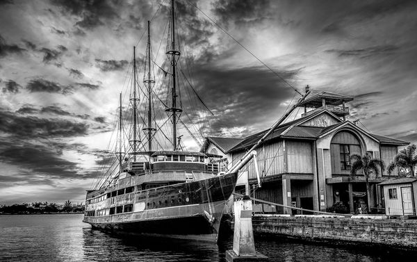
#3 is the one that works best for me. A very interesting study of the ship's and building's architecture, with a dramatic sky for mood.
Aug 18, 2015 16:11:00 #

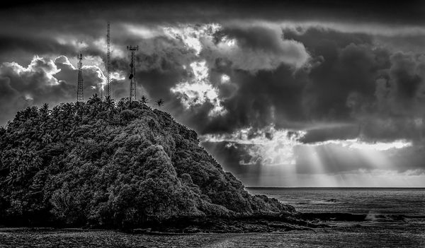
Number one for me with the suns rays through the clouds. The pylons are a distraction though and I would probably remove them.
Aug 18, 2015 16:28:08 #
Love your B&W treatment of subject matter. Nice rich blacks and excellent tonal range. Beautiful job!
Enjoyed your images. Please post more of your B&W work.
Enjoyed your images. Please post more of your B&W work.
Aug 18, 2015 17:25:20 #

Aug 18, 2015 17:33:37 #

Aug 19, 2015 08:20:52 #

Excellent B&W, really like #3, but all good work - thanks for sharing.
Aug 19, 2015 09:13:17 #

Aug 19, 2015 10:18:14 #
Mark7829
Loc: Calfornia
The first two are over sharpened. Too many white halos around the edges. They lack a foreground element but not always available. The third one the top of the mast is cut off and you are not level. The building is tilted, particularity the storage shed in the bottom right. Good tonal qualities for black and white.
Aug 19, 2015 10:38:54 #

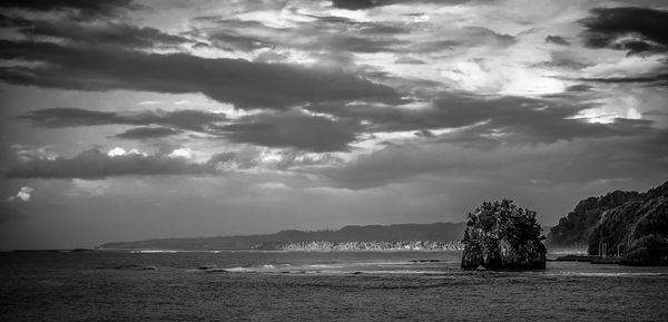
I always seem to be in left field from everyone else. I like #2 best. #3 is interesting, but the sky and the boat detail fight with each other. I'd like it better with a simple, non-distracting sky so that the boat detail really shows up. I like #1 but the electrical poles are a bit distracting. Can they be easily removed?
Aug 19, 2015 12:47:31 #
Aug 19, 2015 14:16:28 #
Thanks everyone for the critiques and complements,,,, I really appreciate the input,, always room for improvement, but the fun is learning..
If you want to reply, then register here. Registration is free and your account is created instantly, so you can post right away.