A Little help
Jul 9, 2015 23:00:20 #

I'm only a snap shot guy.....
The ones that stand out for me are:
1. Still Life-Don't know why, maybe it's the lighting.
3. Action
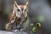
6. Bird-Consider cropping a little tighter. Seems there is
a lot of empty space around this little guy.
8. People Candid
Hope this is helpful!
Pat
The ones that stand out for me are:
1. Still Life-Don't know why, maybe it's the lighting.
3. Action
6. Bird-Consider cropping a little tighter. Seems there is
a lot of empty space around this little guy.
8. People Candid
Hope this is helpful!
Pat
Jul 9, 2015 23:34:50 #
Jul 10, 2015 00:00:22 #
endjr wrote:
I'm would like a critique of some pics I'm going to enter in a juried show. Thanks.
Pick any one. Your the winner. I think each of these is pretty awesome.
Jul 10, 2015 09:46:40 #
My only criticism pertains to the first image.
There appears to be some litter on the grass behind the bench that needs to be removed.
Other than that, I like all the shots.
There appears to be some litter on the grass behind the bench that needs to be removed.
Other than that, I like all the shots.
Jul 10, 2015 10:29:59 #
Madman wrote:
My only criticism pertains to the first image.
There appears to be some litter on the grass behind the bench that needs to be removed.
Other than that, I like all the shots.
There appears to be some litter on the grass behind the bench that needs to be removed.
Other than that, I like all the shots.
Thank you, the litter is leaves.
Jul 10, 2015 15:45:37 #

Still life... A nice picture but I would get rid of the white under the bench..
Architecture... I like the way the leading line of the wall takes you uo and then back to the paves area in front of the church. I also like the low angle and the pot of flowers and pile of stones add interest ...
Action... A very good action picture, the water is well caught and the boy in nicely in line with the diagonals of the rope and lines in the pool...
Landscape...I like the way the branch bends and mimics the rock formation in the background even down to the stumpy bit at the end. Taken from a well seen angle...
Waterfowl Very nice and sharp, shame the wing tip is missing...
Seascape... Lots of great textures and shades of blue...
Candid... I think this might be better with the sky cropped off as it looks to be sloping to the right, this may not be the casr but it gives that impression.....
Seascape.. The fence and shadow make a great leading line to the building.
A good set of pictures and good luck in the competition...
Jul 10, 2015 16:36:14 #
Really do enjoy your landscapes. That fellow looking over the bluff wouldn't be at Horseshoe Bend would it?
Jul 10, 2015 16:53:56 #
HillbillyHiker wrote:
Really do enjoy your landscapes. That fellow looking over the bluff wouldn't be at Horseshoe Bend would it?
Yes in Page AZ.
Jul 10, 2015 17:08:35 #
My personal pick is the Landscape. Love the composition and colors.
Jul 10, 2015 17:14:11 #
Jul 10, 2015 17:15:01 #
nanaval wrote:
Still life... A nice picture but I would get rid o... (show quote)
Thank you for your helpful input.
Jul 10, 2015 22:02:25 #

Jul 10, 2015 22:09:40 #
Jul 11, 2015 00:28:57 #

Michael feather Frame wrote:
Pic 1# to much dark space/ Lighten chair a little ( keep the dark space ) title " Parents Gone " " Loved One Gone "
Pic 2# LoVe It ! Great Composition, Great CoLor, and Depth of Field !
Pic 4# LoVe It ! Great Composition... but i see it more liKe... This !
new !!! just... shaRing ?
Pic 2# LoVe It ! Great Composition, Great CoLor, and Depth of Field !
Pic 4# LoVe It ! Great Composition... but i see it more liKe... This !
new !!! just... shaRing ?
I like the dark space in #1. Don't think there's too much dark space. If it was lightened up, too much of the background might show up and would draw attention away from the bench.
Jul 11, 2015 15:04:57 #
Collie lover wrote:
I like the dark space in #1. Don't think there's too much dark space. If it was lightened up, too much of the background might show up and would draw attention away from the bench.
Lighten just the chair... using Dodge Tool / at actual pixels or above / use tool no more than 14 pt. / new title " Missing You "
If you want to reply, then register here. Registration is free and your account is created instantly, so you can post right away.