Check out Printers and Color Printing Forum section of our forum.
Story book cover, romance novel, or trash?
May 27, 2015 02:35:51 #
May 27, 2015 04:10:20 #

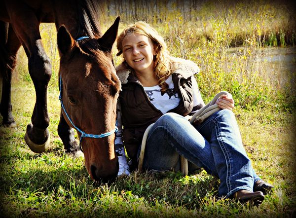
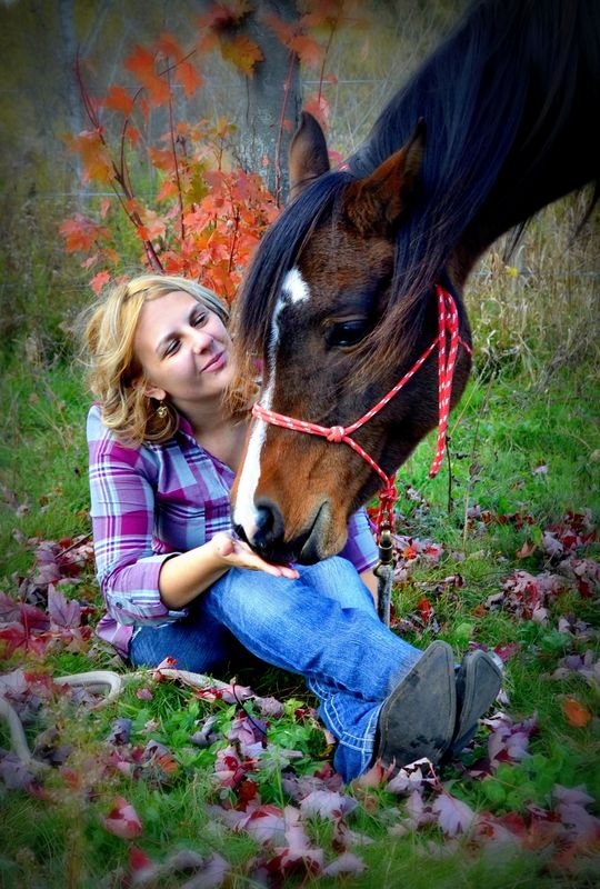
Very nice, especially # 3. The color in the 1st 2 don't look quite right to me, but that may be because some photos don't look right on UHH unless you check the download button.
Anyway, I think the 3rd photo is great.
Anyway, I think the 3rd photo is great.
May 27, 2015 04:54:55 #
May 27, 2015 05:48:47 #

May 27, 2015 06:38:29 #
You cheated with #3. The girl's expression did it all! Beautiful! Actually,both expressions made it!
May 27, 2015 07:15:05 #
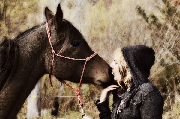
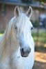
A very nice set. If you could have highlighted just the horse's eye in #1, making it more visible, you'd have a great book jacket photo. #3 is already there. djt
May 27, 2015 08:09:11 #
Quickflash wrote:
Very nice, especially # 3. The color in the 1st 2 don't look quite right to me, but that may be because some photos don't look right on UHH unless you check the download button.
Anyway, I think the 3rd photo is great.
Anyway, I think the 3rd photo is great.
Thank you for looking! I was going for a look of solitude in the first one, she really loves animals and these are at a horse shelter near by. They are rescued animals.
Check out Panorama section of our forum.
May 27, 2015 08:09:47 #
May 27, 2015 08:10:59 #
DaveO wrote:
You cheated with #3. The girl's expression did it all! Beautiful! Actually,both expressions made it!
Thanks DaveO ! #3 is not my favorite, but everyone seems to like it the best. I am glad i added it :)
May 27, 2015 08:14:06 #
djtravels wrote:
A very nice set. If you could have highlighted just the horse's eye in #1, making it more visible, you'd have a great book jacket photo. #3 is already there. djt
Thanks djtravels :) After looking at it, you are correct, the highlight in the horses eye would have added quite a bit to the photo. #3 is not my favorite. Although the colors in 1 and 2 are muted, I feel i over saturated the colors in #3.
May 27, 2015 12:32:25 #
, I feel i over saturated the colors in #3.[/quote]
Personal preference on something like that.
:thumbup:
Personal preference on something like that.
:thumbup:
Check out Astronomical Photography Forum section of our forum.
May 27, 2015 12:35:22 #
djtravels wrote:
, I feel i over saturated the colors in #3.
Personal preference on something like that.
:thumbup:[/quote]
Composition sometimes outweighs other aspects!
May 28, 2015 06:35:58 #

May 28, 2015 07:02:37 #

May 28, 2015 08:36:44 #
If you want to reply, then register here. Registration is free and your account is created instantly, so you can post right away.
Check out Astronomical Photography Forum section of our forum.