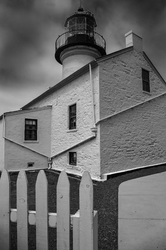
Point Loma Lighthouse in B&W or Color?
May 26, 2015 18:35:30 #

pete-m wrote:
Color, but not by much- Mostly because of the windows.
Too bad about that thing in the lower left.
Too bad about that thing in the lower left.
Thanks Pete for the windows catch. I had not noticed that they are showing much more detail in the color image. I lightened this up in the B&W and re did the photo. What do you think?
Also the lower left.....are you referring to the peeling paint that I touched up? You like the peeling paint?
May 26, 2015 18:36:15 #
jeanbug35 wrote:
Color for me.
Thanks a lot jeanbug35 for your input on this image. You are in the majority!
May 26, 2015 19:16:09 #
I would work on the contrast a little more in the black and white image, but I still prefer the black and white image even if you don't do any more processing on it.
May 26, 2015 19:16:10 #
I would work on the contrast a little more in the black and white image, but I still prefer the black and white image even if you don't do any more processing on it.
May 26, 2015 21:39:31 #
May 26, 2015 22:24:09 #

Black and white. The color shot is mostly white but, except for the blue sky, the beige and gray detract more than anything. Nice composition on both. B&W wins by large margin.
May 26, 2015 23:12:34 #

Excellent shots, Brent! I actually think I like the B&W better; the sky looks neat in B&W.
May 26, 2015 23:53:59 #
btbg wrote:
I would work on the contrast a little more in the black and white image, but I still prefer the black and white image even if you don't do any more processing on it.
btbg, I think I am done working on this one! If you prefer the B&W then that is it....b&W it is! Thanks for your vote.
May 26, 2015 23:56:35 #
frjack wrote:
Black and white. The color shot is mostly white but, except for the blue sky, the beige and gray detract more than anything. Nice composition on both. B&W wins by large margin.
So, frjack, you say the b&w wins by a LARGE margin? Nice!
Thanks for the "Nice composition on both." comment.
May 26, 2015 23:58:04 #
sailorsmom wrote:
Excellent shots, Brent! I actually think I like the B&W better; the sky looks neat in B&W.
Thanks as always sailorsmom for the nice positive comments. I'm leaning for the b&W shot too. It may be pretty close to 50 / 50 now!
May 27, 2015 00:51:46 #

May 27, 2015 01:21:32 #
May 27, 2015 11:13:39 #
May 27, 2015 11:31:50 #
texasdan78070 wrote:
B&W
Thanks texasdan78070 for your vote. It's pretty close.
May 27, 2015 15:08:41 #

If you want to reply, then register here. Registration is free and your account is created instantly, so you can post right away.