Old style
Mar 1, 2015 09:35:43 #
Mar 1, 2015 09:47:11 #

jgreco wrote:
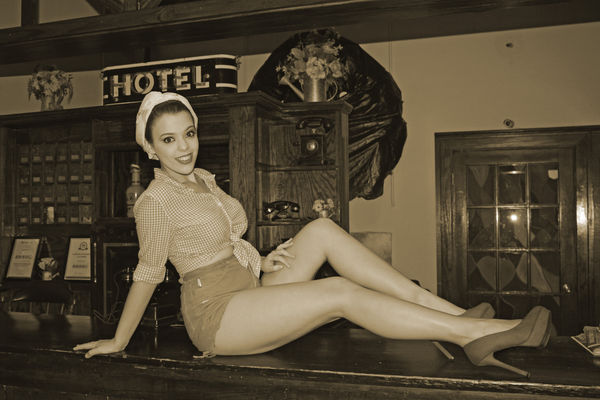
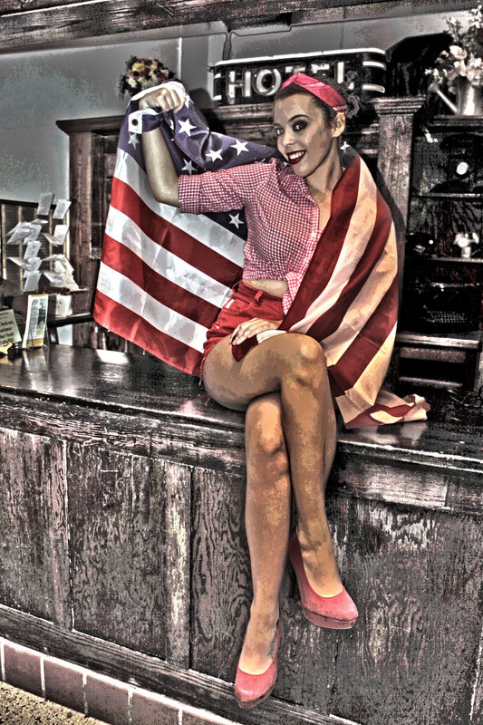
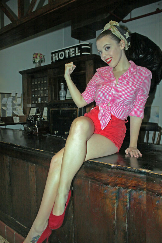
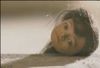
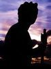
Recent photo shoot in old B&B lobby. Intent was to create old pinup style
1 & 3.... :thumbup: :thumbup:
not sure what you did to number two, but not for me
Mar 1, 2015 10:03:44 #
Mar 1, 2015 10:33:53 #
Mar 2, 2015 06:08:00 #

Mar 2, 2015 06:21:35 #

Mar 2, 2015 06:45:43 #
jgreco wrote:
Recent photo shoot in old B&B lobby. Intent was to create old pinup style
1 & 3
:thumbup: :thumbup: :thumbup: :thumbup:
Mar 2, 2015 10:19:44 #
Mar 2, 2015 12:23:15 #
What a fun location for this shoot! I see the old-timey phone on the bar... any shots of her holding the reciever up to her ear?
Make-up and outfit are great, too. Number three is the best pose for her. very nice!
Make-up and outfit are great, too. Number three is the best pose for her. very nice!
Mar 2, 2015 12:38:30 #

#1 is the best - clone out your flash reflections that are in the door to the right. A wider aperture might have been better if only to soften the background a bit, Lots of detail there drawing they eye away. But overall, decent image.
#2 is awful. HDR is not meant for skin. I think this could have been the best of the bunch.
#3 - I think this might have bee a lot better without whatever color thing you did. That green does not improve the image. Also, be really careful about lens choice and the positioning of legs. In this case, her legs look out of proportion to her upper body. A longer lens with you farther back would mitigate this - or having her turned more like #1. Don't cut off part of a foot.
In #3, her legs are also much brighter than her upper body - flash is too close and it also appears to be an unmodified, on-camera flash (or at least too close to the camera) which make that lighting so flat/hard
Mar 2, 2015 17:25:51 #

If you want to reply, then register here. Registration is free and your account is created instantly, so you can post right away.