Check out Sports Photography section of our forum.
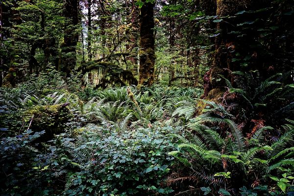
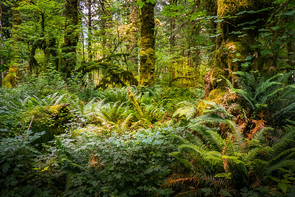
Hoh Rain Forest
Jan 30, 2015 09:03:17 #
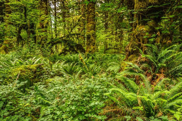
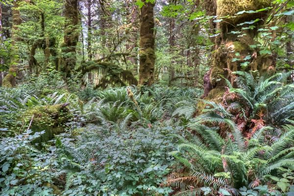
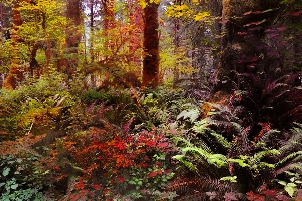
I like the image, MtnMan. Tried to enhance the image by adding to the illusion of depth: increased contrast, added tone, introduced vignette. Another GIMP. Click download to see effect.

Jan 30, 2015 11:24:39 #

Had to be different due to a good mix of colored submissions.
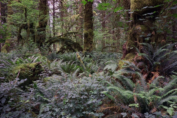
Processed in CS5 Channels Monochrome, and then with the preset Vintage Grunge III under Film Collection in Topaz 5.
Processed in CS5 Channels Monochrome, and then with the preset Vintage Grunge III under Film Collection in Topaz 5.

Jan 30, 2015 11:49:01 #

Check out The Dynamics of Photographic Lighting section of our forum.
Jan 30, 2015 11:54:48 #

lloydl2 wrote:
Beautiful greenery, since there was no distinguishable subject I decided to go with a split tone in LR using green for background and a magenta family for the highlights and then doing a bit of lighting effects with radial filters..
Thanks for an interesting variation. I've never used the split tone.
Not reality but art!
Jan 30, 2015 11:55:45 #
Shakey wrote:
I like the image, MtnMan. Tried to enhance the image by adding to the illusion of depth: increased contrast, added tone, introduced vignette. Another GIMP. Click download to see effect.
Nice! Thanks for the variation.
Jan 30, 2015 11:56:45 #
ronwande wrote:
Here's my take on the image. First of course as y... (show quote)
Thanks. I like how you brightened the moss on the trees.
Jan 30, 2015 11:58:36 #
Bob Yankle wrote:
Made a Duplicate Layer, then blended the two together using multiply - this made the image considerably darker but it also made the colors richer. I used Piccure + to sharpen the image, but the same could probably be done with the Unsharp Mask.
Thanks, Bob. I often use the Multiply layer approach but was discouraged in this case because of the dark areas. All RAW images need sharpening to finish them off. I usually just make do with Lightroom sharpening but am working with variations in CS6.
Check out Commercial and Industrial Photography section of our forum.
Jan 30, 2015 12:02:41 #
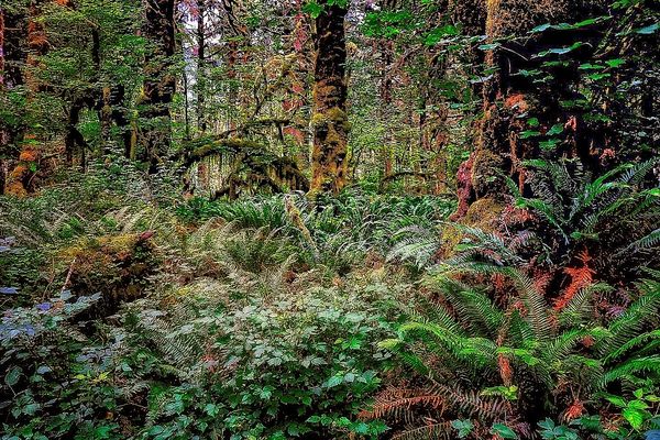
roadking11 wrote:
Greetings MtnMan'
Beautiful profusion of plants, but no center of focus to hold interest. Using dodge and burn I created a path to the center tree. Also used dodge and burn on the natural occurrences on the tree to help the imagination of the viewer.
Beautiful profusion of plants, but no center of focus to hold interest. Using dodge and burn I created a path to the center tree. Also used dodge and burn on the natural occurrences on the tree to help the imagination of the viewer.
Thanks for an interesting variation. I like the path idea.
Jan 30, 2015 21:18:36 #
Here's version 2 without the split town and a lot of dodge and burn to make stuff pop..
Jan 30, 2015 21:58:14 #
Here are 2 versions of touch-ups I did of your photo, one using Photo Shop and one using Photomatrix single photo tone mapping .
Jan 31, 2015 01:26:27 #

Used PS CC 2014 : Applied multiple additions of color range, changing each color toward the summer/fall colors. Used the burn tool to keep the foilage on the richer side. Saturation and light/darkness was insertred along with the color range adjustments.I may have gone overboard on the sturation, but heck, I was having too much fun to stop.
Jan 31, 2015 11:06:56 #
Had to give this another whirl with LightZone,

Jan 31, 2015 19:31:44 #
ozmerelda
Loc: Osprey, FL
I've just read through all of the posts and the renditions.
I am very impressed especially with the generosity and helpfulness of everyone!
:) :) :) :) :)
I am very impressed especially with the generosity and helpfulness of everyone!
:) :) :) :) :)
Jan 31, 2015 19:32:09 #
ozmerelda
Loc: Osprey, FL
lloydl2 wrote:
Here's version 2 without the split town and a lot of dodge and burn to make stuff pop..
Love this one most!
Feb 1, 2015 03:17:09 #
Ok, I hope this is at least a little bit different than some of the other submissions.
I isolated some of the leaves in the foreground and took down the glare. I then isolated some of the shadows and brought out a bit of detail. Also, I tried to bring out the light greens to add come depth. And a very, very small amount of sharpening. I also wanted the moss to stand out a little more since it's such a nice part of this photo. All of this was done with Nik Vivesa control points. I'm certain the same can be done in PS.
In LR I simply adjusted clarity, vibrance, contrast, and appropriate color channels. I don't recall exact slider settings but, it's adjust to taste for the most part. Different monitors have a certain influence too.
I attempted to draw the viewer into the woods and past the foreground. I also try to reproduce a rich natural look.
I always benefit from these exercises and hope it helps you with your work :wink:
EDIT: I just noticed that with the intent of adding a tiny amount of color, I think I may have over saturated the magenta a bit, which is more apparent on download :|

If you want to reply, then register here. Registration is free and your account is created instantly, so you can post right away.
Check out Infrared Photography section of our forum.